
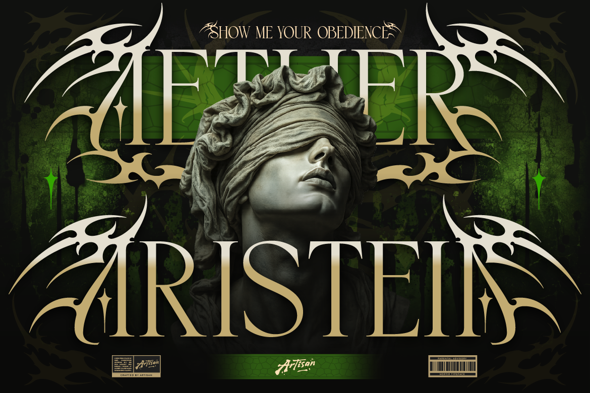
Why You Need an Ethnic Serif Font for Logos
Bring cultural texture to your packaging! Learn how using an ethnic serif font for logos like Arimels adds boho charm and authenticity to your brand.
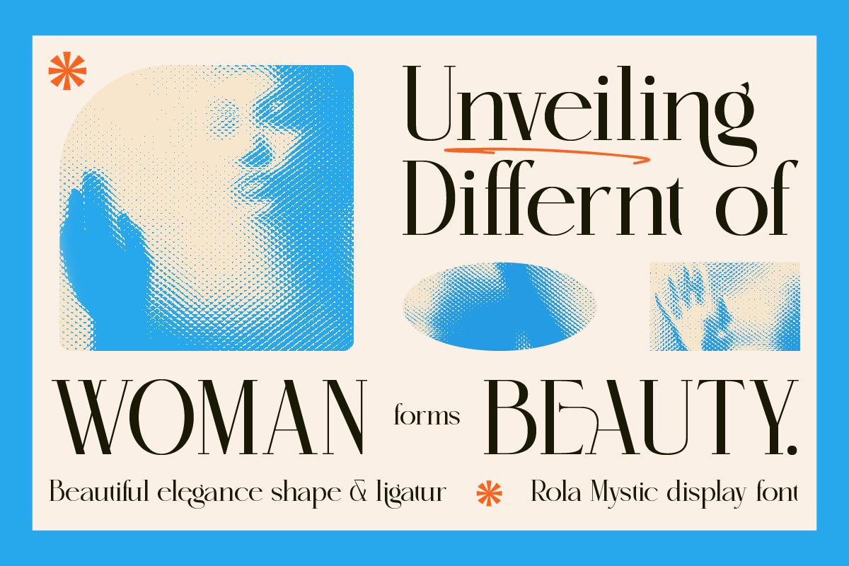
If you’ve ever spent way too long staring at a font picker — switching between one style and another, zooming in, zooming out, asking yourself “does this feel right?” — you’re not alone. Choosing between serif and sans-serif is one of the most common typography dilemmas, and honestly, it trips up a lot of people, even those who’ve been designing for a while.
The good news is that once you understand what each style actually communicates, the decision gets a whole lot easier. You stop guessing and start choosing with intention.
So let’s break it down — no jargon, no design school lecture. Just a clear, practical guide to help you figure out which direction fits your brand best.
Let’s start with the basics. A serif is the small decorative stroke or “foot” at the end of a letter’s main strokes. You know those little finishing lines on the tips of letters? Those are serifs. Classic examples of serif fonts include Times New Roman, Georgia, and Garamond.
Sans-serif, on the other hand, means exactly what it sounds like — “sans” is French for “without.” These fonts have no little feet or decorative strokes. The letters are clean, straight, and uniform. Think Arial, Helvetica, or Futura.
Simple enough, right? But the real difference goes way beyond the visual. Each style carries decades of cultural association and psychological meaning — and that’s what we need to dig into.
Serif fonts have been around for centuries — literally. They originated in Roman stone carvings and have been used in books, newspapers, and official documents for hundreds of years. That history is exactly what gives them their character.
When people see a serif font, they tend to feel things like trust, tradition, authority, and elegance. It’s the typographic equivalent of wearing a tailored suit — it signals that you take your craft seriously and that you’ve been around long enough to know what you’re doing.
Serif fonts tend to work really well for:
A font like Cantilos from Artisan Font is a good example of a serif that brings this kind of elegant, timeless energy. It feels refined and considered — the kind of font that makes a brand look like it was built to last, not just built fast.
Sans-serif fonts became popular in the 20th century alongside modernism, the Bauhaus movement, and eventually the digital age. They’re clean, functional, and forward-looking — which is why so many tech companies, startups, and contemporary brands have gravitated toward them.
When people see a sans-serif font, the associations are usually: modern, approachable, clean, efficient, and friendly. It’s less “established institution” and more “innovative brand that gets things done.” There’s also a democratic quality to sans-serif — it feels accessible and open rather than exclusive.
Sans-serif fonts tend to work really well for:
Veltcon from Artisan Font is a clean, modern sans-serif that embodies this perfectly. It’s versatile enough to work across different touchpoints — your website, your packaging, your social media — while keeping everything feeling cohesive and contemporary.
For something with a bit more edge and confidence, Rushmax brings that bold sans-serif energy that works brilliantly for brands that want to make a strong statement — product launches, bold headlines, and brands that aren’t afraid to take up space.
Here’s the honest answer: there’s no universally correct choice. It genuinely depends on your brand. But here are some questions that can help you get there faster:
If the answer is trustworthy, established, elegant, or premium — lean serif. If it’s modern, fresh, approachable, or minimal — lean sans-serif. Your font is the first handshake your brand makes. Make sure it’s the right one.
Older audiences often associate serif fonts with credibility and professionalism. Younger audiences tend to respond well to clean sans-serifs. This isn’t a hard rule, but it’s worth considering who you’re actually talking to.
Some industries have strong typographic conventions. Law, finance, and luxury goods tend to lean serif. Tech, wellness, and lifestyle tend to lean sans-serif. You don’t have to follow conventions — but you should know them before you break them.
For digital-first brands (websites, apps, social media), sans-serif fonts generally render more cleanly on screens, especially at smaller sizes. For print-heavy brands (packaging, editorial, stationery), serifs can look stunning. If you’re doing both, consider how your font holds up across different contexts.
Here’s a pro move that a lot of great brands use: pair a serif with a sans-serif. This creates visual contrast and hierarchy while letting you tap into the strengths of both styles.
A common and effective pairing formula is to use a serif for your headings — to bring that sense of authority and personality — and a clean sans-serif for body text, where readability matters most. Or flip it: a bold sans-serif headline with a refined serif for supporting text. Both approaches work beautifully when done with intention.
The key is contrast without conflict. The two fonts should feel like they belong in the same world — complementary in mood, even if they’re different in style.
Choosing between serif and sans-serif isn’t about which one looks better in general — it’s about which one is right for your brand specifically. Once you get clear on the feeling you want to create and the audience you’re speaking to, the choice becomes a lot more intuitive.
And if you’re looking for quality fonts to try — whether serif, sans-serif, or something in between — explore the collection at Artisan Font. Every font comes with proper commercial licensing, so you can use it across your brand with confidence.
Good typography is one of those investments that quietly pays off every single day.
Why You Need an Ethnic Serif Font for Logos
Bring cultural texture to your packaging! Learn how using an ethnic serif font for logos like Arimels adds boho charm and authenticity to your brand.
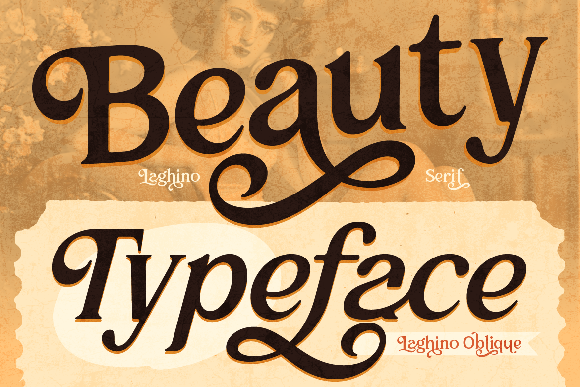
Why You Need a Luxury Serif Font for Branding
Make your brand look high-end! Learn how using a luxury serif font for branding like Laghino adds sophistication and charm to your packaging.
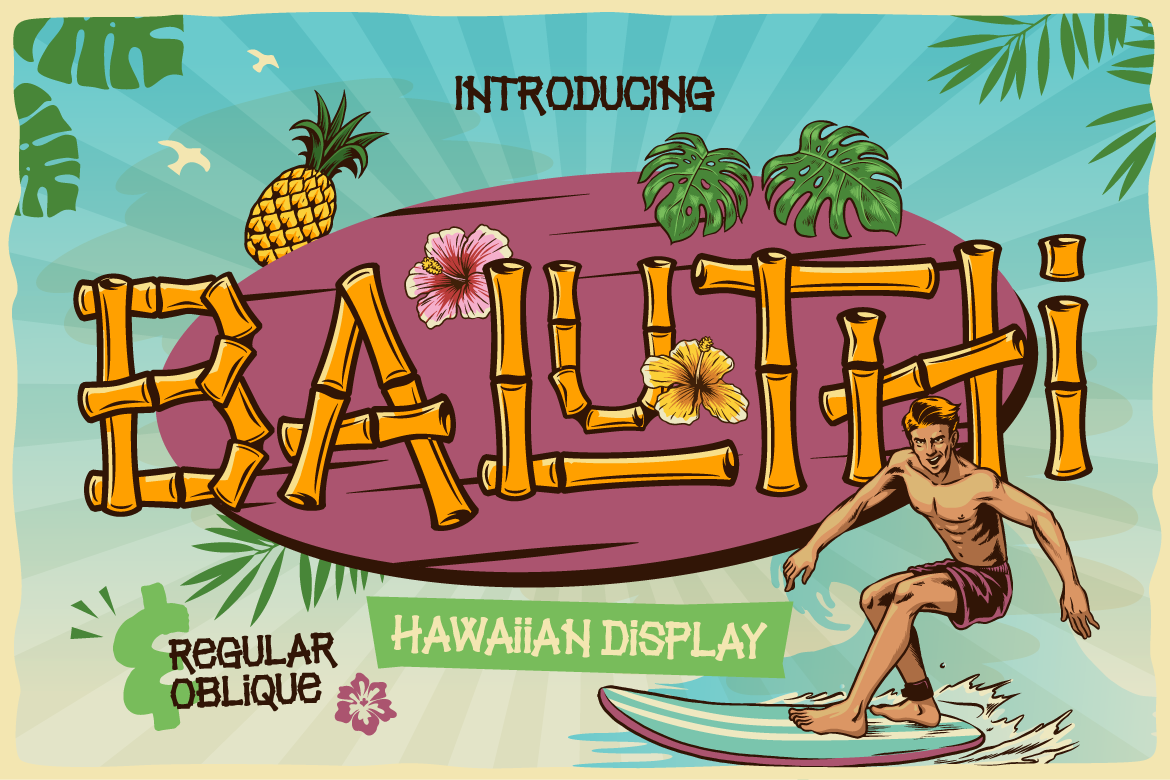
Why You Need a Bamboo Hawaiian Font for Summer Branding
Bring summer vibes to your packaging! Learn how using a bamboo hawaiian font like Baluthi adds tropical charm and fun energy to your branding.