Script fonts are some of the most beautiful typefaces out there. There’s something about a flowing, handwritten style that feels warm, personal, and full of character. When you see a gorgeous script font on a wedding invitation or a boutique brand’s logo, it just feels right.
But here’s the thing — script fonts are also one of the most commonly misused type styles in design. Use them in the wrong context, at the wrong size, or in the wrong amount, and they can make your design look cluttered, hard to read, or just plain off.
So let’s talk about script fonts properly. What they are, when they shine, and — just as importantly — when to put them down and walk away.
What Exactly Is a Script Font?
Script fonts are typefaces that mimic handwriting or calligraphy. Unlike serif or sans-serif fonts where letters stand independently, script fonts often have connecting strokes between letters — making them look like they were written by hand in one fluid motion.
They come in a huge range of styles, from formal calligraphy scripts that look like they belong on a wedding invitation, to casual handwritten styles that feel more relaxed and personal, to decorative ink scripts with dramatic flair and texture.
Seratonin from Artisan Font is a great example of the latter — a pixel script and inked style that has that beautiful handcrafted quality with real texture and warmth. It doesn’t just look written; it looks crafted.
When Script Fonts Work Brilliantly
Logos and Brand Names
Script fonts can be stunning in logos — especially for brands in beauty, food, lifestyle, and wedding industries. A flowing script logo feels personal and distinctive in a way that sans-serif fonts often can’t match. The key here is legibility: your brand name needs to be readable at a glance, so choose a script that’s elegant but clear.
Quotes and Pull Text
One of the most effective uses of script fonts is for quotes, testimonials, or pull text in social media content. A single meaningful sentence in a beautiful script font, paired with a clean layout, creates that editorial, high-end feel that performs really well on Instagram and Pinterest.
Packaging and Labels
Artisan products — handmade candles, small-batch sauces, boutique skincare — often use script fonts on their packaging to communicate the handcrafted, personal nature of the product. Lisaline’s elegant script style from Artisan Font is perfect for this kind of use — it brings that “made with love” feeling to a label or box.
Accent Typography
Script fonts work beautifully as accents within a larger design — one word or phrase in a script style, surrounded by cleaner, more neutral typography. This contrast creates visual interest without making the whole design hard to read. Think of a headline where one word is in a flowing script and the rest is in a bold sans-serif. Elegant and effective.
When to Avoid Script Fonts
Body Text — Never
This is the number one rule: never use a script font for body text. Long paragraphs in a script font are genuinely painful to read. The connected letterforms and varying stroke widths that make scripts beautiful at large sizes become a visual obstacle at small sizes. Always use a clean, simple font for any text longer than a headline or short phrase.
All Caps in Script
Script fonts are designed for mixed case — uppercase and lowercase together. Writing in ALL CAPS with a script font almost always looks wrong. The letters were designed to flow together in a natural hand-written rhythm, and all caps breaks that completely. Avoid it unless the font was specifically designed for it.
Very Small Sizes
Script fonts lose their beauty — and their legibility — at small sizes. The fine strokes and connecting details become muddy and hard to distinguish. If you need text to be small (footnotes, captions, labels), use a clean sans-serif or serif instead and save the script for the headline.
Formal or Corporate Contexts
Script fonts carry an inherently personal, casual, or artistic feeling. That’s their strength — and their limitation. In formal contexts like legal documents, financial reports, or corporate presentations, a script font can undermine the seriousness of the content. Know your context and choose accordingly.
How to Use Script Fonts Like a Pro
A few golden rules to keep in mind:
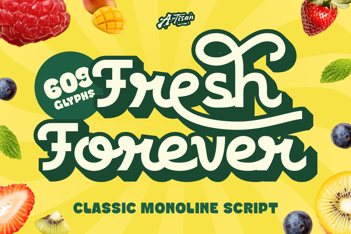
- Pair with a simple font. Script fonts need a neutral partner — a clean sans-serif or simple serif — to balance them out. A font like Racole (Artisan Font’s classic monoline script) pairs beautifully with something minimal and modern.
- Use sparingly. One script element per design is usually enough. The more you use it, the less impact it has.
- Size it up. Script fonts almost always look better bigger. Give them room to breathe and show off their details.
- Test legibility first. Before committing to a script font, send your design to someone who hasn’t seen it. Ask them to read it cold. If they struggle, the font might be too decorative for the use case.
- Choose quality. A poorly made script font with bad kerning will look amateur no matter how elegant the style is. Melowdy’s warm retro character from Artisan Font is an example of a script that’s been built with proper attention to spacing and detail — it reads smoothly and looks beautiful in application.
Script fonts are a powerful tool in any designer’s or brand owner’s toolkit. When used well, they bring warmth, personality, and elegance that few other font styles can match. When misused, they make designs harder to read and less polished.
The key is intention — knowing why you’re using a script font, where it’s going to live, and how it’s going to interact with everything else in your design. Get that right, and script fonts will absolutely elevate your brand.
Want to explore some beautiful script fonts for your next project? Check out the full collection at Artisan Font — there’s a script for every mood and every brand personality.