Luxury branding operates on a different set of rules than most design work. Where many brands compete on visibility and volume, luxury brands compete on restraint, precision, and the quiet confidence of knowing they don’t need to shout. Typography plays an enormous role in communicating that sensibility — and getting it wrong is one of the fastest ways to undercut an otherwise premium product or service.
Here’s a guide to the typography choices that signal luxury — and which fonts are worth considering for your high-end brand.
What Makes a Font Feel Luxurious?
Luxury typography tends to share certain qualities: refined, often elegant serif structures with historical credibility; generous spacing and letterforms that aren’t crowded or rushed; high contrast between thick and thin strokes, which reads as precision and craft; and an overall sense of restraint — luxury fonts rarely shout, they speak quietly and let the quality of the craft do the talking.
This is also why luxury brands tend to use less typography overall, not more. White space and restraint are themselves part of the luxury visual language.
Top Luxury & High-End Font Picks
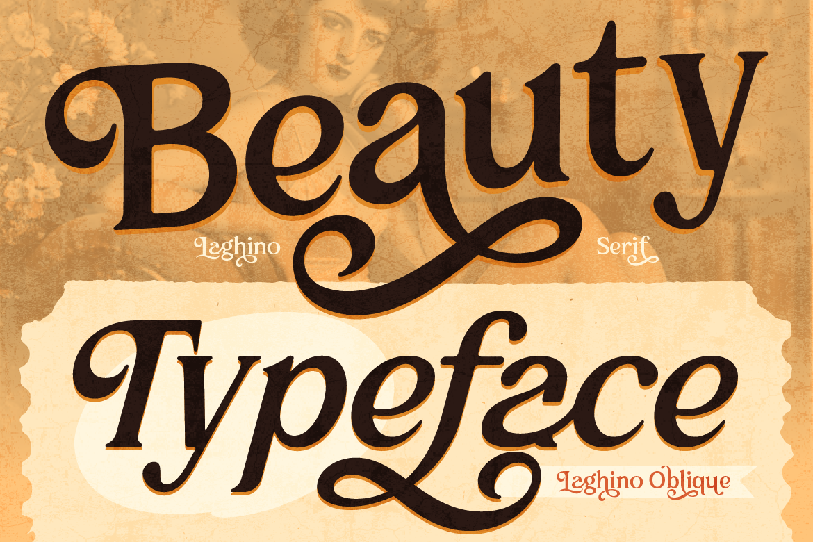
Cantilos brings exactly the kind of refined, minimalist elegance that luxury branding calls for. Its clean serif structure feels timeless rather than trendy — the kind of font that won’t look dated in five or ten years. It’s a strong choice for fashion, jewelry, premium skincare, or any brand that wants to project quiet sophistication.
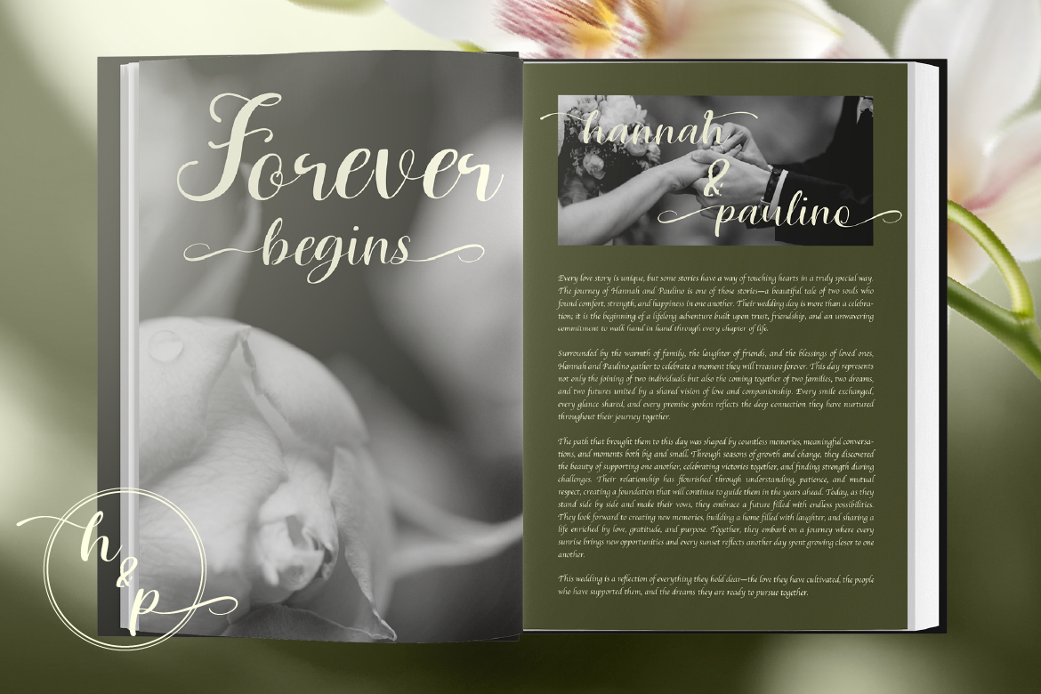
Lisaline’s elegant script style adds a layer of refined, personal sophistication when used as an accent. Luxury brands often use a script element for signatures, monograms, or special packaging details — and Lisaline fits that role beautifully. It feels handcrafted and exclusive, exactly the sensibility that high-end products want to communicate.
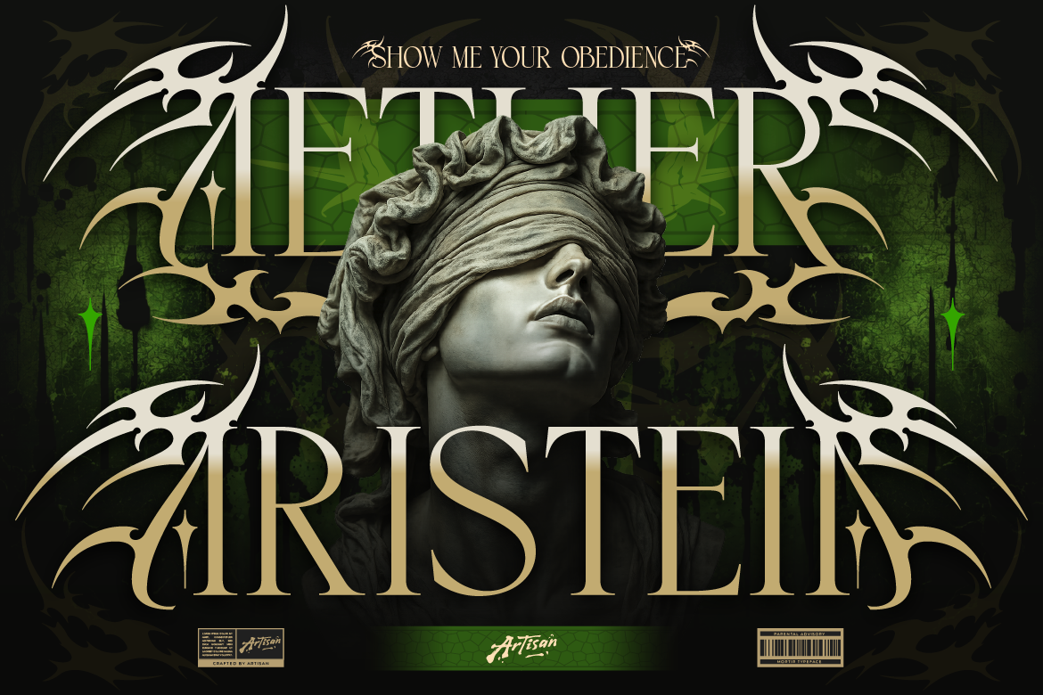
Foramte brings a more decorative, distinctive quality to the luxury aesthetic — perfect for brands that want elegance with a bit more visual presence. Its refined detailing works well for packaging, invitations, or brand moments where you want something memorable but still tasteful and considered.
Where Luxury Fonts Work Best
- Fashion & jewelry — logos, packaging, lookbooks, invitations
- Premium skincare & beauty — product labels, brand websites, marketing materials
- Hospitality & fine dining — menus, signage, hotel branding
- Real estate & high-end services — brochures, listings, client-facing materials
Tips for Luxury Typography Done Right
- Embrace white space. Luxury design breathes — don’t crowd your typography with unnecessary elements
- Limit your font count. Often just one or two fonts, used with extreme consistency, communicates more luxury than a varied typographic system
- Increase letter spacing for headlines. Slightly wider letter spacing on headline text often reads as more premium and considered
- Keep colors muted. Luxury typography pairs best with restrained, sophisticated color palettes — think black, white, cream, deep jewel tones, or metallics
Luxury branding is ultimately about restraint, craft, and confidence. The right typography communicates all three without saying a single word about price or exclusivity directly — it just feels premium, because every detail has been considered. Explore the elegant and refined font picks at Artisan Font and give your luxury brand the typography it deserves.