You downloaded a beautiful font, installed it, and started typing — but something feels a little flat. The font looks nice, sure, but you’ve seen it used in designs that look far more expressive and detailed than what you’re getting. What’s the difference?
Nine times out of ten, OpenType features explain the gap. Most designers never unlock them, so they get only a fraction of what their fonts can actually do. Here’s what you’re missing.
What Is OpenType?
OpenType is a font file format that Adobe and Microsoft developed together. It can store a much larger character set and set of features than older font formats. When you see a font file ending in .otf (or even .ttf with OpenType features baked in), you’re looking at a font that potentially packs far more than the basic letters and numbers you see when you type.
Type designers call those extras OpenType features — and they can completely transform how a font looks.
The Most Common OpenType Features Explained
Alternates (Stylistic Alternates)
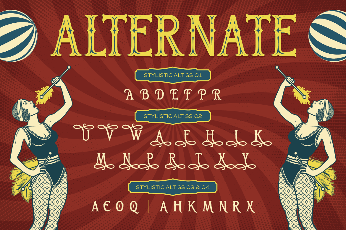
Many fonts include alternate versions of certain letters. These are slightly different designs for the same character, and they give you more creative control. For example, a capital “A” might have a standard version and an alternate with a decorative swash or a different structural form. You can swap between them to customize the look of specific words or letters.
Ligatures
A ligature combines two or more letters into a single, unified glyph. The classic example is “fi” — in many serif fonts, the dot of the “i” would collide with the curve of the “f,” so type designers merge them into one flowing character. Ligatures make text look more polished and intentional, especially in formal or high-end designs. Some decorative fonts even include creative ligatures that form entirely unique letterform combinations.
Swashes
Swashes are extended, decorative flourishes that designers add to certain letters — usually capitals or the first or last letter of a word. A swash on a capital “S” might carry a long, curving tail that extends below the baseline. Used sparingly, swashes add elegance and visual flair to headlines and logos.
Contextual Alternates
These alternates activate automatically based on the letters around them. For example, if two of the same letter appear next to each other, the font might automatically swap one for an alternate form to avoid visual repetition. This happens in the background without any manual intervention — the font essentially makes smart typographic decisions for you.
Small Caps
Small caps are uppercase letters that match the height of lowercase letters. Formal typesetting relies on them — think legal documents, book chapters, and editorial design — to add typographic hierarchy without the visual disruption of full-size capitals.
Fractions and Ordinals
Some fonts include specially designed fraction glyphs (1/2, 3/4, etc.) and ordinals (1st, 2nd, 3rd). Type designers build these to look properly formatted and visually balanced, not like manually scaled numbers.
How to Access OpenType Features
Here’s the tricky part: OpenType features don’t show up by default. You have to turn them on. Here’s how in the most common tools:
Adobe Illustrator / InDesign / Photoshop — Open the Glyphs panel (Type > Glyphs) to see every character available in the font, including all alternates and special characters. You can also use the OpenType panel to toggle features like ligatures, swashes, and small caps.
Canva — Support varies by font; you can access some alternates through the text toolbar.
Figma — You’ll find OpenType features in the Type Settings panel for supported fonts.
Microsoft Word — Go to Format > Font > Advanced and look for OpenType features like ligatures and stylistic sets.
Why This Matters for Your Designs
Understanding OpenType features means you get more value from every font you own. A rich set of alternates and ligatures gives you enormous flexibility — the same typeface can look completely different depending on which features you turn on.
This makes a real difference for logo design, headlines, and branding work, where exact letterforms matter. Two designers using the same font can produce strikingly different results, simply based on whether they use the OpenType features or not.
At ArtisanFont, most fonts in the collection include detailed character maps in the product files, so you can see exactly what alternates, ligatures, and special characters are available. It’s worth exploring — you might be surprised how much more personality your font has hiding beneath the surface.
Start Exploring
OpenType features separate “I downloaded a font and typed some text” from “I actually know how to use this font.” Once you start exploring them, you’ll wonder how you ever designed without them.
Next time you purchase or download a font, open the Glyphs panel and take a look around. Chances are, a whole second (or third) font is hiding in there, waiting for you to discover it.