Social media users scroll through hundreds of feet of content every single day. You only have about 1.5 seconds to capture someone’s attention before they swipe past your post.
While imagery plays a huge role, your text typography is what actually delivers your message. Here are 4 simple typography tricks to make your social media graphics stand out instantly.
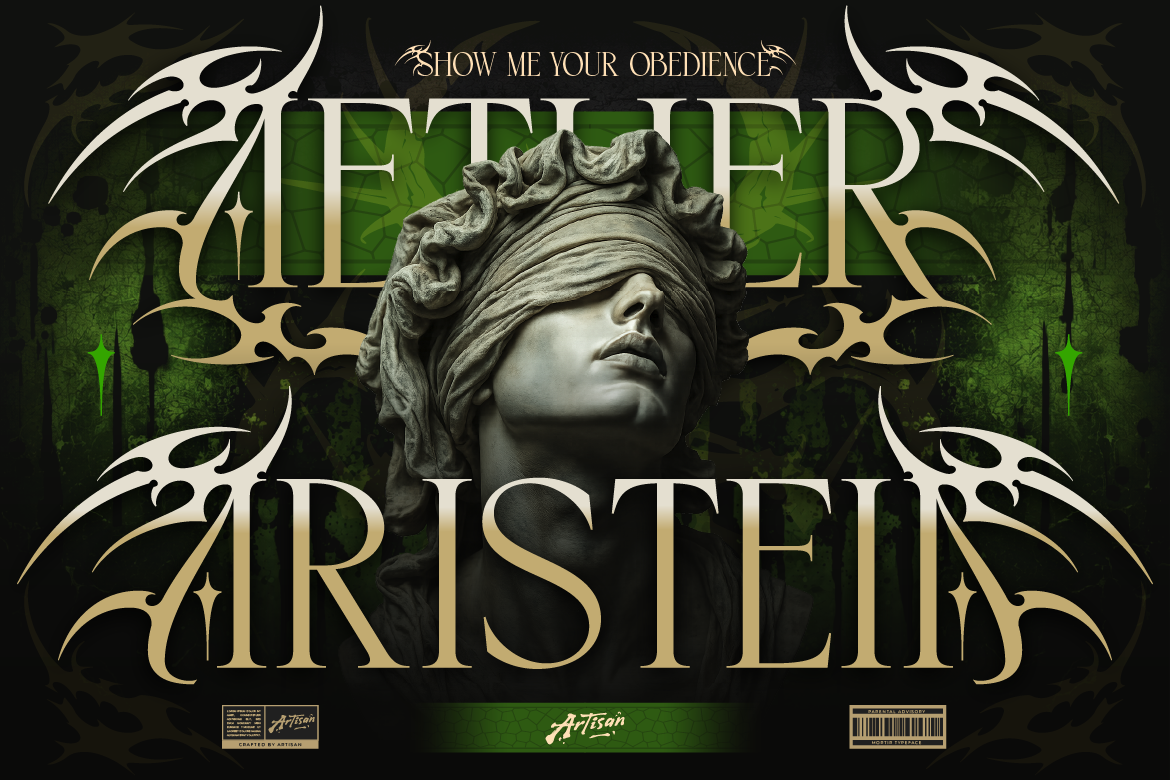
1. Go Big with Eye-Catching Display Headlines
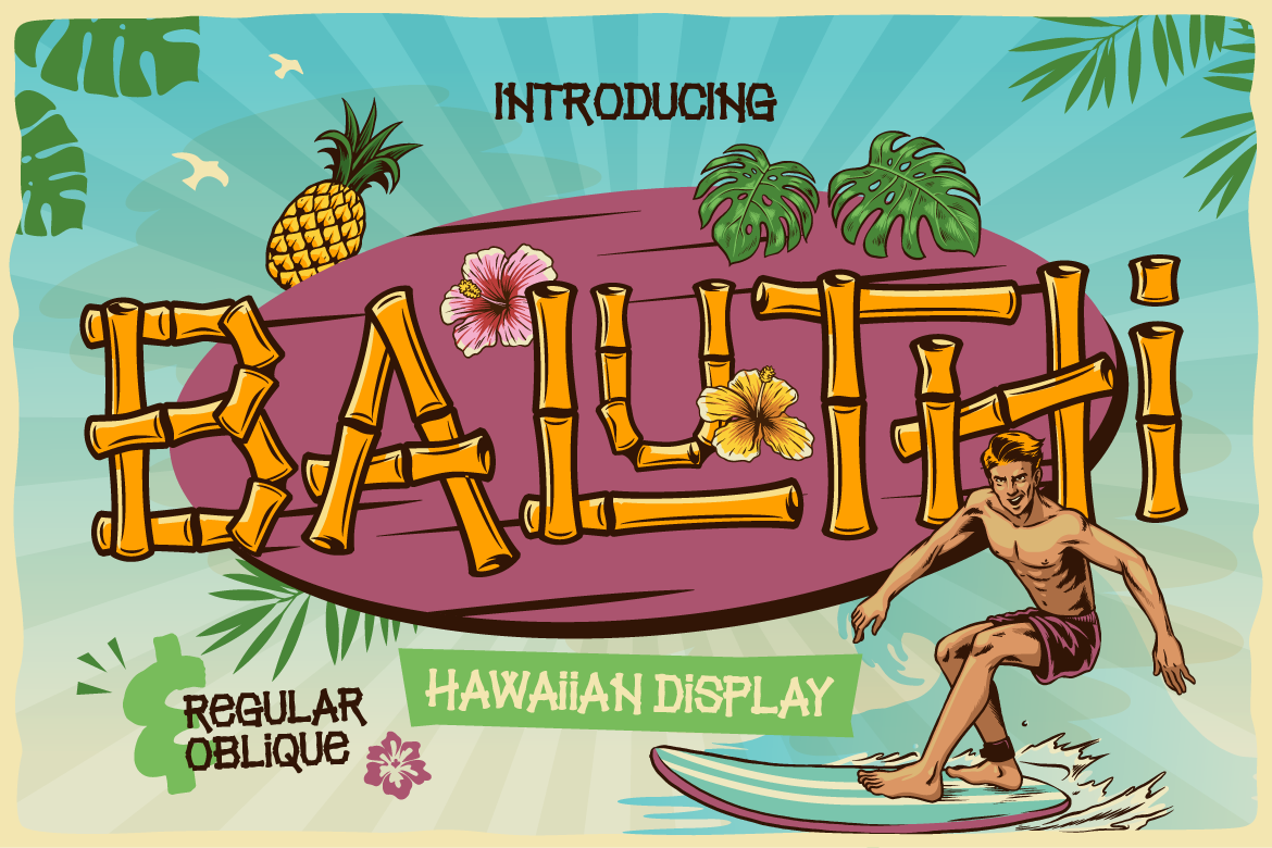
Dainty, subtle text gets completely overlooked in mobile feeds. Use a distinct Display Font with bold shapes or unique character details for your post’s primary hook or title.
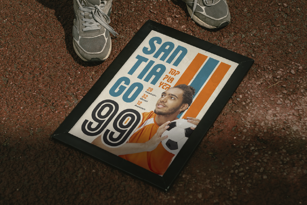
Make your main headline large enough that anyone can read it without pausing or zooming in on their phone.
2. Maximize Background Contrast
Poor contrast is the quickest way to ruin a good graphic. White text on a light gray background might look aesthetic, but it fails the split-second readability test on social media.
- Always put light-colored fonts on dark backgrounds or vice versa.
- Use semi-transparent background shapes under your text if your font sits over a busy photo.
3. Keep Text Layouts Short & Scannable
No one opens social media apps to read dense walls of text glued onto a single square image. Break your message into quick, bite-sized lines:
- Limit graphics to 1 headline and 1 brief sub-headline.
- Put detailed explanations in the written post caption instead of crowding the image.
4. Inject Personality with Accent Handwritten Fonts
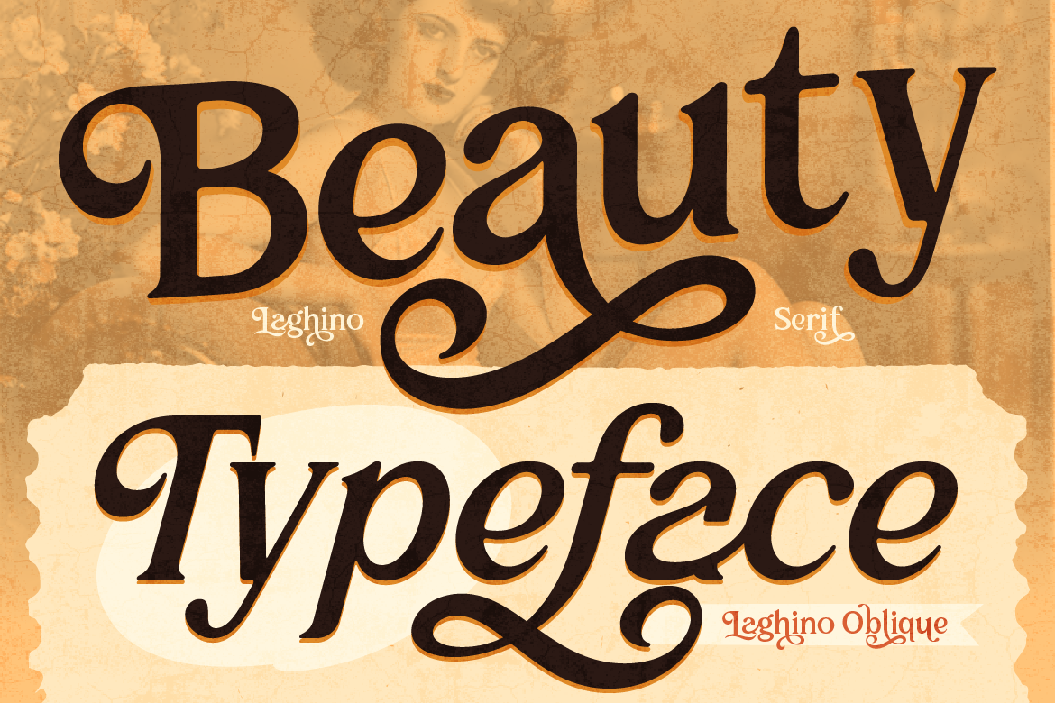
To give your brand graphics a human, approachable touch, use a stylized Handwritten or Signature Script Font for small emphasis words (like “Special Offer”, “New”, or short quotes). This breaks up rigid layouts and adds visual flair.
Want to level up your social media graphics? Explore our collection of high-impact Display and Signature Script Fonts built to capture attention!