Creating a strong logo often requires combining two different typefaces: one for the main brand name and another for the tagline or business category. Mastering font pairing for logos ensures that your visual identity looks cohesive, professional, and memorable.
If you are unsure how to combine typefaces without creating visual chaos, follow these three fundamental rules.
1. Create Clear Contrast Between Fonts
The golden rule of typography pairing is to avoid mixing fonts that look too similar. If you use two thin serif fonts together, they will clash and confuse the viewer’s eyes. Instead, aim for clear visual contrast by pairing opposing styles.
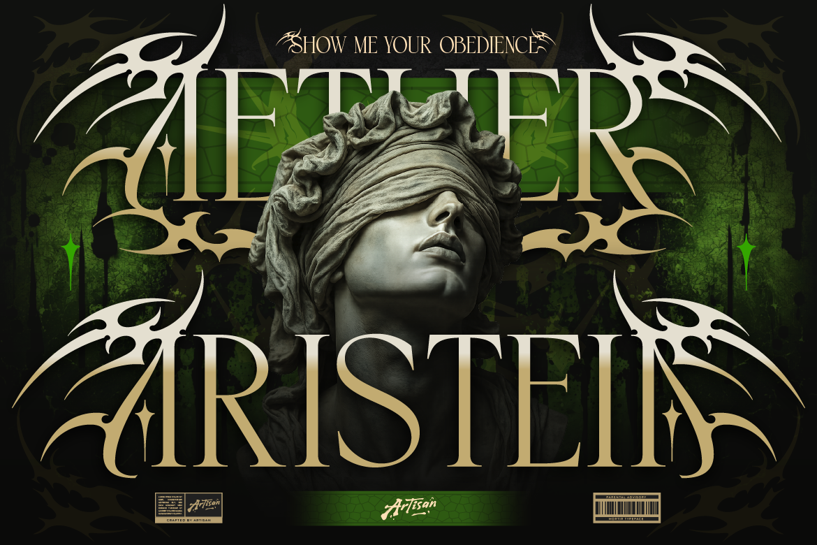
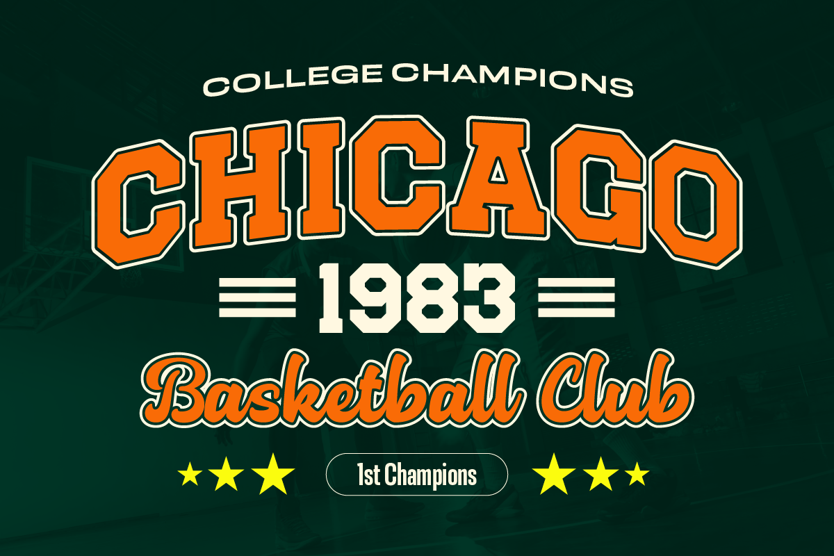
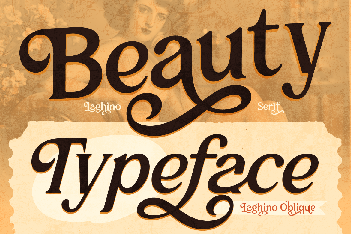
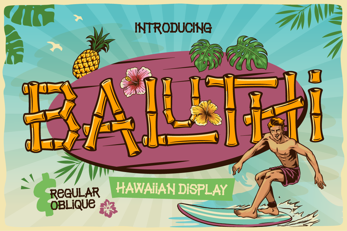
For example, pair a decorative Display or Serif font for your main logo text with a clean, neutral Sans Serif font for your secondary tagline.
2. Establish a Strict Visual Hierarchy
Your main brand name should always be the hero element. When planning your font pairing for logos, make sure your primary font carries more weight, size, or personality than your secondary font:
- Primary Font: Bold, distinctive, and filled with character.
- Secondary Font: Simple, highly readable, and set in a smaller point size.
3. Limit Your Brand Identity to Two Fonts
When browsing font libraries, it is tempting to pick three or four decorative styles. However, using too many fonts ruins brand consistency. Sticking to a maximum of two well-matched fonts creates a clean layout that customers can easily recognize across all platforms.
Looking for perfect typography combinations? Check out our curated Serif and Sans Serif font collections to find the ideal match for your new logo!