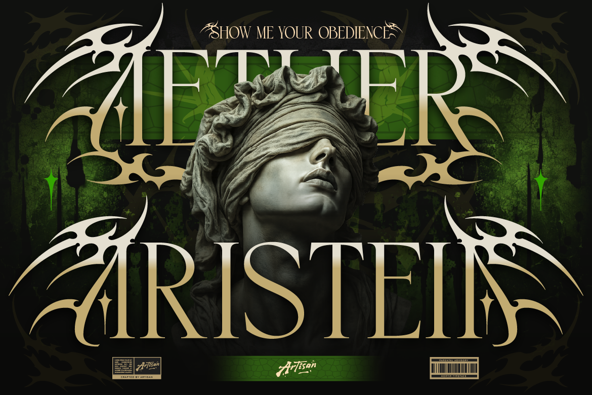
Why You Need an Ethnic Serif Font for Logos
Bring cultural texture to your packaging! Learn how using an ethnic serif font for logos like Arimels adds boho charm and authenticity to your brand.

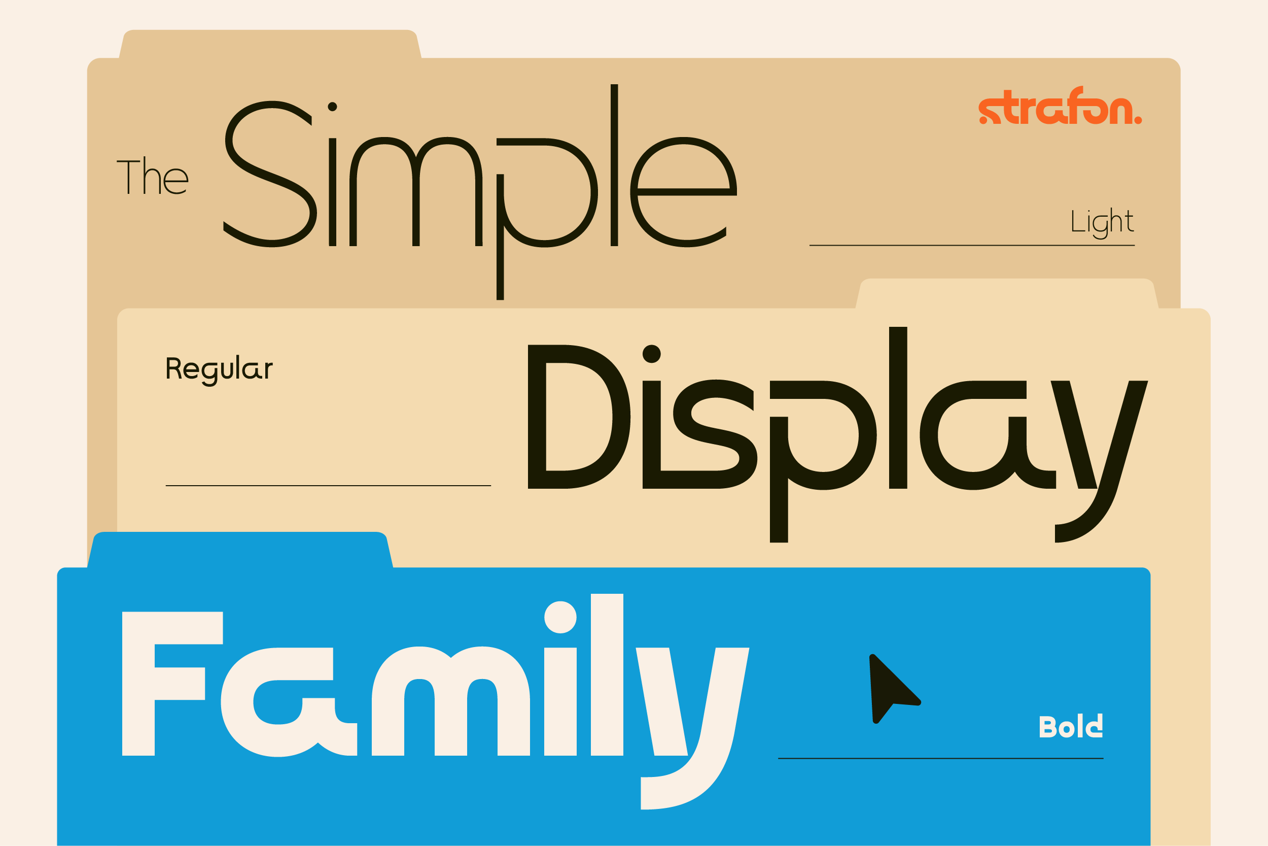
In digital design, readability is everything. While decorative display fonts are great for headlines, body copy and user interfaces require clean clarity. Choosing modern sans serif fonts ensures your brand message remains effortless to digest across all digital screens.
Here is how clean sans serif typography elevates modern corporate identities, SaaS platforms, and digital apps.
Sans serif fonts strip away decorative end strokes, leaving pure geometric lines. For example, modern sans typefaces feature crisp letterforms and balanced proportions. Therefore, your text remains sharp whether viewed on a mobile screen or a massive billboard.
Minimalist typography is essential for modern business communication:
Instead of introducing multiple different fonts, try using a single sans serif font family with multiple weights. Use Bold or Extra Bold weights for main section titles, and Regular or Light weights for body paragraphs. As a result, your design looks unified and clean.

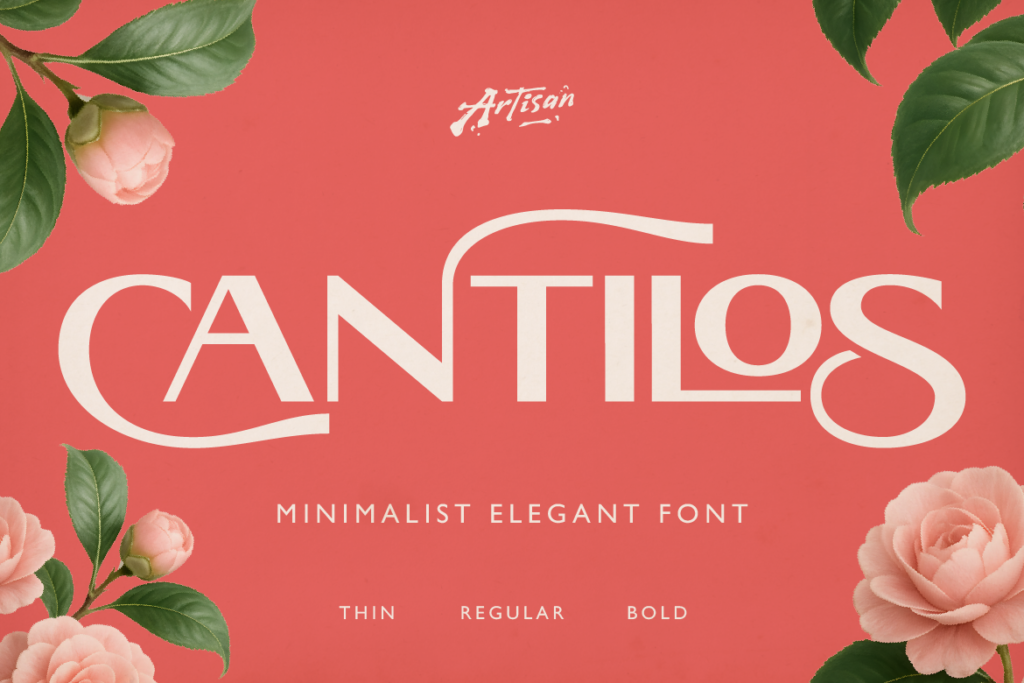
Upgrade your design toolbox today! [Explore Flanky at Artisan Font now] and build sleek, professional corporate layouts effortlessly!
Why You Need an Ethnic Serif Font for Logos
Bring cultural texture to your packaging! Learn how using an ethnic serif font for logos like Arimels adds boho charm and authenticity to your brand.
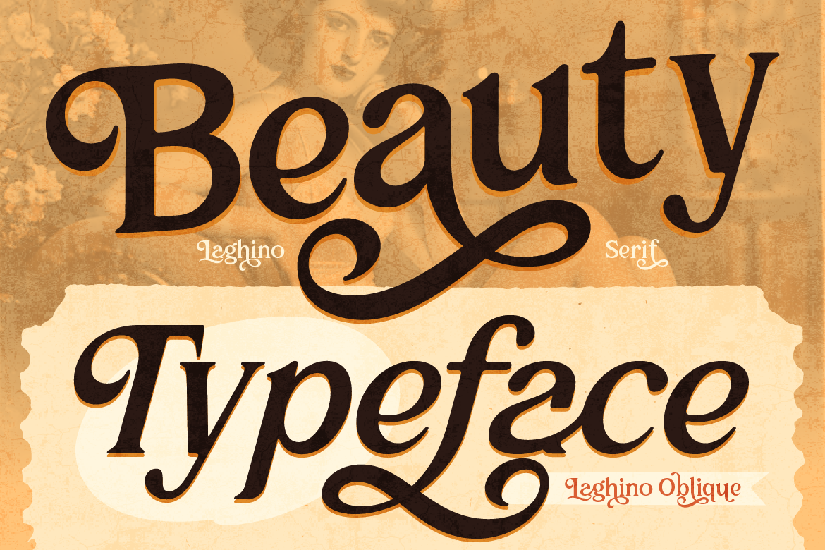
Why You Need a Luxury Serif Font for Branding
Make your brand look high-end! Learn how using a luxury serif font for branding like Laghino adds sophistication and charm to your packaging.
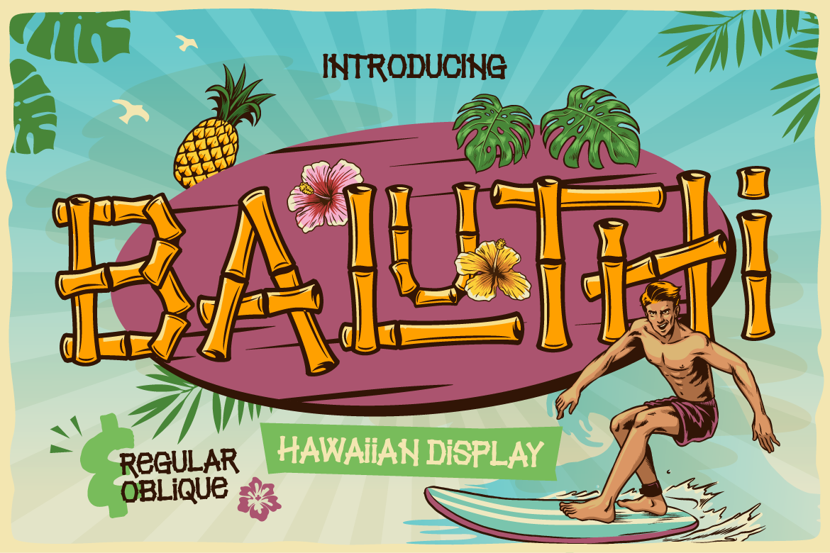
Why You Need a Bamboo Hawaiian Font for Summer Branding
Bring summer vibes to your packaging! Learn how using a bamboo hawaiian font like Baluthi adds tropical charm and fun energy to your branding.