Combining two different typefaces for a brand logo is one of the most challenging tasks in graphic design. If the selected font styles clash, your overall brand identity looks chaotic and amateurish. However, if the chosen fonts are too similar, your design lacks contrast and looks visually flat. Finding the best font duo for logos solves this problem instantly by providing complementary fonts engineered to work together.
Here is why working with pre-matched font duos speeds up your design workflow and elevates your client branding projects.
The Struggle of Manual Font Pairing
Designers often spend hours testing hundreds of font combinations, tweaking weights, and adjusting sizes to find two typefaces that harmonize. Without a deep understanding of font anatomy, pairing a decorative script with a serif or sans serif can lead to visual conflict.
When font styles fight for attention, the audience struggles to figure out where to look first. Consequently, the brand loses its professional appeal and authority.
1. Eliminates Guesswork in Typeface Contrast
Type designers engineer font duos specifically to complement each other in weight, x-height, and stroke thickness. For example, a font duo usually pairs an expressive headline style (such as a condensed script or vintage serif) with a clean, neutral supporting style (such as a wide sans serif). Therefore, you receive built-in contrast without testing dozens of random fonts.
2. Establishes a Clear Visual Hierarchy
A professional brand identity requires a primary title and a secondary tagline. Using a pre-matched font duo establishes a clear reading order:
- Primary Title: The decorative or bold font style draws immediate visual attention to the brand name.
- Secondary Tagline: The neutral, clean font style keeps location details, establishment dates, or business categories easily readable at smaller point sizes.
As a result, your audience reads your brand name first and supporting details second.
3. Saves Time on Tight Client Deadlines
In a fast-paced agency or freelance environment, efficiency is key. Using a high-quality font duo allows you to deliver polished, cohesive branding concepts to clients much faster, eliminating endless revision rounds caused by weak typography choices.
Recommended Solutions from Artisan Font
- Tenford: A classic font duo combining a stylish condensed script with a wide sans serif for instant logo balance.
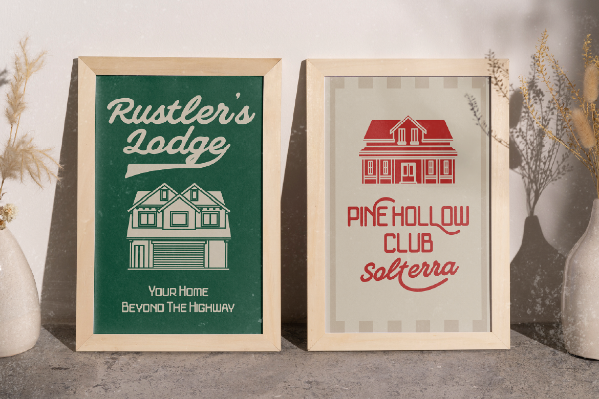
- Veltcon: A versatile vintage font duo pairing a wide sans serif with an expressive cursive script for cohesive retro branding.
Speed up your creative workflow and deliver stunning brand identities! [Explore Tenford and Veltcon at Artisan Font now] and create perfectly paired logo designs effortlessly!