Not every brand wants to feel bright, friendly, and approachable. Some brands need to feel dark, intense, mysterious, or powerful. And when that’s the vibe — whether you’re in music, fashion, gaming, tattoo culture, or any other industry that lives in the darker corners of the aesthetic spectrum — your typography needs to show up.
Dark and gothic fonts are some of the most misunderstood in typography. People either overuse them (slapping a blackletter font on everything and calling it “edgy”) or avoid them entirely because they seem too niche. The truth is that when used with intention, dark typography is incredibly powerful.
Here’s a guide to the different styles of dark typography, when they work, and some specific picks to consider.
Understanding the Different Dark Typography Styles
Blackletter / Gothic
Blackletter is one of the oldest typographic traditions — it originated in medieval Europe and was used for centuries in religious manuscripts and early printed books. Today, it’s been adopted by metal bands, tattoo culture, streetwear, and luxury fashion alike. It communicates tradition, intensity, and a certain timeless authority.
Reblade from Artisan Font is a strong example of a blackletter typeface done for the modern era. It has that classic gothic architecture in the letterforms while still being designed for contemporary use — bold enough to dominate a logo or poster headline, but precise enough to feel intentional rather than chaotic.
Dark Tribal & Occult
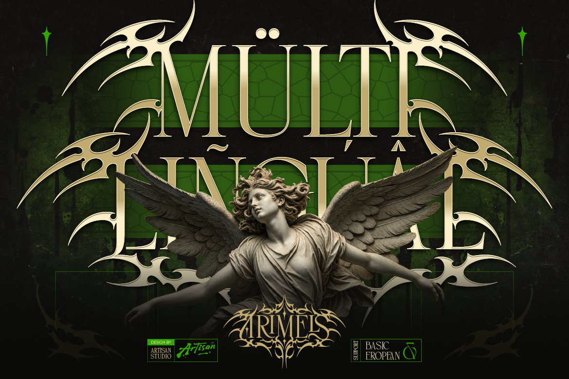
Beyond blackletter, there’s a category of dark typography that draws from tribal art, occult symbolism, and ancient scripts. These fonts feel primal, mysterious, and deeply textural. Anomale’s dark tribal design from Artisan Font lives in this space — it has an almost hand-carved quality that makes it feel like it belongs on a ritual artifact rather than a digital file. Perfect for music acts, horror brands, or any project that needs to feel genuinely unsettling and powerful.
Gothic Display & Grunge
Gothic display fonts take the intensity of blackletter and push it toward more expressive, often rougher territory. These are the fonts you see on band merch, horror movie posters, and heavy metal album covers. Grimersia embodies this style — it has that raw, feral energy that communicates power and darkness without any apology. It’s a font with attitude.
Blackletter With a Modern Edge
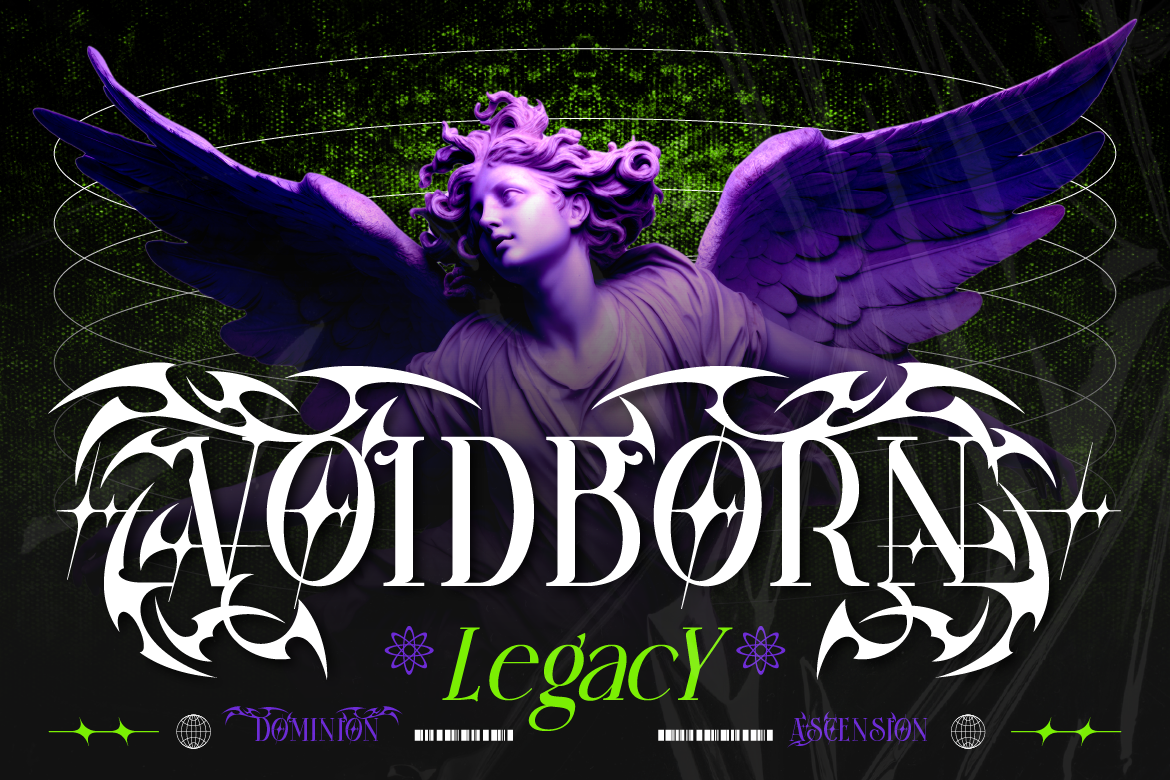
Then there’s the category of fonts that take blackletter’s DNA and remix it for contemporary brands — particularly in streetwear and fashion. Beltino’s slashed blackletter style is a great example: it has the gothic bones but with sharp, modern cuts that make it feel fresh and relevant in 2026. This is the style that’s been showing up on high-fashion brand logos and streetwear drops.
Where Dark Fonts Work Best
Music — Especially Metal, Rock, and Hip-Hop
This is the most obvious home for dark typography — and for good reason. Band logos, album artwork, concert posters, and merch have always been a canvas for bold, dark typographic expression. Gothic and blackletter fonts communicate the intensity and edge that audiences in these genres respond to.
Tattoo & Body Art Brands
Tattoo studios and artists have long had an affinity with gothic and dark typography — it fits the craft’s aesthetic heritage. Studio branding, flash art prints, and social content all benefit from fonts that feel bold, skilled, and a little dangerous.
Fashion & Streetwear
Gothic typography has been a staple in high fashion for decades — think of the brands that use blackletter in their logos. In streetwear, dark and gothic fonts signal authenticity and counter-culture credibility. When done well, they can make a brand feel simultaneously prestigious and rebellious.
Gaming & Entertainment
Horror games, dark fantasy titles, tabletop RPGs, and streaming channels in the horror/thriller space all benefit from typography that sets the right atmospheric tone. Dark fonts establish mood immediately and tell the audience exactly what kind of experience they’re in for.
How to Use Dark Fonts Without Going Overboard
- Headlines only. Dark display fonts are not for body text — they’re too complex to read in long form. Keep them for logos, titles, and key display moments
- Pair with something simple. A clean sans-serif for body text keeps the design readable and creates effective contrast with the dramatic headline font
- Give it space. Gothic and blackletter fonts need room to breathe — tight spacing makes them illegible
- Consider your background. Dark fonts on dark backgrounds can look incredible — but make sure there’s enough contrast to actually read the text
- Use intentionally. Dark typography is a strong statement — it works best when every design decision around it reinforces the same mood
Dark and gothic fonts aren’t for everyone — and that’s exactly their strength. For brands that operate in spaces where intensity, power, mystery, or rebellion are core to their identity, the right dark font is one of the most effective tools available.
Used with intention, they don’t just look cool — they communicate something real about who the brand is and what it stands for. Explore the dark and gothic font collection at Artisan Font and find the one that fits the darkness your brand needs.