Your packaging is often the first physical touchpoint a customer has with your brand. Before they taste your product, use your skincare, or open your box — they see your packaging. And typography is one of the most powerful elements in that first impression.
The right font on a label or box communicates quality, personality, and trust in a fraction of a second. The wrong one — and customers might put it back on the shelf without even reading what it says.
So let’s talk about how to choose fonts for packaging that actually do their job — and some specific picks worth trying.
Why Packaging Typography Is Different From Other Design Contexts
Packaging has unique constraints that other design contexts don’t. Your font needs to work at potentially very small sizes — ingredient lists, weight measurements, legal information. It needs to hold up when printed on different materials — paper, glass, plastic, foil. And it needs to read clearly under store lighting or in an unboxing video.
Beyond the technical constraints, packaging typography also has to work in 3D space. Unlike a flat screen or a poster, packaging wraps around a product. Your font needs to read well from multiple angles and at varying distances.
These are real considerations that should shape your font choices from the start.
What to Look for in a Packaging Font
- Readability at small sizes — your font needs to be legible even in an 8pt ingredient list
- Clear number support — weights, volumes, prices, and dates appear on almost every package
- Print-friendly design — some fonts that look great on screen break down when printed, especially at small sizes
- Strong brand personality — your headline font should communicate who you are immediately
- Commercial license — packaging is a commercial use; always ensure your font license covers it
Font Picks by Product Category
Food & Beverage Packaging
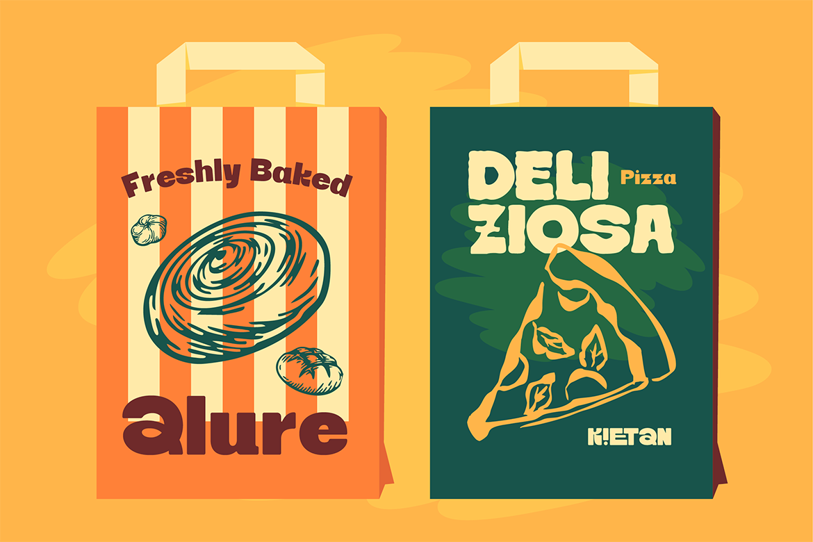
Food packaging needs fonts that communicate appetite appeal alongside brand personality. Kietan is a great choice here — it has a warm, inviting display quality that works beautifully for food brands that want to feel artisanal and approachable. It’s the kind of font that makes a jar of hot sauce or a bag of specialty coffee feel like it was made with genuine care.
Beauty & Skincare Packaging
Beauty packaging is where elegance and legibility need to coexist perfectly. Foramte brings a refined, decorative quality that feels premium and considered — exactly the kind of presence you want on a serum bottle or a luxury skincare box. It reads as crafted and intentional, which is a powerful signal in the beauty space where trust and quality perception are everything.
Fashion & Apparel Packaging
Fashion packaging — hang tags, boxes, tissue paper, bags — needs fonts that are bold enough to make an impression but refined enough to feel premium. Bestilo’s signature display style strikes this balance well. It has personality and visual weight without veering into territory that feels too casual or too loud for a fashion context.
Artisan & Handmade Products
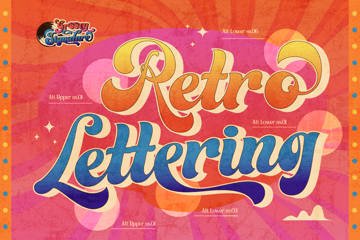
For handmade candles, small-batch preserves, artisan ceramics, or craft goods of any kind — the packaging font needs to communicate that human touch. Slyzhee’s retro typeface energy does this beautifully. It has that warmth and character that signals “this was made by a real person who cares,” which is exactly the story artisan brands need to tell.
The Two-Font System for Packaging
The most effective packaging typography usually uses two fonts: one display font for the brand name and headline elements, and one clean secondary font for all the supporting information — ingredients, instructions, weight, legal copy.
This two-font system creates clear visual hierarchy — the customer’s eye knows exactly where to look first (the brand name in your display font) and where to find the details (the clean secondary font). It also keeps the packaging from feeling cluttered.
The secondary font should almost always be a simple, neutral sans-serif or a clean serif. The more expressive your display font is, the simpler your secondary font should be.
Common Packaging Typography Mistakes to Avoid
- Using a decorative font for small print — ingredient lists and legal copy need to be readable; don’t use your display font for these
- Choosing a font that doesn’t print well — always get a physical print proof before finalizing your packaging font
- Ignoring contrast — your font color needs enough contrast against the background to read clearly, especially if the background is a photo or texture
- Using too many fonts — two fonts maximum on a package; more than that and it starts to feel chaotic
- Forgetting about licensing — packaging is always commercial use; make sure your font license explicitly covers this
Packaging typography is one of those design decisions that has real commercial consequences. The right font helps your product stand out on a shelf, communicates your brand’s quality and personality, and builds the kind of trust that turns first-time buyers into loyal customers. Take the time to choose well — and if you’re looking for fonts that are built for real-world commercial use and come with proper licensing, the Artisan Font collection is a great place to start.