Walk down any grocery store aisle or scroll through an online shop, and you’ll notice something: the products that catch your eye first usually have one thing in common — great typography. Packaging design is one of the most competitive visual spaces a designer works in, and font choice is one of the most powerful tools you have.
So what makes a font work on packaging? And which styles tend to perform best? Let’s dig in.
Why Typography Is So Critical in Packaging
On a shelf — physical or digital — you have about two seconds to make an impression. Unlike a website (where someone is already engaged) or a social post (where they chose to follow you), packaging has to stop a stranger mid-scroll or mid-step. Typography is the fastest way to communicate brand personality, product category, and emotional tone — all before the consumer reads a single word of copy.
The wrong font can make a premium product look cheap, a natural product look synthetic, or a fun snack brand look corporate and uninviting. The right font makes someone pick it up without even knowing why.
Key Principles of Great Packaging Typography
Before we look at specific styles, here are the core principles that apply to almost any packaging project:
Legibility at small sizes. Packaging often includes a lot of text in limited space — ingredient lists, net weight, barcodes, taglines. Whatever font you choose for body copy needs to stay crisp and readable even when small.
Contrast and hierarchy. There’s usually a product name (large, expressive), a descriptor line (medium, clear), and fine print (small, functional). Your typography system needs to handle all three distinctly.
Shelf visibility. A font that looks great on screen might not read well from three feet away on a retail shelf. Always test at realistic distances and scales.
Brand alignment. The font should instantly communicate what category this product belongs to and who it’s for — premium vs. affordable, natural vs. clinical, playful vs. serious.
Font Styles That Work Well in Packaging
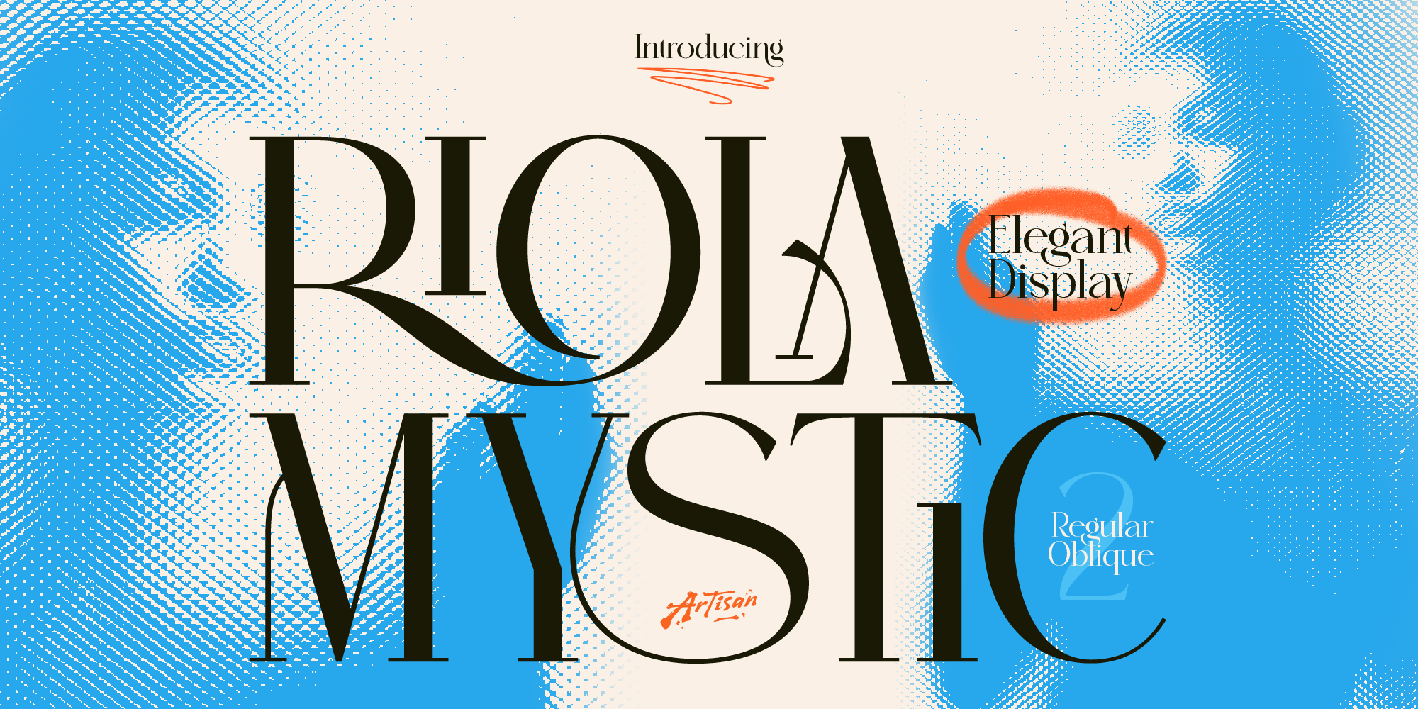
Bold display serifs — Great for premium, artisan, or heritage products. A bold serif on a packaging label immediately signals quality and craftsmanship. Think specialty coffee, craft spirits, fine chocolate, or high-end skincare.
Brush scripts — Ideal for food brands, lifestyle products, and anything positioned as handcrafted or natural. A well-chosen brush script can make mass-produced packaging feel like it came from someone’s kitchen — in the best possible way.
Geometric sans-serifs — A staple for modern, clean, or functional products. Supplement brands, tech accessories, minimalist cosmetics, and eco-friendly products often rely on geometric sans-serifs to feel clean, trustworthy, and contemporary.
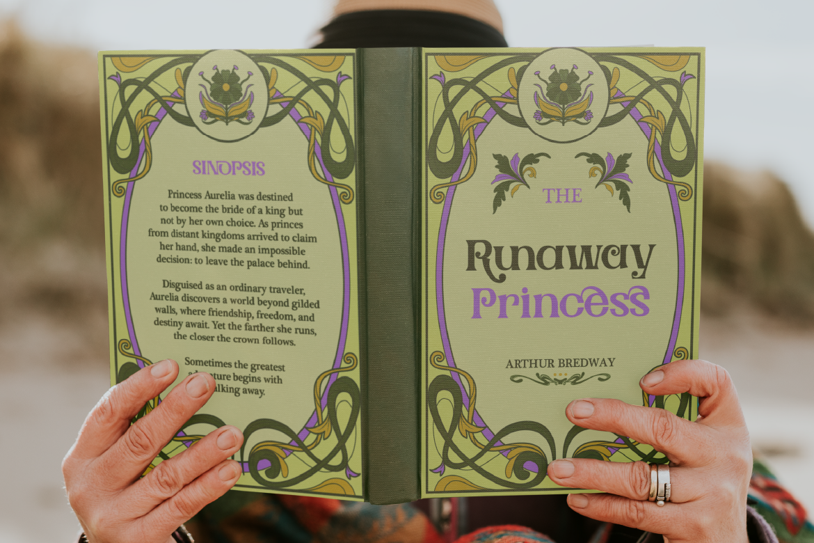
Vintage and retro display fonts — Perfect for brands leaning into nostalgia, craft culture, or regional identity. Think hot sauces, craft beer labels, artisan snacks, and specialty goods that want to feel “established” even if they’re new.
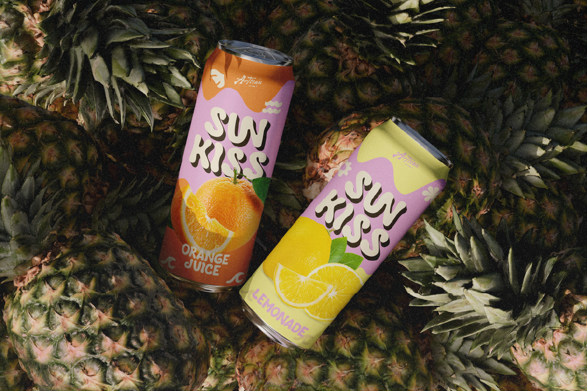
Playful rounded fonts — Excellent for children’s products, snack foods, and anything that needs to feel fun, approachable, and energetic. Rounded letterforms feel friendly and safe — exactly the right signal for these categories.
Common Packaging Typography Mistakes
❌ Using a script font for the ingredient list. Script fonts are for headlines — never for small, informational text on packaging where legibility is critical.
❌ Choosing a font because it “looks cool” without checking legibility at scale. Always test your font printed at actual size before finalizing.
❌ Using too many fonts. Two fonts maximum — three if you have a very good reason. More than that, and packaging starts looking chaotic.
❌ Ignoring contrast. Light text on a light background (or dark text on dark) disappears on shelves. Always ensure strong contrast between your text and packaging surface.
❌ Forgetting about font licensing. Commercial packaging is almost always a paid, commercial use — make sure your fonts are licensed appropriately for this.
Great packaging typography is part strategy, part intuition. You’re choosing fonts that communicate value, trigger emotion, and survive real-world conditions — all at the same time. The best approach is to define your brand personality first, then find fonts that speak that language naturally.
If you’re looking for fonts that bring personality and versatility to packaging design, explore the ArtisanFont collection — from bold vintage displays to elegant serifs and playful brush scripts, there’s a style for every product story.