
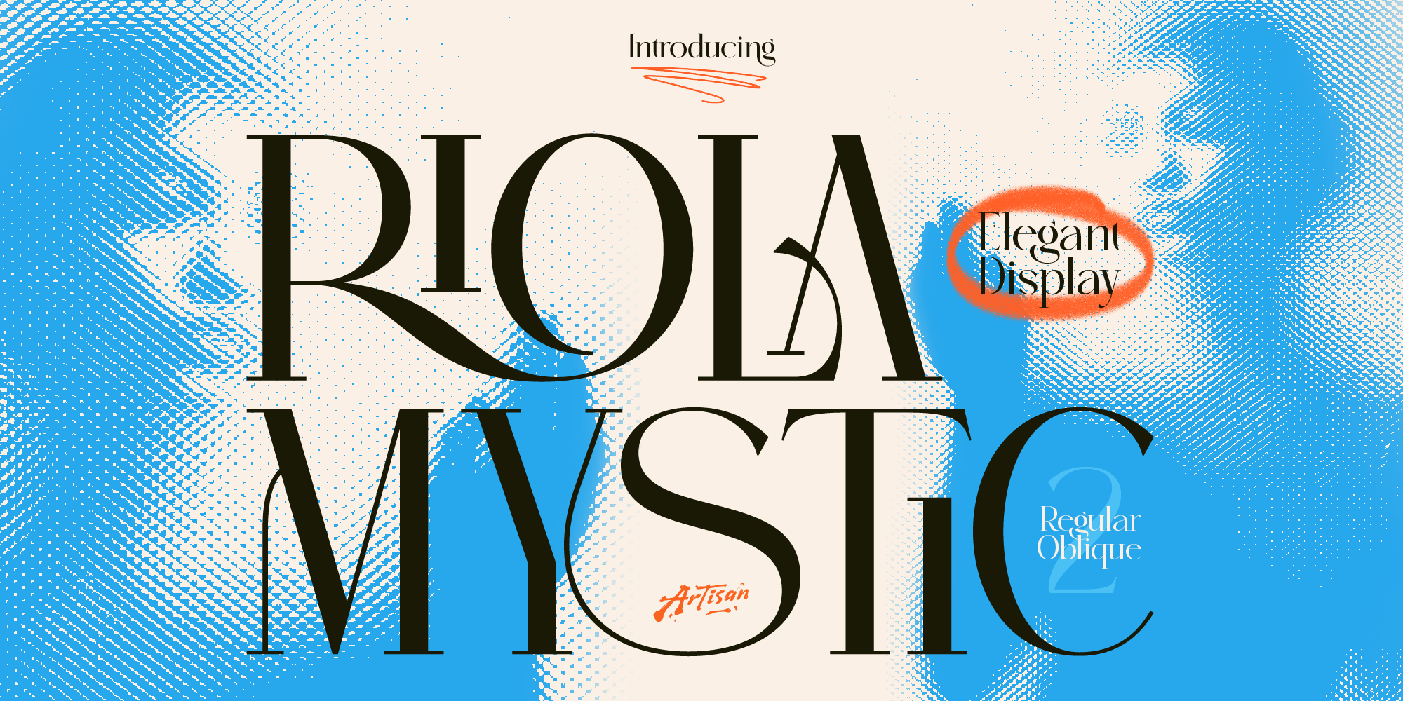
Why You Need a Mystic Elegant Display Font for Your Brand
Elevate your brand identity with a mystic elegant display font. Discover how Riola brings celestial luxury to skincare, tarot, and boutique logos.
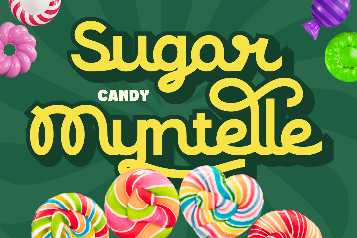
Okay, real talk. We’ve all been there — you spend time making a beautiful graphic, you post it, and… crickets. Meanwhile someone else’s post with a bold font slapped on a plain background is getting thousands of saves. Frustrating, right?
Here’s the thing: fonts play a huge role in whether your content stops the scroll or gets skipped. The typography you choose communicates your brand’s personality before anyone reads a single word. It sets the mood. It signals whether you’re worth paying attention to.
So in this guide, we’re breaking down what makes a font actually work for social media in 2026 — and pointing you toward some solid picks depending on your content style. Let’s get into it.
Not every font that looks gorgeous in print will work on social media. The environment is completely different. People are scrolling fast, usually on mobile, often with the sound off. Your font has maybe two seconds to do its job.
Here’s what separates a great social media font from one that just looks pretty in a preview:
Typography trends on social media move fast. What was everywhere last year can feel dated quickly. Here’s what’s actually resonating with audiences right now:
Big, confident typography is still dominating feeds in 2026. Think large headlines that fill the frame. This works especially well for motivational content, announcements, and product launches — basically anything that needs to demand attention immediately.
The nostalgia wave is not going anywhere. Retro-style fonts with rounded edges, funky letterforms, and that vintage print energy are still performing incredibly well — especially for lifestyle brands, food content, and anything targeting a younger, trend-forward audience.
On the flip side, clean and minimal fonts are thriving in niches like wellness, beauty, and luxury lifestyle. The “less is more” approach — where the font is simple but the spacing, layout, and color do the heavy lifting — feels elevated and editorial.
Script fonts are having a moment, particularly for quote content, personal branding, and creative niches. The key in 2026 is choosing scripts that still read clearly — overly decorative ones that are hard to decipher tend to get scrolled past, no matter how beautiful they look.
Different types of content call for different typographic energy. Here are some picks from Artisan Font’s collection, matched to the kind of content you’re creating:
Cantilos is a great fit here. It has that elegant, refined quality that feels right at home in lifestyle content — think OOTD posts, aesthetic flat lays, travel photos with overlaid text. It’s polished without being stiff, which makes it feel relatable and aspirational at the same time. Perfect for brands that want to feel premium but still approachable.
When you need to make noise, Rushmax delivers. It’s a display font with real presence — the kind of typography that makes your launch post or sale announcement impossible to ignore. Use it big, use it bold, and let it do the talking. Great for brands in streetwear, music, or anything that thrives on hype.
Veltcon is your workhorse font for social media. It’s clean, modern, and reads easily at any size — which means it works for your feed posts, your Stories, your carousel subtitles, and your Reels text all at once. If you want visual consistency across your content without using multiple fonts, this is the one to reach for.
Funkora brings that retro-meets-modern energy that’s performing really well on Instagram and TikTok right now. If your content has a fun, playful, or nostalgic vibe — think food content, pop culture commentary, or anything that leans into Y2K or 90s aesthetics — Funkora fits right in. It’s got personality without being overwhelming.
Even the best font can fall flat if it’s not used well. Here are a few things to keep in mind:
This is a quick but important one. A lot of content creators use free fonts they find online — which is totally fine for personal projects. But if you’re a content creator working with brands, running a business account, or monetizing your content in any way, those “free” fonts might not cover commercial use.
When you grab a font from Artisan Font, it comes with a proper commercial license. You’re covered for business use — whether that’s sponsored content, client work, digital products, or your own brand. One less thing to worry about.
For anyone who creates content professionally or semi-professionally, this is genuinely worth thinking about.
Typography is one of those things that quietly makes a huge difference in your content — even when people can’t explain exactly why one post feels more polished than another. A well-chosen font does a lot of work in the background: it builds brand recognition, sets the mood, and makes your content easier and more enjoyable to consume.
In 2026, the creators winning on social media aren’t necessarily the ones with the fanciest cameras or biggest budgets. A lot of them just have really intentional, consistent visuals — and fonts are a big part of that.
If you’re ready to level up your content typography, check out the full collection at Artisan Font. There’s something for every content style — from clean and minimal to bold and retro.
Check more Artisan Font collections! -> Artisan Fonts
Why You Need a Mystic Elegant Display Font for Your Brand
Elevate your brand identity with a mystic elegant display font. Discover how Riola brings celestial luxury to skincare, tarot, and boutique logos.
3 Spooky Halloween & Dark Fantasy Fonts
October is close enough that anyone doing seasonal design work should already be building their font shortlist — party flyers, product drops, packaging, social campaigns.
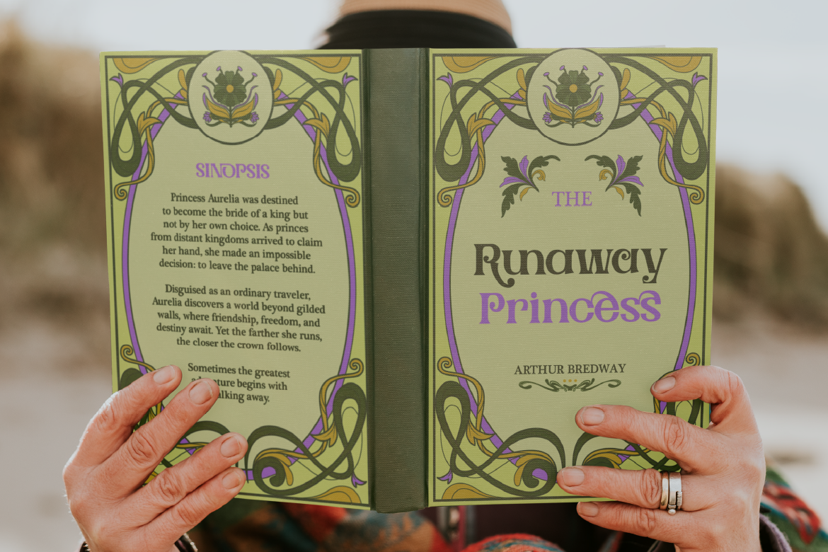
3 Retro & Vintage Fonts for Nostalgic Branding
70s psychedelic swagger, old-world Art Nouveau elegance, and a smooth vintage script-sans duo — three fonts built for brands with a nostalgic streak.