Many clothing brand owners have faced this frustrating experience: you design a graphic tee that looks incredible on your flat computer screen, but when the physical shirt arrives, the text looks warped, awkward, or hard to read when actually worn on a body.
Understanding how to choose the best fonts for t shirt printing requires looking beyond digital artboards. Fabric stretches, folds, and moves, which drastically changes how typography looks in the real world. Here is how to select and prepare fonts that stay crisp on physical apparel.
The Real Problem: Flat Computer Screens vs Moving Fabric
Graphics software presents your design on a completely flat, rigid canvas. However, human bodies are curved, and cotton fabrics stretch across chests, shoulders, and backs. Thin decorative fonts, tight letter spacing, and complex cursive scripts often collapse or warp when fabric folds during movement.
Additionally, heavy screen-printing inks bleed slightly into cotton fibers during high-heat curing. If your font features tiny gaps or super-thin inner loops, the ink fills those spaces, resulting in a muddy, unprofessional print.
The Simple Solution: Heavy-Weight Geometry and Smart Kerning
To ensure your apparel graphics look sharp from every angle, implement these three printing fixes:
- Select Heavy-Weight Vector Fonts: Choose typefaces featuring thick stems and solid structural shapes. Styles like athletic sport fonts or blocky slab serifs retain their shape regardless of fabric movement.
- Expand Letter Spacing (Tracking): Increase your letter spacing by 5% to 10% for screen printing projects. Giving characters extra space prevents wet textile ink from bleeding together.
- Position Text Above Natural Fabric Folds: Avoid placing fine text details directly across mid-torso areas where t-shirts naturally crease when sitting. Place major text graphics across the upper chest or upper back for maximum flat visibility.
Recommended Apparel Fonts from Artisan Font
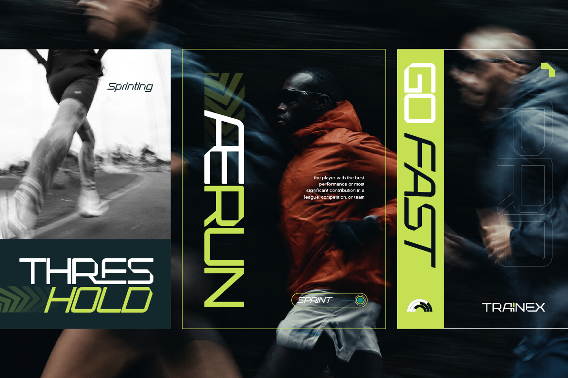
- Trainex: A modern sport font engineered with sharp blocky outlines that print crisp on hoodies and athletic tees.
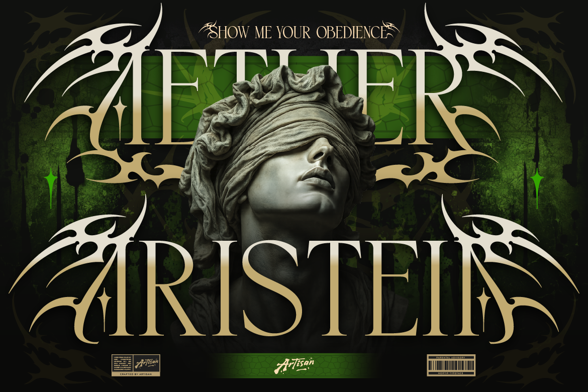
- Reblade: A sharp blackletter font designed with thick gothic strokes that pop off dark streetwear cotton.
Stop wasting money on bad apparel prints! [Explore high-impact t-shirt fonts at Artisan Font today] and make your clothing line look professional!