Sports branding has a visual language all its own — speed, power, precision, and competitive energy, all communicated in a fraction of a second. And typography is doing a massive amount of that work. The right sports font doesn’t just spell out a team name or a product line; it makes you feel the intensity before you even process the words.
Whether you’re building a fitness brand, a sports team identity, an athletic apparel line, or content for a racing or motorsport audience, here’s what you need to know about choosing the right typography.
Let’s break down the styles and the top picks.
What Makes a Font Feel “Athletic”?
Sports fonts typically share several characteristics: bold, heavy weights that convey strength and power; italicized or slanted forms that suggest forward motion and speed; sharp, angular cuts that feel dynamic and aggressive; and condensed letterforms that allow for big, impactful headlines in tight spaces like jersey numbers or scoreboards.
These design choices aren’t accidental — they’re rooted in decades of sports broadcasting graphics, team uniforms, and stadium signage that have trained audiences to associate certain visual cues with competition and athleticism.
Top Sports & Athletic Font Picks
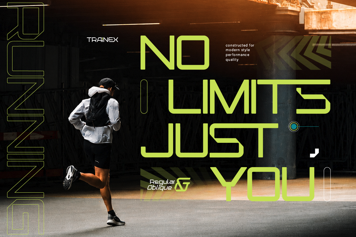
Trainex is built for modern athletic branding — clean, bold, and dynamic. It has that contemporary sports aesthetic that works across fitness apps, gym branding, and athletic apparel. Its slanted, forward-leaning structure naturally communicates motion and energy, making it a strong choice for any brand that wants to feel current and performance-driven.
Fasthon channels racing and motorsport energy with its sharp, performance-driven design. The font’s name says it all — it’s built for speed. This is an excellent choice for automotive brands, racing teams, motorsport content, and any brand that wants to communicate precision engineering and high performance.
Sencito brings a clean, line-based sport display style that works well for modern athletic brands wanting a slightly more refined take on the sports aesthetic. It’s versatile enough to work for both team branding and individual athlete personal brands, with enough boldness to stand out on jerseys, banners, and digital content.
Glorea’s inline sport styling gives it a distinctive double-line structure that adds visual interest while maintaining strong athletic energy. It works particularly well for running brands, marathon events, and fitness content where you want something that feels active and dynamic without being overly aggressive.
Ganter brings a futuristic edge to athletic typography, perfect for brands at the intersection of sports and technology — think performance wearables, e-sports, or cutting-edge fitness tech. It has that sci-fi precision combined with the boldness sports branding requires.
Where Sports Fonts Work Best
- Team & league branding — logos, jerseys, scoreboards, merchandise
- Fitness & gym brands — apps, apparel, social content, gym signage
- Motorsport & racing — event branding, team livery, promotional content
- Sports events — tournaments, marathons, championship promotional materials
Tips for Using Sports Fonts Effectively
- Use bold, high-contrast colors. Team colors, energetic palettes, and strong contrast amplify the athletic energy
- Add motion cues. Slight italicization or angled layouts reinforce the feeling of speed and movement
- Keep it legible at a distance. Sports typography often needs to be readable from far away — stadiums, billboards, jerseys — so test for distance legibility
Sports and athletic typography is all about communicating energy, power, and performance instantly. The right font becomes part of the emotional experience of competition itself. Browse the full sports font collection at Artisan Font and find the typography that matches your team or brand’s competitive spirit.