There’s something timeless about the western aesthetic. The rugged boldness, the sun-baked textures, the sense of wide open space and frontier spirit — it’s a visual language that’s been around for over a century and still resonates deeply today. And at the heart of western design? Typography.
Whether you’re designing for a BBQ joint, a country music brand, a fashion label with a cowboy edge, or just a creative project that needs that wild west energy — the right font makes all the difference. A great western font doesn’t just spell out words; it tells a story.
Here’s a guide to what makes western fonts work — and some picks that’ll bring the right kind of frontier spirit to your project.
What Defines a Western Font?
Western fonts draw their DNA from the signage, wanted posters, and printed materials of 19th-century America. They tend to share a few key visual characteristics that make them immediately recognizable:
- Slab serifs — thick, bold serifs that give letters a sturdy, grounded quality
- High contrast strokes — dramatic shifts between thick and thin parts of a letterform
- Decorative details — inline effects, shadows, textures, or ornamental flourishes
- Condensed letterforms — tall, narrow letters that make text feel powerful and space-efficient
- Vintage character — an overall feeling of age, history, and handcrafted quality
The Western Fonts Worth Using
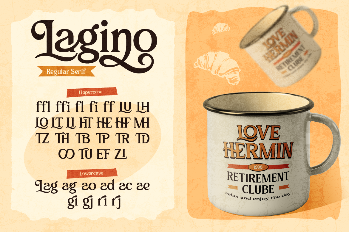
Marona is the go-to choice when you want something that feels authentically western without being a costume. It carries the classic characteristics of frontier-era typography — strong letterforms, that unmistakable western swagger — while still being versatile enough for modern brand applications. Perfect for logos, poster headlines, and brand names that need to communicate rugged authenticity.
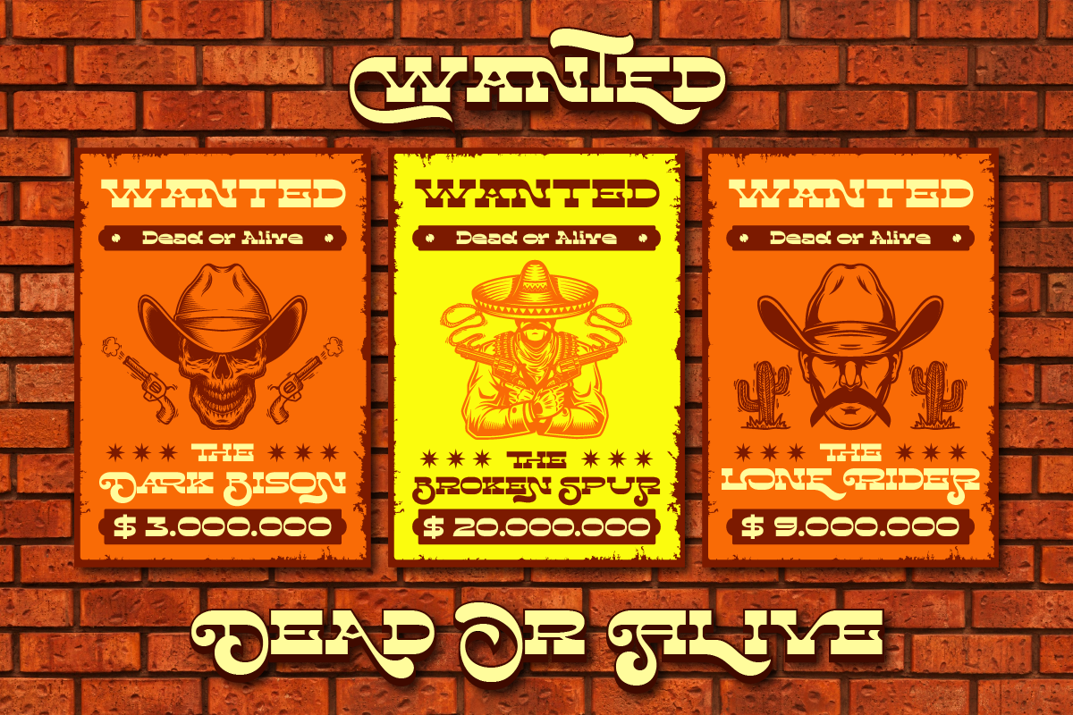
Truewild brings a rawer, more untamed quality to the western aesthetic. If Marona is the sheriff’s badge, Truewild is the wanted poster — bold, slightly rough around the edges, and full of character. It works brilliantly for brands and projects that want the western vibe but with a more contemporary, edgy twist. Great for streetwear brands with a western influence, country music projects, or outdoor adventure brands.
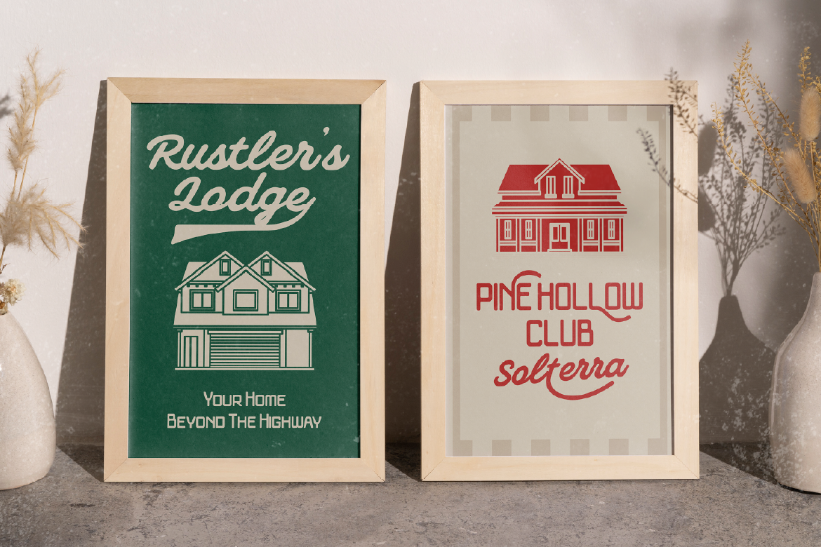
Rockcave adds textural richness to the western font conversation. It has that rough, almost hand-carved quality that evokes wood type printing and frontier signage. The texture in the letterforms makes it feel genuinely crafted rather than digitally perfect — which is exactly the kind of authenticity that works well for artisan food brands, craft beverages, and heritage-style products.
Ricopalm is an interesting one — it takes western typography sensibilities and adds a warm, tropical twist. The result is a font that works beautifully for brands that live at the intersection of cowboy culture and summer vibes. Think beach-town BBQ joints, country-inspired resort brands, or tropical lifestyle labels that want a playful, sun-soaked take on the western aesthetic.
Where Western Fonts Work Best
Food & Beverage Branding
BBQ restaurants, craft breweries, hot sauce brands, steakhouses — the western aesthetic communicates boldness, quality, and a certain unpretentious confidence that resonates strongly in the food space. A great western font on a label or menu immediately sets the tone.
Music & Entertainment
Country music, Americana, folk, and alt-country artists have always leaned into western typography for album art, merchandise, and promotional materials. It’s a visual shorthand that speaks directly to the audience.
Fashion & Apparel
The western fashion revival is very real in 2026 — cowboy boots, fringe, denim, and Western-inspired streetwear are all trending. Brands in this space can use western fonts to reinforce their aesthetic across hang tags, lookbooks, and social content.
Events & Posters
Rodeos, country fairs, themed parties, film festivals with a western theme — event posters are where western fonts truly shine. Big, bold, textured typography at large scale is exactly what these fonts were designed for.
Tips for Using Western Fonts Well
- Keep body text simple. Western display fonts are for headlines only — use a clean, readable font for any body text
- Lean into earthy color palettes. Browns, burnt oranges, deep reds, dusty greens, and off-whites all complement western typography beautifully
- Texture is your friend. Aged paper backgrounds, grunge overlays, and rough textures amplify the western feel
- Don’t over-decorate. Western fonts already have a lot going on — resist the urge to pile on too many other decorative elements
- Use ALL CAPS sparingly. Many western fonts look great in caps for short words, but test both upper and mixed case to see what works best for your specific font
Western fonts are one of those typographic traditions that never really goes out of style — they just evolve. In 2026, the western aesthetic is showing up in fashion, food, music, and lifestyle branding in fresh, contemporary ways.
Whether you want something classically frontier or a more modern take on the cowboy aesthetic, the right font makes it all come together. Explore the western font picks at Artisan Font and find the one that tells your brand’s story the right way.