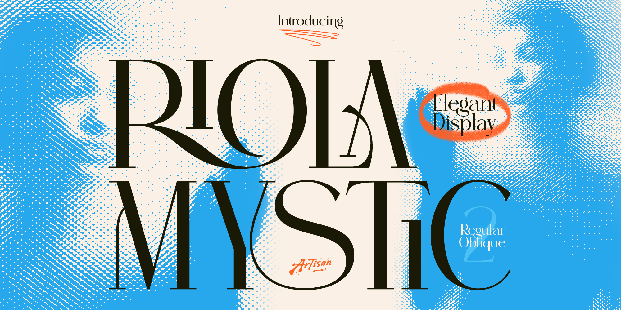
Why You Need a Mystic Elegant Display Font for Your Brand
Elevate your brand identity with a mystic elegant display font. Discover how Riola brings celestial luxury to skincare, tarot, and boutique logos.

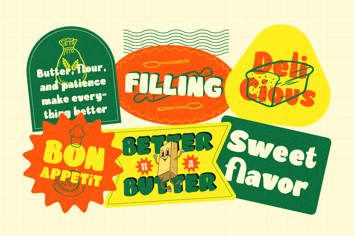
Not every brand needs to be serious. In fact, some of the most memorable brands out there have built their entire identity around being fun, approachable, and just a little bit weird in the best possible way. If your brand has a sense of humor, a playful spirit, or just wants to stand out from a sea of overly polished competitors, quirky typography is your secret weapon.
Let’s talk about what makes a font feel genuinely playful (rather than just unprofessional), and which fonts can bring that energy to your brand.
This is the key question, because plenty of brand owners avoid playful fonts out of fear they’ll look amateurish. But there’s a real difference between a quirky font that’s well-designed and intentional, versus one that just looks sloppy.
Well-executed quirky fonts still have consistent letterforms, balanced spacing, and quality craft — the personality comes from the shapes and concept, not from technical sloppiness. They’re used intentionally, often as accent or headline fonts rather than for everything, and they’re paired thoughtfully with cleaner supporting elements that ground the design.
Get this balance right, and quirky typography becomes a powerful brand asset rather than a liability.
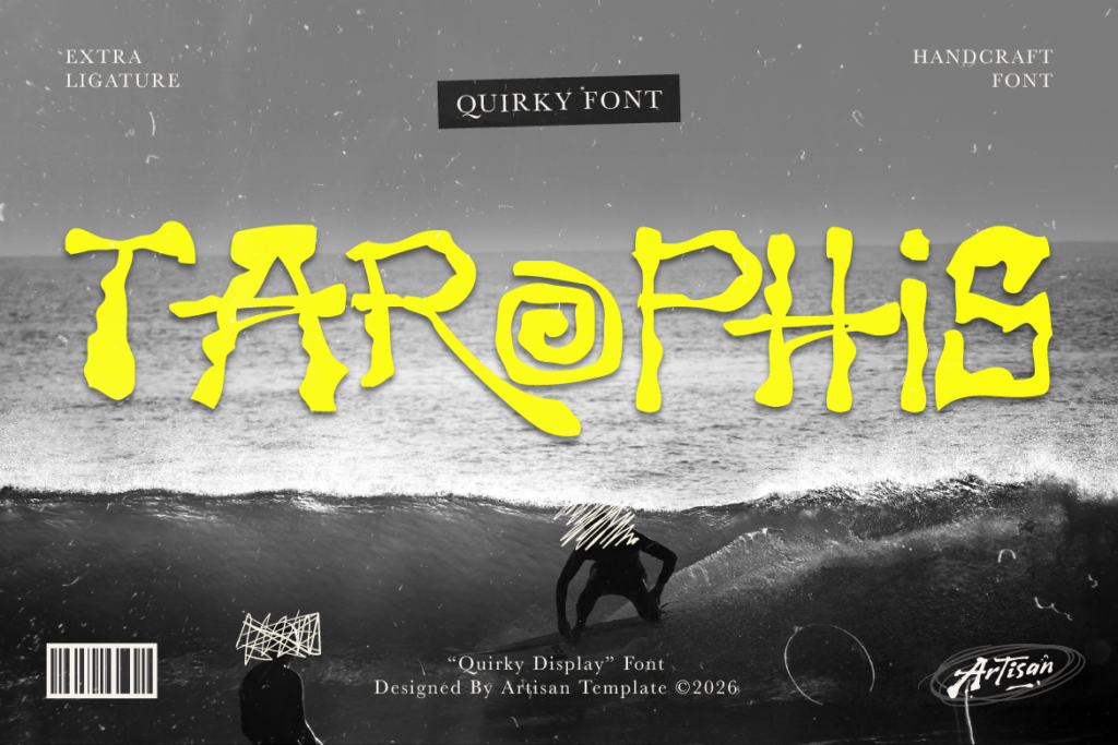
Tarophis brings a distinctively quirky display style that has personality without being childish. Its irregular, playful letterforms make it a great choice for brands that want to feel fun and creative while still appealing to an adult audience. Think board game companies, creative agencies, or brands in entertainment and pop culture.
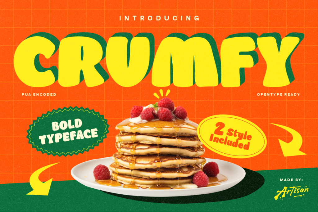
Crumfy is pure cheerfulness in font form — bold, rounded, and impossible not to smile at. It’s a perfect pick for food brands (especially anything sweet or dessert-related), children’s products, or any brand that wants to communicate joy and approachability immediately. The two-style flexibility gives you options for different levels of boldness depending on your application.
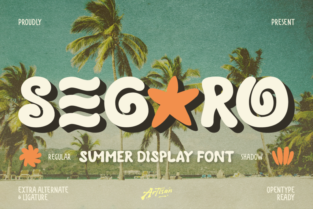
Segaro brings a fun, summery display energy that works well beyond just seasonal content — it has that lighthearted, vacation-mode personality that suits brands wanting to feel relaxed and joyful year-round. Great for lifestyle brands, event promotion, and any content that wants to feel like a good time.
Why You Need a Mystic Elegant Display Font for Your Brand
Elevate your brand identity with a mystic elegant display font. Discover how Riola brings celestial luxury to skincare, tarot, and boutique logos.
3 Spooky Halloween & Dark Fantasy Fonts
October is close enough that anyone doing seasonal design work should already be building their font shortlist — party flyers, product drops, packaging, social campaigns.
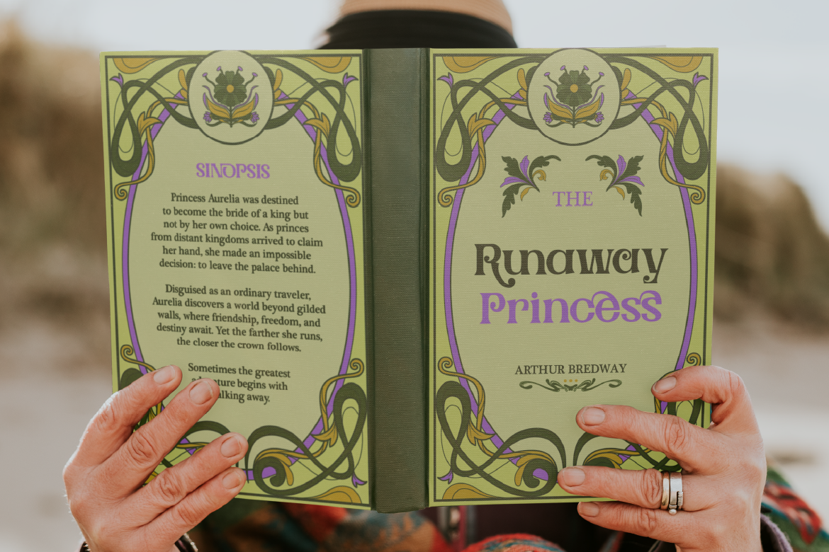
3 Retro & Vintage Fonts for Nostalgic Branding
70s psychedelic swagger, old-world Art Nouveau elegance, and a smooth vintage script-sans duo — three fonts built for brands with a nostalgic streak.