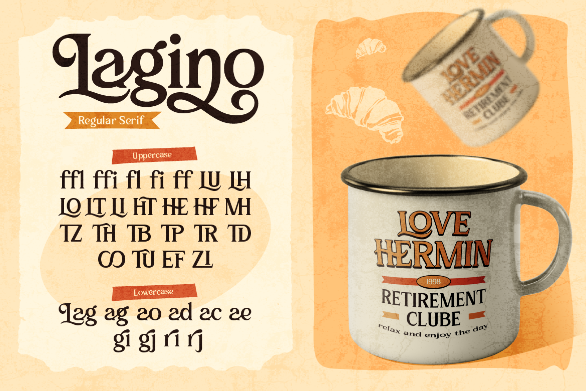
Nostalgic design is currently dominating modern branding trends across the creative industry. Moving away from ultra-flat, sterile minimalist layouts, graphic designers and brand owners are choosing wavy curves and playful lettering to build deeper emotional connections with consumers. Therefore, selecting the best retro display fonts gives your visual graphics instant personality, warmth, and memorable character.
Whether you are designing coffee packaging, bakery boxes, custom merchandise, or social media graphics, using nostalgic typography helps your business stand out in crowded markets. Here is a detailed breakdown of top retro fonts to elevate your brand identity.
1. Soft Wavy Curves Create Warmth and Nostalgic Charm
Retro display fonts naturally evoke strong feelings of comfort, fun, and authenticity. When consumers see soft, flowing letterforms on physical product packaging, they immediately associate your business with handcrafted quality. As a result, your products look more inviting on retail store shelves compared to generic corporate packaging.
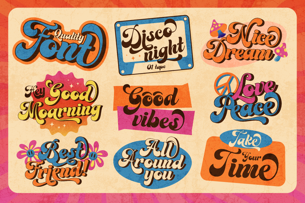
Furthermore, 70s-inspired wavy typography brings a relaxed mood that resonates strongly with contemporary lifestyle audiences. Using rounded, organic letter outlines creates a friendly aesthetic that makes new customers feel comfortable exploring your product line.
2. High Visual Impact for Social Media Banners
Decorative 70s-style fonts carry immense visual weight on small mobile screens. When scrolling through fast-moving feeds on Instagram or Pinterest, users only spend a couple of seconds evaluating graphics. Using an expressive display font for your primary post titles creates an eye-catching visual hook. Consequently, users naturally stop scrolling to read your promotional announcement or product launch details.
Additionally, bold display fonts work exceptionally well when combined with vibrant, vintage-inspired color palettes. Pairing warm mustard yellows, burnt oranges, and sage greens with heavy retro lettering completes an authentic vintage look that captures instant digital engagement.
3. Achieving Balanced Typography Hierarchies
To maintain clear readability across your graphic layouts, establishing visual balance is essential. Decorative retro typefaces carry intense visual personality, so using them for entire paragraphs can overwhelm the reader.
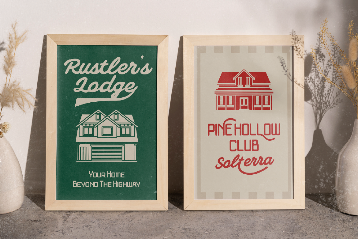
Instead, let your decorative retro font handle main titles and logo marks, while using a simple Sans Serif font for supporting body text, ingredient lists, or menu prices. This strategic contrast keeps your overall design clean, professional, and easy to navigate.
Recommended Fonts from Artisan Font
- Groovy Signature: A bold, wavy display typeface built for eye-catching 70s headlines, apparel graphics, and packaging logos.
- Broteli: A vintage circus display font featuring playful spurs that add nostalgic drama to bakery labels.
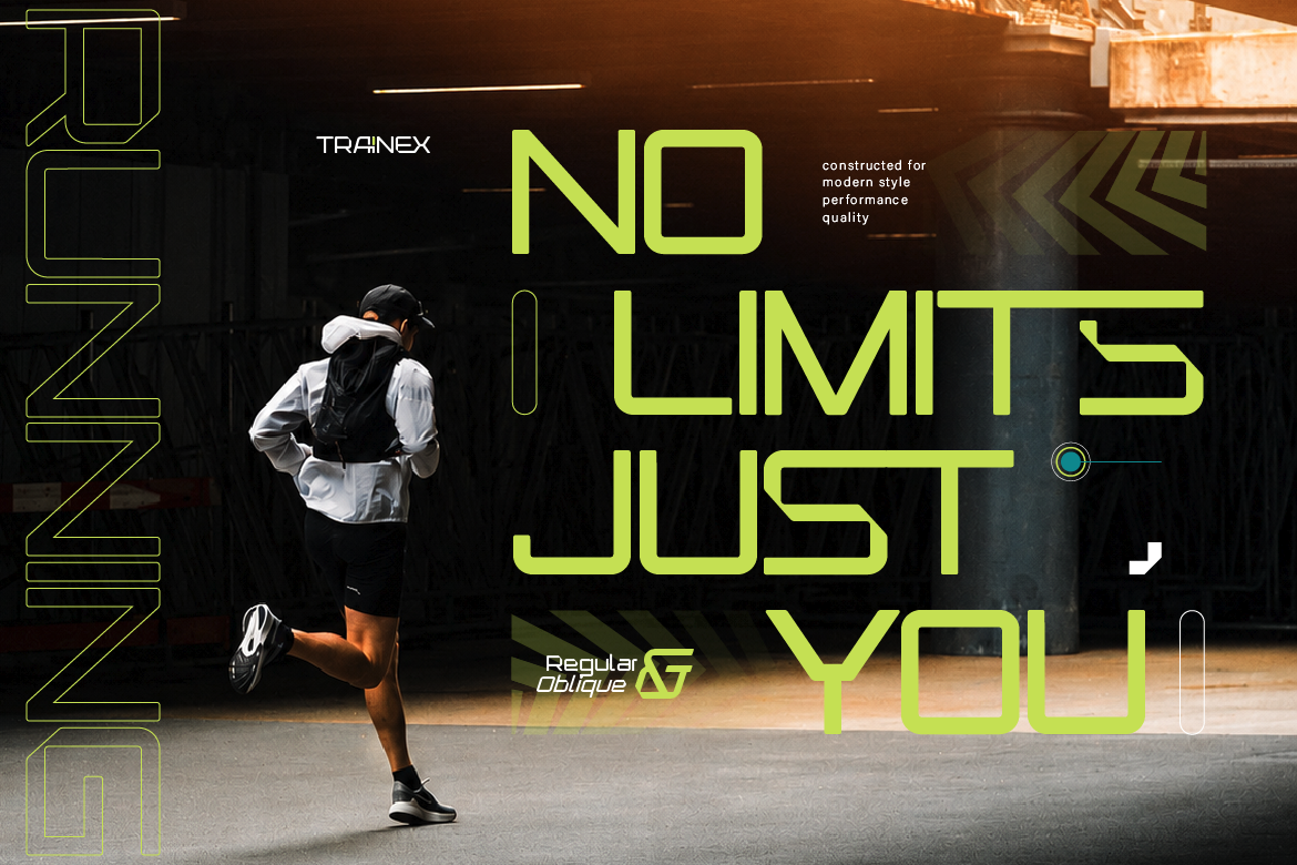
- Veltcon: A versatile font duo combining a wide sans serif with an expressive vintage script for instant visual harmony.
Ready to give your product packaging an energetic vintage makeover? [Browse Groovy Signature on Artisan Font today] and make your logo stand out!