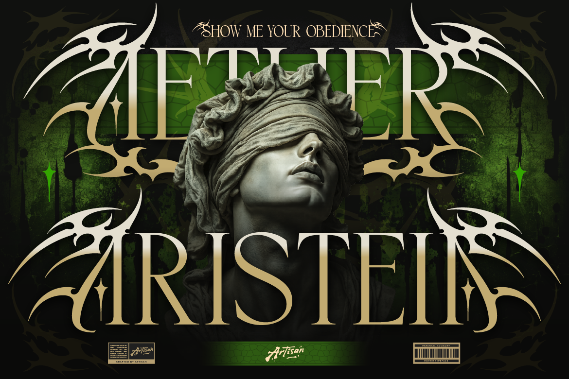
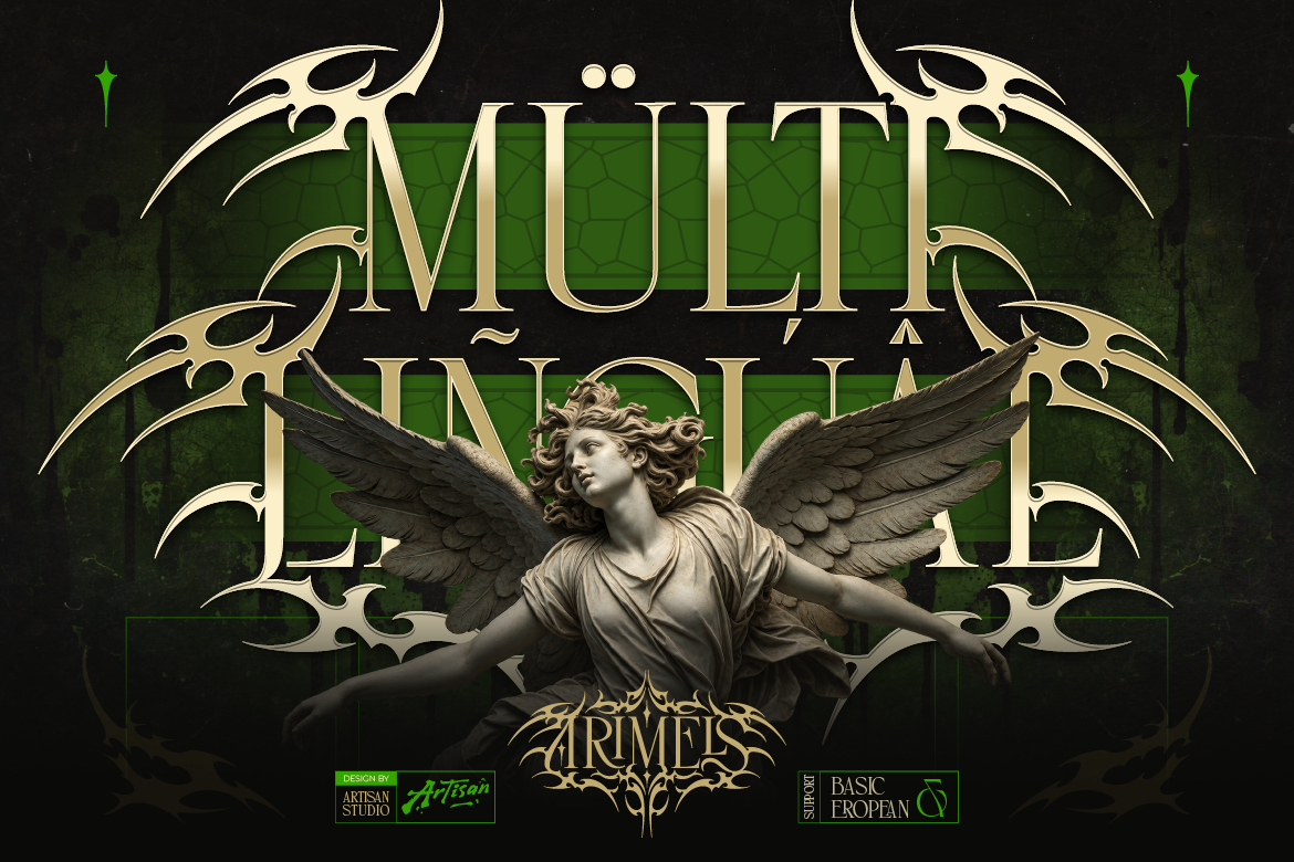
Gothic is having a moment. Scroll through luxury fashion campaigns, high-end packaging, or the latest wave of streetwear drops, and you’ll spot the same signature: sharp, angular blackletter type standing in for old-world craftsmanship and rebellious edge. What used to live exclusively on metal album covers and medieval manuscripts is now showing up on champagne labels, tattoo studio signage, and Fortune 500 rebrand decks.
For designers and brand founders, that’s an opportunity. Blackletter is one of the most polarizing typeface categories out there — used well, it signals heritage, exclusivity, and quiet confidence. Used poorly, it reads as costume-party cliche. The difference almost always comes down to font choice.
Here are five blackletter styles worth knowing, what they’re built for, and how to use them without tipping into caricature.
Why Blackletter Is Trending Again
Three forces are driving the comeback. First, maximalism is back in visual culture, and blackletter’s density and ornamentation fit that mood perfectly. Second, streetwear and luxury have been quietly merging for years, and gothic type is the shared visual language between both worlds. Third, nostalgia-driven design keeps pulling from medieval and Victorian print traditions, and blackletter is the most recognizable typographic artifact of that era.
For brand founders, this means blackletter is no longer a niche choice reserved for metal merch. It’s a legitimate positioning tool for anyone selling craftsmanship, exclusivity, or a bit of controlled rebellion.
Five Blackletter Styles to Know
- Classic Textura — The tightest, most vertical blackletter form, closest to original medieval manuscript lettering. Best for luxury spirits labels, tattoo brand marks, and anything leaning into old-world authenticity. Use sparingly, at larger sizes, since the dense strokes lose legibility fast when scaled down.
- Modern Gothic Display — A cleaned-up, geometric take on blackletter with more open counters and consistent stroke weight. This is the style behind most contemporary streetwear and sneaker-brand logos. It reads as bold and current rather than antique, making it far more versatile across digital and print applications.
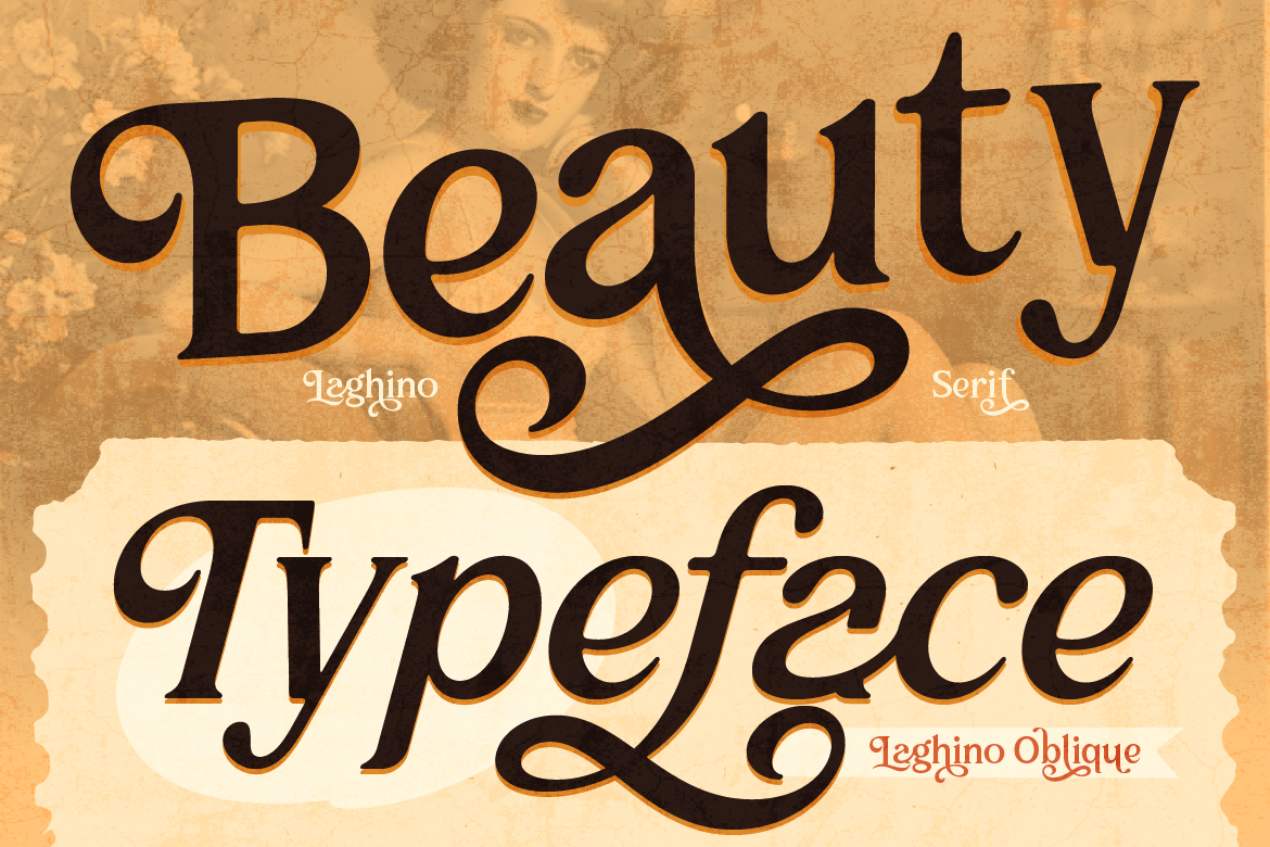
- Fraktur-Inspired Script — Softer, more calligraphic blackletter with decorative flourishes. Ideal for wedding stationery with a gothic twist, craft beverage branding, or editorial headers that need drama without going full metal-band aesthetic. Pairs beautifully with a plain sans-serif body font to keep things readable.
Each of these solves a different brand problem, so the smart move is picking the style that matches your positioning — not just the one that looks coolest in a mockup.
Actionable Design Advice: Making Blackletter Work
Blackletter is unforgiving if you treat it like a body-text font. A few rules keep it working in your favor rather than against you.
Reserve it for short bursts. Blackletter is a display category, full stop. Use it for logotypes, headlines, and single-word statements — never for paragraphs or dense UI copy. The dense ligatures and ornamentation that make it distinctive also make it hard to scan at length.
Give it room to breathe. These typefaces already carry a lot of visual weight, so tight tracking or cramped layouts push them into illegible territory. Add generous letter-spacing and whitespace around any blackletter lockup, especially on packaging where the mark needs to hold up at a distance.
Pair it with a quiet partner. The fastest way to modernize a gothic wordmark is to set your supporting copy — taglines, addresses, ingredient lists — in a clean grotesque or humanist sans. The contrast does the heavy lifting; you don’t need two loud fonts fighting for attention.
Check your license before you scale. Blackletter marks tend to end up everywhere once a brand takes off — packaging, merch, signage, app icons. Before you lock in a typeface for a logo, confirm the license actually covers logo/trademark use and the print runs or product volumes you’re planning. This is the single most common licensing gap we see designers run into after the fact.
Where This Fits Into Your Type Library
You don’t need a dozen blackletter fonts in your kit — you need one or two that are genuinely well-drawn, with clean kerning and a full character set that won’t fall apart the moment you need an accented letter or a ligature. A lot of free blackletter fonts look fine in a headline mockup and then completely break down in production, with inconsistent stroke weights or missing glyphs.
That’s the gap a proper type foundry closes: fonts built for actual commercial use, with the OpenType features, full language support, and licensing clarity that a scraped-together free font simply can’t offer.
Ready to Add Some Gothic Edge to Your Next Project?
If your next brand, label, or capsule collection needs a typeface with real presence, browse the blackletter and display collection at Artisan Font. Every font comes with clear licensing so you can move from mockup to market without guessing whether your use case is covered — explore the full catalog and find your next signature typeface today.