Your logo is often the very first thing people notice about your business. While colors and icons get plenty of attention, the font you choose for your logo text does most of the heavy lifting when it comes to communicating your brand’s personality.
The biggest decision you will face during logo design is choosing between a Serif and a Sans Serif font. Both are timeless, but they tell completely different stories. Here is how to decide which one fits your brand.
Understanding Serif Fonts: Classic & Trustworthy
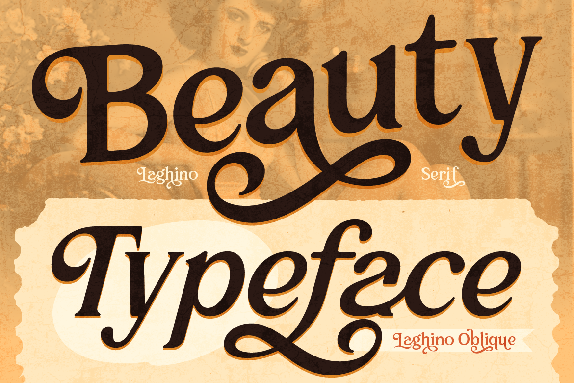
Serif fonts feature small decorative strokes (called “serifs”) attached to the ends of each letter line. Because of their historical roots in print printing, serifs naturally evoke a sense of tradition, authority, and sophistication.
Best used for:
- Luxury goods and high-end fashion lines.
- Professional services like legal, editorial, or financial firms.
- Heritage brands that want to emphasize history and credibility.
Understanding Sans Serif Fonts: Clean & Modern
“Sans” literally means “without.” Sans serif fonts strip away those decorative end strokes, leaving clean, straightforward letterforms. They represent clarity, modernity, and a no-nonsense approach to design.
Best used for:
- Tech startups, modern SaaS apps, and digital platforms.
- Contemporary lifestyle brands and minimalist products.
- Designs that need maximum legibility on small mobile screens.
How to Choose the Right One for Your Brand
To pick the winning style, ask yourself three quick questions:
- What is your brand’s tone? If you are traditional and elegant, go Serif. If you are trendy and casual, go Sans Serif.
- Where will your logo live most? If your logo is primarily displayed on digital screens and social apps, Sans Serifs offer effortless legibility at tiny sizes.
- Can you mix both? Absolutely. Many brands use a bold Serif for their main brand name and a clean Sans Serif for their tagline.
Explore our collection of handcrafted Serif and Sans Serif typefaces to find the perfect font foundation for your new logo design!