If you’ve spent any time browsing fonts, you’ve probably seen the terms “font duo” and “font pairing” used everywhere, sometimes even used interchangeably. But they’re actually not the same thing, and knowing the difference can save you a lot of time (and guesswork) on your next design project.
Let’s break down what each one actually means, and when you’d want to use one over the other.
What Is a Font Duo?
A font duo is a single product that comes with two pre-matched styles designed to work together right out of the box. Think of it as a package deal, the designer has already done the hard work of making sure the two styles complement each other in weight, proportion, and personality.
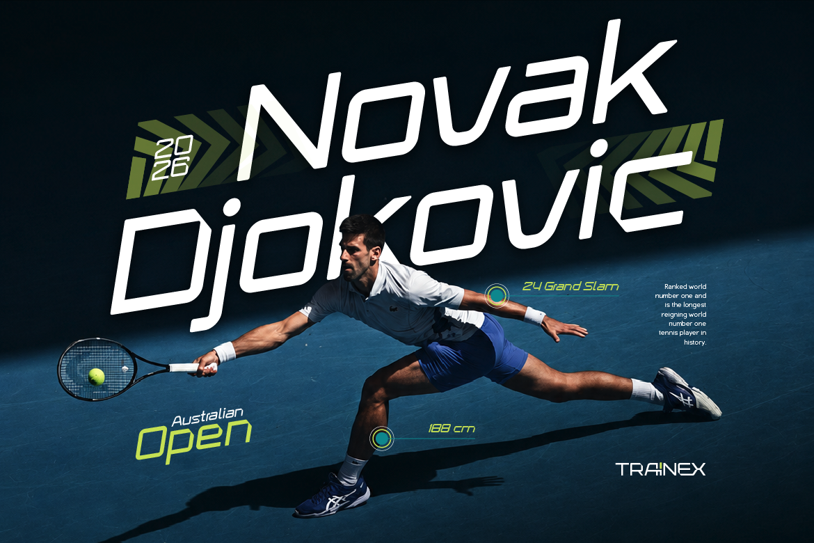
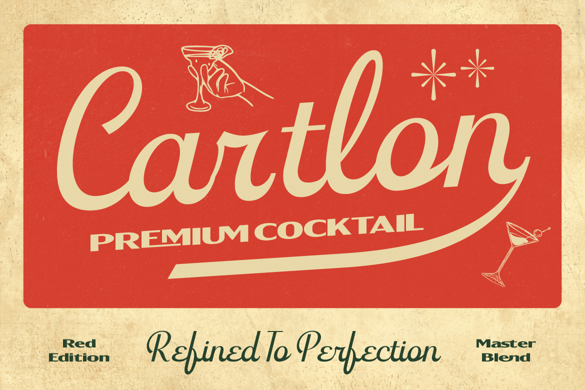
You’ll usually see this labeled directly in the product name or description, fonts like Tenford, Frestype Atlethic, Flaction, or Ganter are all built as duo fonts. That means when you purchase one of these, you’re getting two coordinated styles in one file, no extra searching or testing required.
The biggest advantage of a font duo is convenience. Since the pairing is already designed and tested, you can drop it straight into your project and know it’s going to look intentional and cohesive.
What Is a Font Pairing?
Font pairing, on the other hand, is when you manually combine two separate, independently designed fonts to use together in a project. This might mean using one font for your headline and a completely different font from another family for your body text.
For example, pairing a bold display font with a clean sans serif for readability is a classic font pairing move, but the two fonts weren’t necessarily designed with each other in mind. It’s on you (or your design eye) to make sure the combination actually works well together.
Font pairing gives you a lot more creative freedom since you’re not limited to pre-set combinations, but it also takes more time, and a bit more typographic know-how, to get right.
Why the Difference Actually Matters
Understanding this distinction helps you make smarter choices depending on your project and timeline.
If you’re working on a tight deadline or you’re not 100% confident in your font-pairing instincts, a font duo is your best friend. It takes the guesswork out completely, you get a cohesive look without needing to test different combinations.
If you want more flexibility and a fully custom look, font pairing gives you the freedom to mix fonts from different families to build something more unique to your brand. It just requires a bit more care to avoid combinations that clash or compete.
There’s also a practical side to this: duo fonts come as one purchase covering both styles, while pairing two separate fonts usually means buying (and licensing) each font individually. Always double check the license terms for each font you’re combining.
Which One Should You Use?
Honestly, it depends on the project. Need something fast, reliable, and ready to go? Grab a font duo. Want full creative control and you’re ready to put in a little extra effort? Go the font pairing route.
Either way, both approaches are totally valid, it just comes down to how much time you have and how hands-on you want to be with your typography.
Explore Duo Fonts and More
If you love the convenience of a ready-made pairing, check out the duo font collection over at Artisan Font, each one designed to work together beautifully right out of the box.