Best Sport Fonts for Apparel and Gym Merchandise
Power up your clothing line! Discover the best sport fonts for apparel that print cleanly on hoodies, varsity tees, and motorsports merchandise.
October is close enough that anyone doing seasonal design work should already be building their font shortlist — party flyers, product drops, packaging, social campaigns. The brands and shops that get their spooky-season visuals out early are the ones that actually catch the search traffic and impulse buys, not the ones scrambling the week before Halloween.
The trap with most “Halloween fonts” is that they’re a single novelty style: fun for one poster, useless for anything else in the campaign. The three below all come with more than one style built in, so a single font purchase can carry a logo, a flyer, and packaging copy without repeating the exact same treatment everywhere.
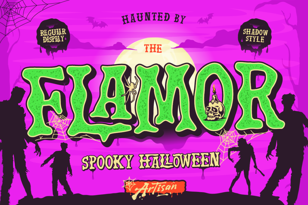
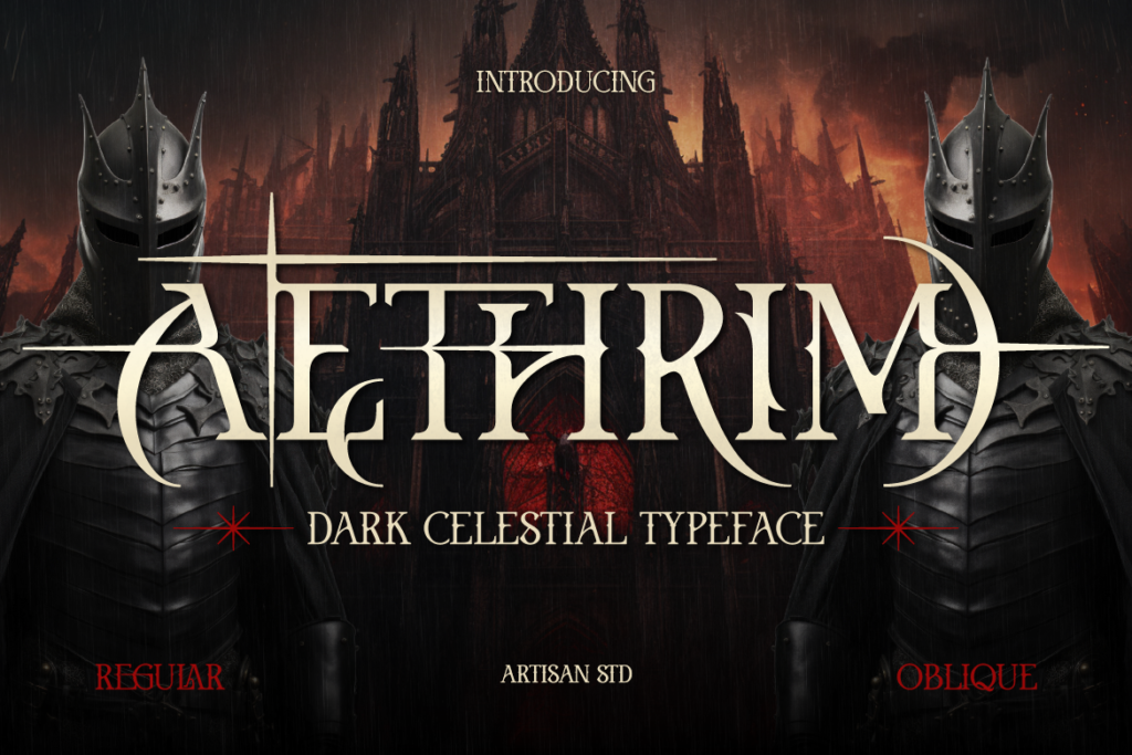
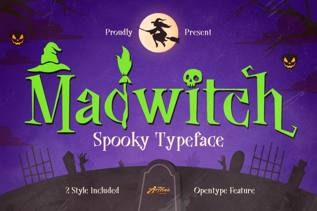
A lot of Halloween-labeled fonts exist purely to nail one striking poster and stop there. What actually makes a font useful for a seasonal campaign is having a second gear — a shadow style, an inkbleed texture, an oblique cut — so the same typeface can flex from a bold headline down to a smaller label or a secondary line of copy without switching fonts entirely. That’s what separates Flamor, Aethrim, and Madwitch from a single-use novelty download: each one gives a campaign room to breathe across multiple assets.
It’s also worth noting these three sit at different points on the spooky spectrum. Flamor and Madwitch lean playful and commercial — built for products people actually want to buy for a Halloween party or a fun seasonal drop. Aethrim leans darker and more literary, better suited to a brand built around fantasy, myth, or dark academia rather than trick-or-treat energy. Picking the right end of that spectrum for your brand matters more than picking whichever font looks spookiest in isolation.
The brands that win October aren’t the ones with the most dramatic single poster — they’re the ones whose typography holds up consistently across every touchpoint, from the hero graphic down to the smallest label.
Explore Flamor, Aethrim, Madwitch, and the rest of Artisan Font‘s seasonal and dark fantasy collection. Browse the catalog now and get your Halloween and dark-fantasy design queue sorted before the season kicks off.
Best Sport Fonts for Apparel and Gym Merchandise
Power up your clothing line! Discover the best sport fonts for apparel that print cleanly on hoodies, varsity tees, and motorsports merchandise.
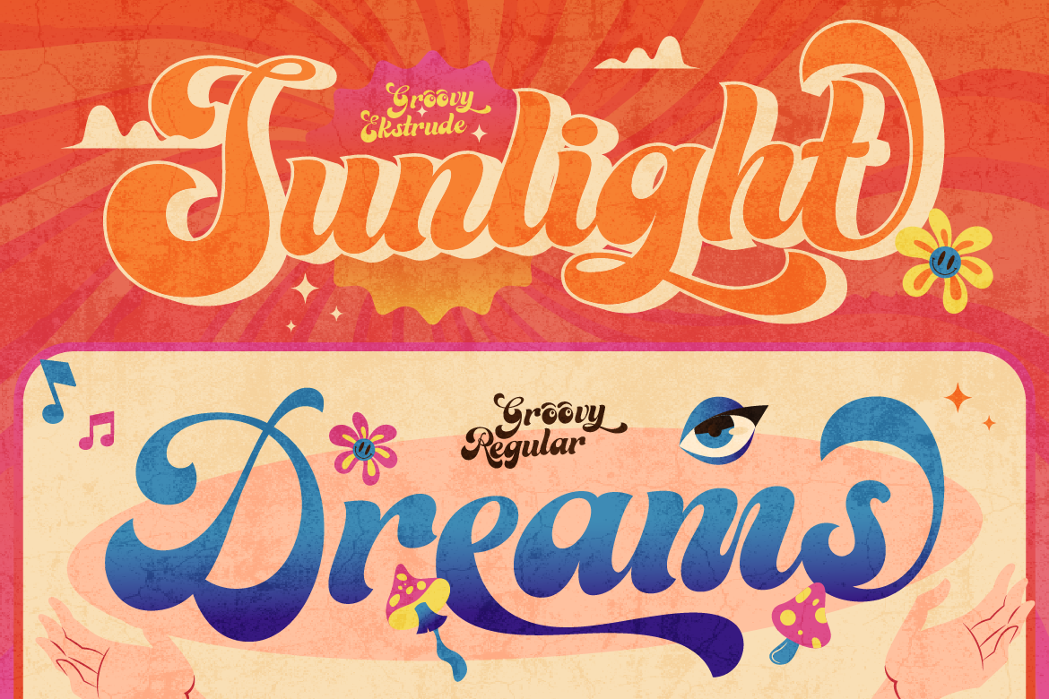
Best Retro Display Fonts for Nostalgic Food Packaging
Bring back 70s nostalgic charm! Discover the best retro display fonts to elevate your artisan food packaging, sticker merch, and product logos effortlessly.
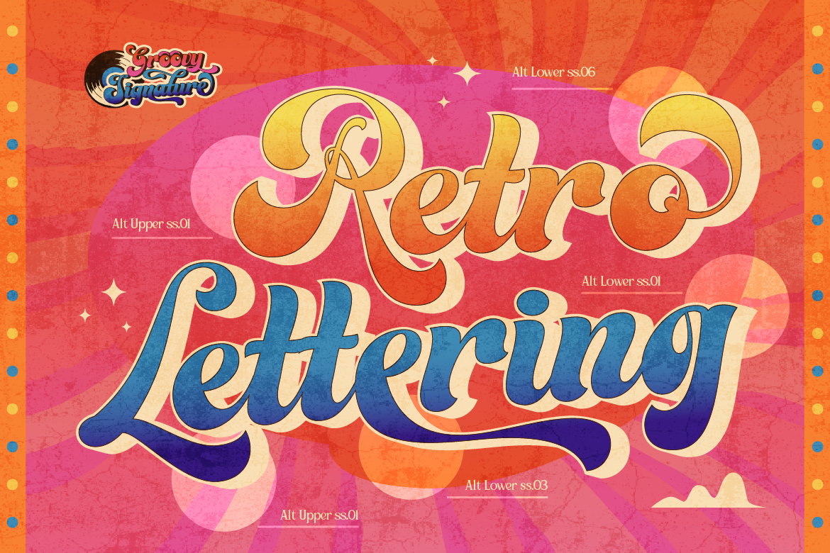
The Ultimate Guide to Vintage Sign & Retro Display Fonts for Branding
Looking to add authentic heritage and nostalgia to your brand? Discover how vintage sign painting and retro display typography elevate modern packaging and logos.