Choosing a font for your website might seem like a small decision — but it’s actually one of the biggest factors in how visitors feel about your brand within seconds of landing on your page. The right font builds trust and sets the mood. The wrong one? It can make even a beautifully designed site feel off, unprofessional, or just plain hard to read.
If you’ve ever spent way too long scrolling through font options with no idea where to start, this guide is for you. Let’s break down exactly how to pick a font that fits your website (and your brand) like a glove.
Start With Your Brand Personality
Before you even open a font library, ask yourself: if my brand were a person, how would it talk? Calm and professional? Fun and energetic? Bold and edgy? Elegant and refined?
Fonts carry personality just like colors do:
- Serif fonts (with little “feet” on the letters) tend to feel classic, trustworthy, and editorial — great for law firms, publications, or luxury brands.
- Sans-serif fonts (clean, no feet) feel modern, minimal, and approachable — perfect for tech, startups, or lifestyle brands.
- Script or handwritten fonts feel personal, creative, and warm — ideal for boutiques, food brands, or anything with a “handmade” touch.
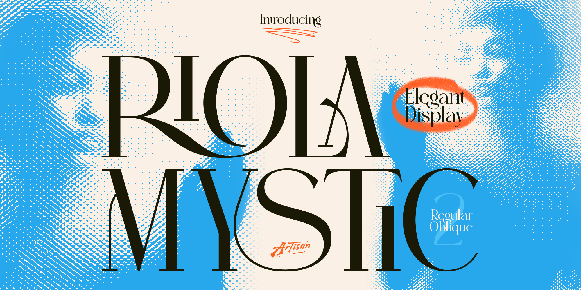
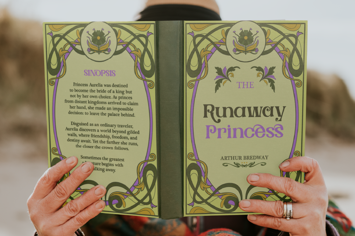
- Display or decorative fonts are bold and attention-grabbing — best used sparingly for logos, headers, or branding moments.
Once you know the feeling you’re going for, narrowing down fonts becomes way easier.
Prioritize Readability (Always)
Here’s the thing: a font can look stunning in a mockup but become a nightmare once it’s actual body text on a screen. Before falling in love with a font, test it for readability by asking:
- Can I comfortably read a full paragraph without strain?
- Do the letters stay clear and distinct at smaller sizes (like 14-16px)?
- Does it work well on both desktop and mobile screens?
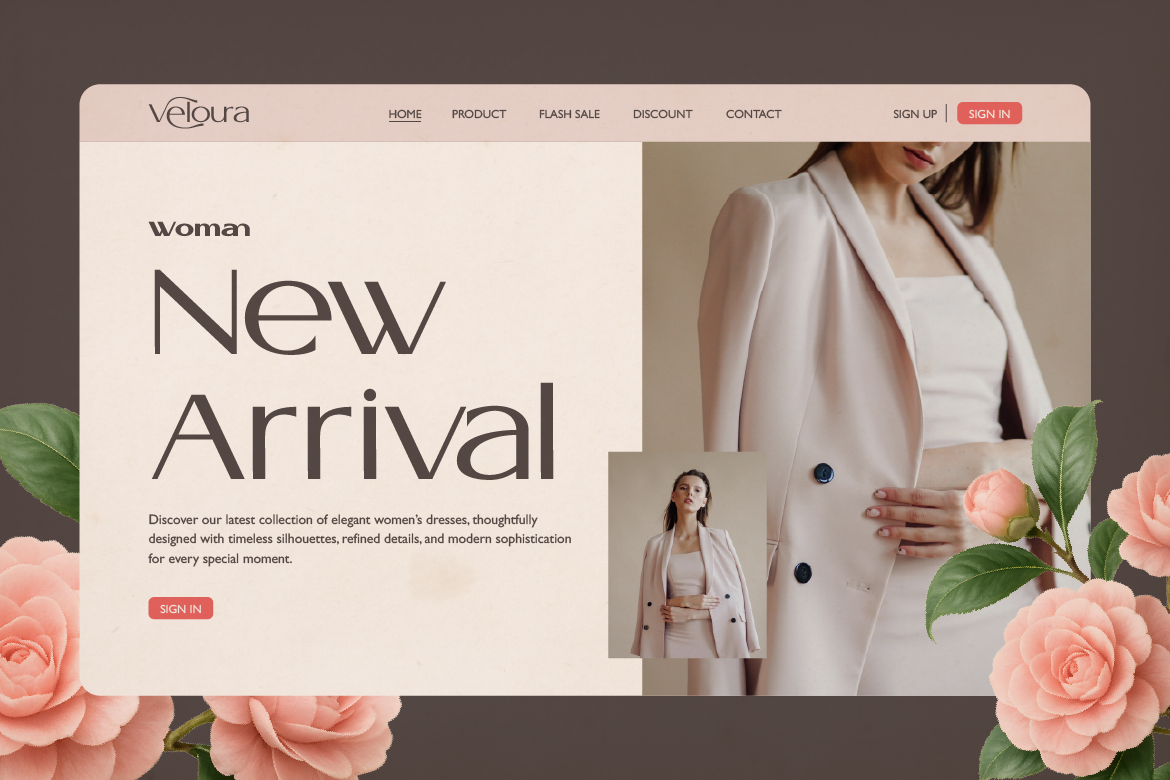
A good rule: save bold, decorative, or display fonts for headlines and accents only. Your body text — the part people actually read — should always prioritize clarity over style.
Limit Yourself to 2-3 Fonts
Just like in print design, websites look most polished when they stick to a small, consistent font system:
- A heading font — something with character that represents your brand.
- A body font — clean, readable, and comfortable for long-form text.
- (Optional) An accent font — for buttons, quotes, or small branding details.
Using too many fonts makes your site feel chaotic and unprofessional, even if each individual font is great on its own. When in doubt, less is more.
Consider Loading Speed and Performance
This one’s easy to overlook, but it matters a lot for SEO and user experience. Custom fonts need to load before your text displays properly, and too many font files (or font weights) can slow down your site.
A few tips:
- Stick to 2-3 font weights max (e.g., regular, medium, bold) instead of loading every weight available.
- Use modern font formats like WOFF2, which are optimized for the web.
- Make sure your font files are properly licensed for web use — some font marketplaces, like ArtisanFont, include web licensing options so you don’t run into legal headaches down the line.
Match Your Font to Your Industry (But Don’t Be Boring)
Every industry has its typography “norms” — but that doesn’t mean you have to follow them blindly. Standing out (in a good way) often comes from bending the rules slightly while still feeling appropriate for your audience.
For example:
- A finance brand doesn’t have to use a stiff corporate serif — a clean, confident sans-serif can feel modern and trustworthy too.
- A food brand doesn’t have to use a playful script — a bold, characterful sans-serif (like a chunky display font) can feel fun and appetizing in a different way.
The goal isn’t to copy what everyone else is doing, but to make sure your font choice still feels appropriate and intentional for your industry and audience.
ArtisanFont Picks for Different Website Styles
Not sure where to start looking? Here are a few fonts from the ArtisanFont collection that work great for specific website vibes:
- Cantilos — A minimalist, elegant sans-serif that’s perfect as a go-to body font. Clean, modern, and easy to read across devices — great for portfolios, SaaS sites, or minimalist brands.
- Foramte — An elegant serif that brings a touch of sophistication to headings. Ideal for luxury brands, editorial blogs, or boutique e-commerce sites.
- Flanky — A bold, playful sans-serif with tons of personality. Perfect for food brands, lifestyle websites, or anything that wants to feel fun and energetic.
- Truewild — A western-inspired slab serif with rustic charm. Great for cafes, outdoor brands, or websites going for a “handcrafted” feel.
- Lisaline — An elegant script font, best used sparingly for logos, hero sections, or special callouts on sites that want a personal, refined touch.
Tip: Try pairing a bold ArtisanFont display or script for your headings with Cantilos as your body font — it’s clean enough to let your headline font shine while keeping the rest of your site easy to read.
Test Before You Commit
Once you’ve narrowed down your options, don’t just pick and forget — actually test the fonts on a real page:
- View it on different screen sizes (desktop, tablet, mobile).
- Check how it looks in both light and dark backgrounds (if your site supports dark mode).
- Get feedback from a few people — sometimes a font that looks great to you might feel “off” to others, especially for readability.
Choosing the right font for your website isn’t about finding the “perfect” font that exists in some design fantasy — it’s about finding a font (or font pair) that fits your brand personality, stays readable, and performs well technically.
Start with your brand’s vibe, prioritize readability for body text, and don’t be afraid to mix in some personality through your headings. And if you need a starting point, browsing a curated collection like ArtisanFont is a great way to find fonts that are both stylish and practical for the web.