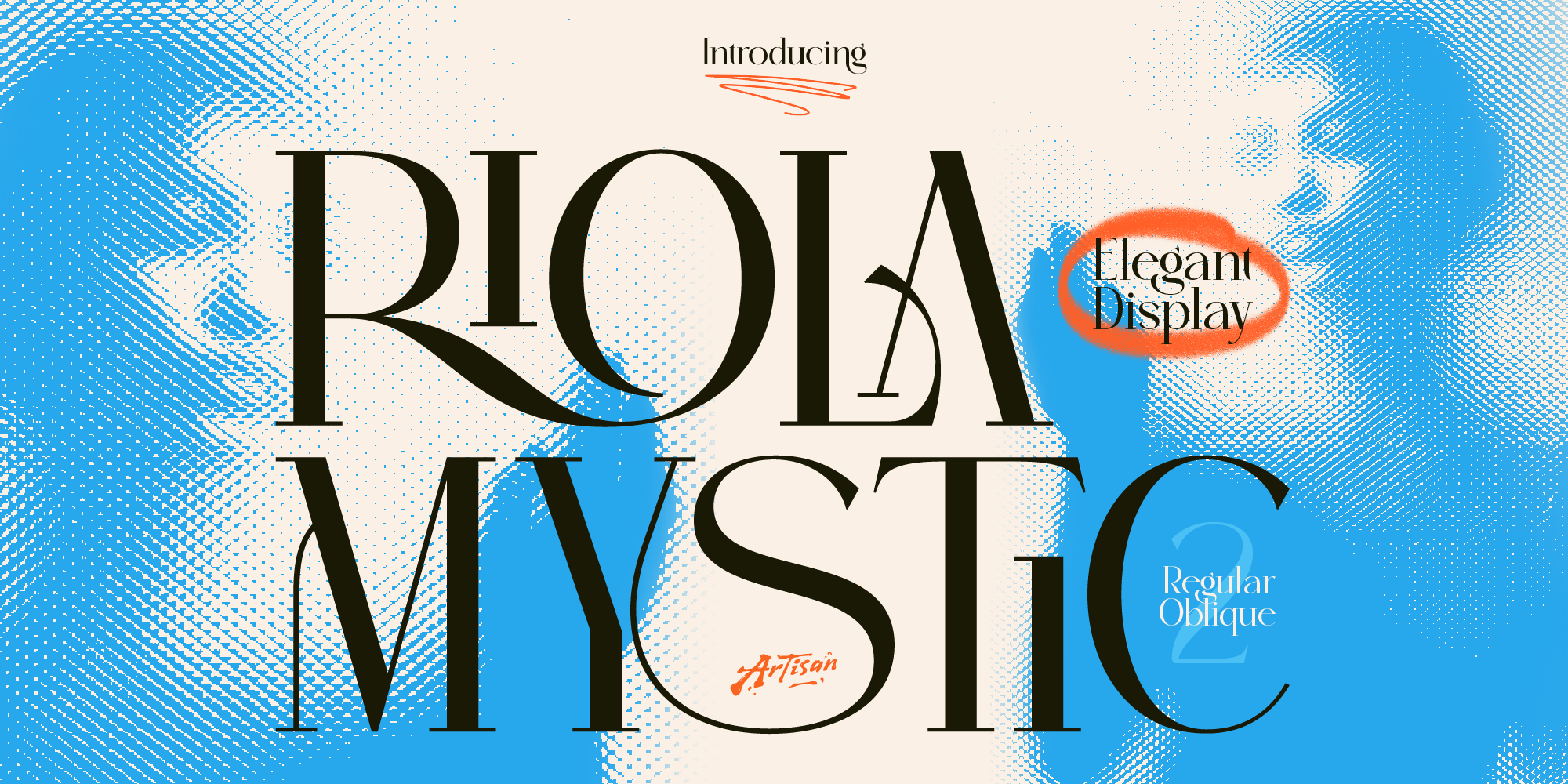
Why You Need a Mystic Elegant Display Font for Your Brand
Elevate your brand identity with a mystic elegant display font. Discover how Riola brings celestial luxury to skincare, tarot, and boutique logos.

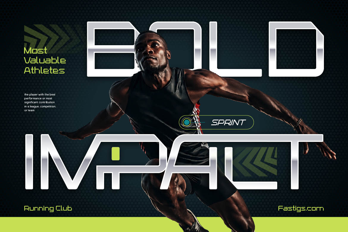
Designing typography on a computer screen is very different from printing text onto physical fabric. Nothing is more disappointing than receiving your custom T-shirts only to find the text looks blurry, smudged, or unreadable. Learning how to prevent blurry fonts on printed t-shirts will save you time and production costs.
Here are three simple design fixes to ensure your apparel typography stays sharp in print.
Thin, delicate lines might look sleek on your monitor, but screen-printing ink often bleeds on cotton textures. Consequently, fine letter strokes completely disappear or blur together during production. For merchandise, always choose heavy-weight display fonts with thick stems.
Exporting your shirt design as a low-resolution PNG image causes pixelation during printing. Always convert your text into vector shapes (Create Outlines in Illustrator) before sending files to your printer. As a result, your text scales infinitely without losing crisp detail.
Text placed too closely together will merge when thick textile ink hits the fabric. Increasing your letter spacing slightly gives the ink room to settle, keeping every character sharp and distinct.
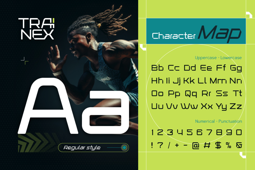
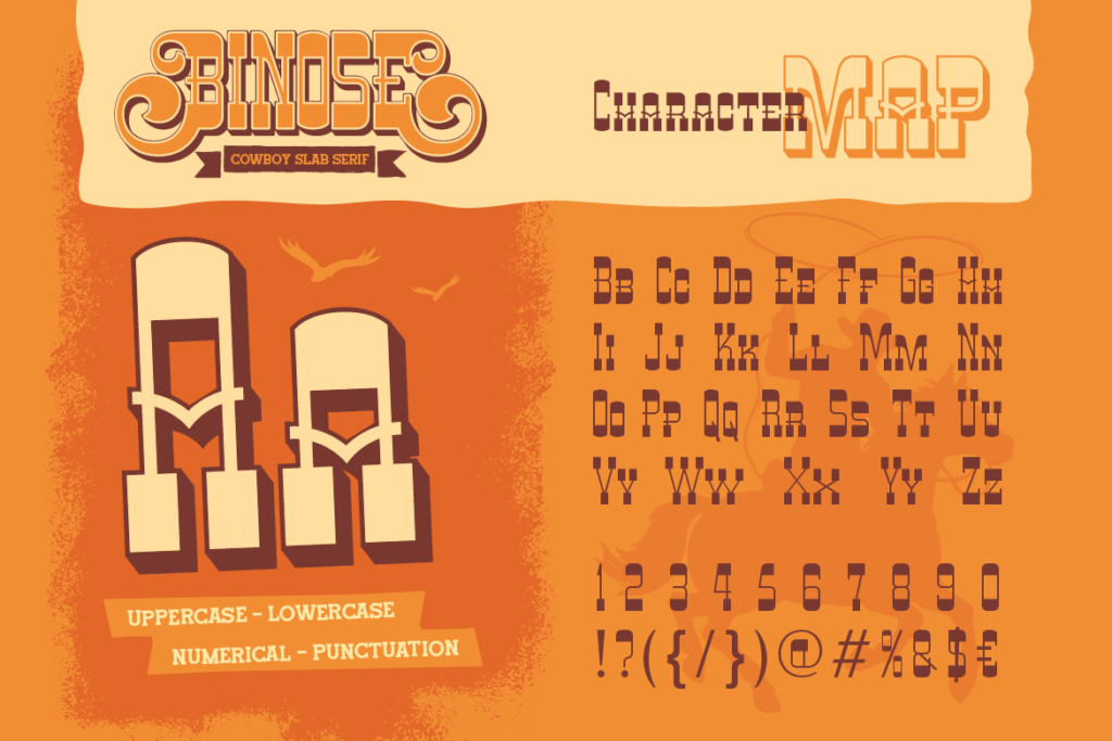
Want your apparel prints to look sharp every single time? [Explore high-impact apparel fonts at Artisan Font today] and upgrade your print quality!
Why You Need a Mystic Elegant Display Font for Your Brand
Elevate your brand identity with a mystic elegant display font. Discover how Riola brings celestial luxury to skincare, tarot, and boutique logos.
3 Spooky Halloween & Dark Fantasy Fonts
October is close enough that anyone doing seasonal design work should already be building their font shortlist — party flyers, product drops, packaging, social campaigns.
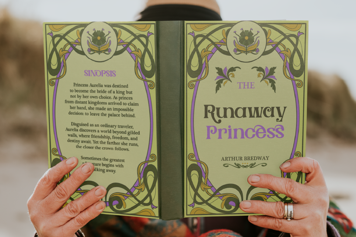
3 Retro & Vintage Fonts for Nostalgic Branding
70s psychedelic swagger, old-world Art Nouveau elegance, and a smooth vintage script-sans duo — three fonts built for brands with a nostalgic streak.