You’ve just generated a stunning visual using Midjourney, Adobe Firefly, or Canva AI. The composition is great, the colors are perfect, and the mood is exactly what you were going for. Now you need to add text — and suddenly you’re staring at a font picker wondering where to start.
Pairing typography with AI-generated visuals is a skill that’s becoming increasingly essential for designers and content creators. Here’s how to do it well.
Step 1: Read the Mood of the Visual First
Before you open your font library, spend a moment analyzing the visual itself. AI-generated images carry strong atmospheric cues — color palette, texture, composition style, and overall energy. Your font needs to respond to those cues, not fight them.
Ask yourself:
- What emotion does this visual evoke? Calm and serene? Bold and energetic? Mysterious and dramatic?
- What era or aesthetic does it reference? Vintage? Futuristic? Natural and organic? Clean and modern?
- What’s the visual weight? Detailed and textured? Minimal and spacious? Dark and moody? Light and airy?
Your font choice should amplify these qualities — not contradict them.
Step 2: Match Font Personality to Visual Personality
Here’s a practical guide to matching font styles with common AI-generated visual aesthetics:
Dark, moody, cinematic visuals → Dramatic serif fonts, high-contrast display types, or gothic/blackletter styles. The typography should feel as weighty and atmospheric as the image.
Bright, tropical, summer visuals → Playful brush scripts, bold rounded display fonts, or handwritten styles. The type should feel warm, energetic, and sun-soaked.
Clean, minimal, editorial visuals → Geometric sans-serifs, thin serifs, or simple modern display fonts with generous spacing. The typography should breathe alongside the image.
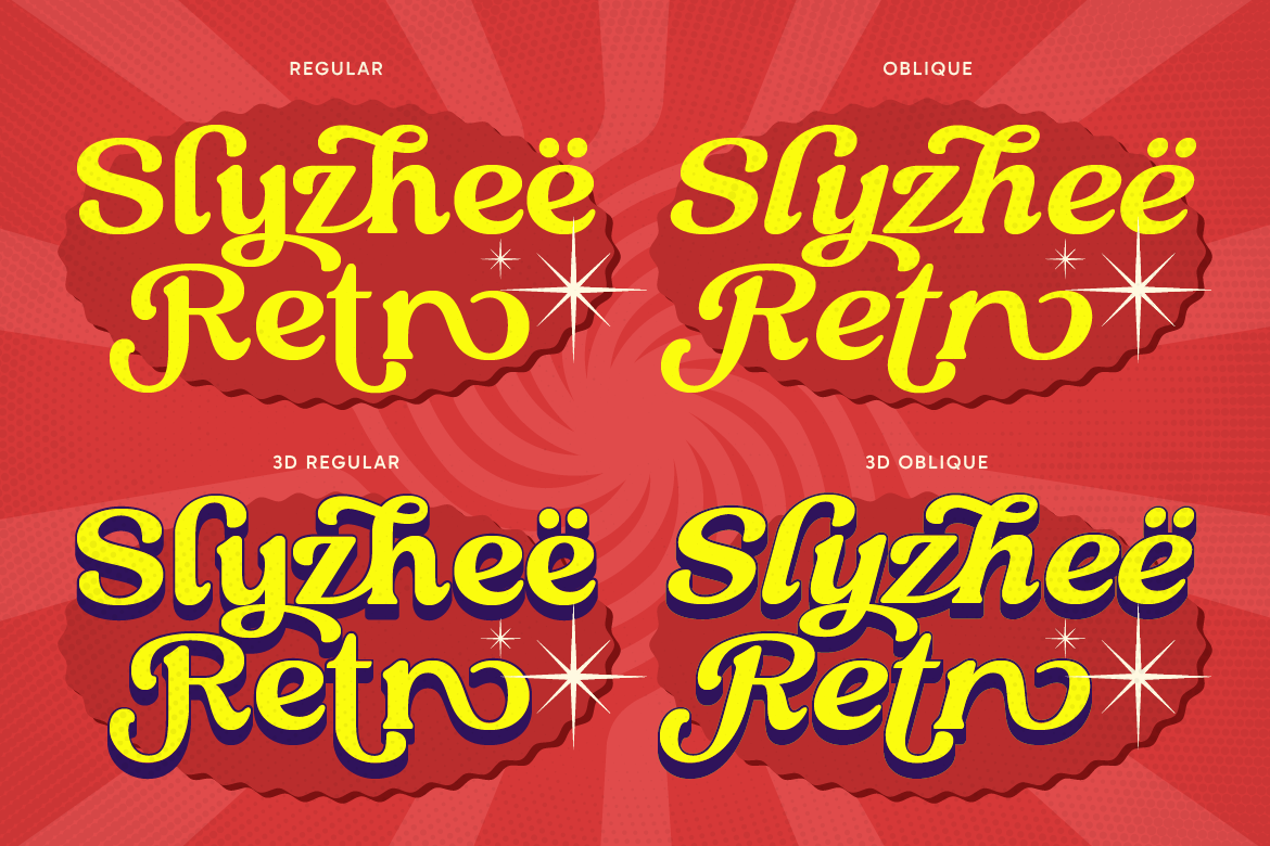
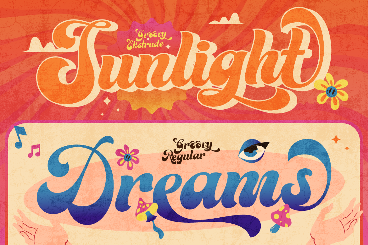
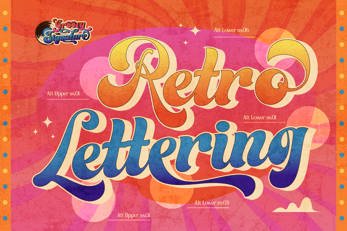
Vintage, retro, nostalgic visuals → Inline display fonts, bold slab serifs, or hand-painted display styles. Look for fonts with texture and character that feel era-appropriate.
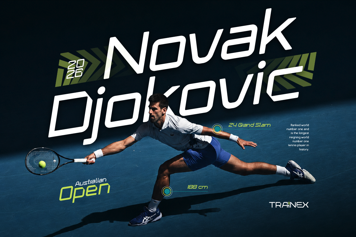
Futuristic, tech, abstract visuals → Sharp geometric sans-serifs, condensed display fonts, or experimental typefaces with a forward-looking feel.
Luxurious, high-fashion visuals → Elegant high-contrast serifs or refined script fonts. Thin, sophisticated letterforms that feel expensive and editorial.
Step 3: Consider Contrast and Legibility
AI-generated visuals are often complex — rich with detail, texture, and competing visual elements. This makes legibility a real concern when adding typography.
A few techniques that help:
Use contrast in color. If the visual is dark, use light typography. If it’s light and airy, use dark or bold type. High contrast between text and background is non-negotiable for readability.
Simplify your font choice. Complex visuals pair better with cleaner, simpler fonts. Save highly decorative typefaces for minimal compositions where they have room to breathe.
Use text overlays strategically. A semi-transparent overlay, a solid shape behind the text, or placing text in a naturally clear area of the image all help maintain legibility without covering the visual.
Avoid thin fonts on complex backgrounds. Lightweight, thin fonts disappear into detailed AI-generated imagery. Use at least a medium weight, or go bold.
Step 4: Test at the Right Scale
A font that looks perfect at preview size in your design software can completely fall apart at the actual output dimensions. This is especially true with AI-generated visuals, which are often generated at specific resolutions.
Always check your typography at:
- The actual final output size (print, social media, web)
- Multiple screen sizes if it’s a digital design
- Both light and dark viewing conditions if possible
Small adjustments to size, weight, or tracking at this stage can make a huge difference in the final result.
Step 5: Keep It Simple
The temptation when working with visually rich AI-generated content is to match it with equally complex typography. Resist this. The visual is already doing a lot of work — your typography should complement it, not compete.
Two fonts maximum. Clear hierarchy. Intentional placement. Let the visual breathe.
Pairing typography with AI-generated visuals is really just an extension of classic design principles — contrast, hierarchy, mood alignment, and legibility. The AI handles the atmosphere; your font choice handles the communication. Get both right, and the combination is more powerful than either element alone.
Build a font library diverse enough to match any visual mood, and you’ll never be stuck staring at a font picker again. Explore the ArtisanFont collection for typefaces across every style and aesthetic.