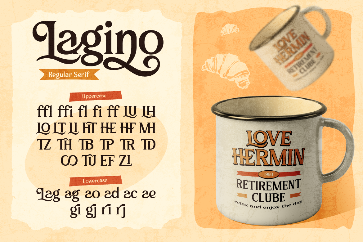
Best Fonts for Coffee Packaging and Roastery Branding
Stand out on store shelves! Discover the best fonts for coffee packaging that capture artisan warmth, premium quality, and customer interest.

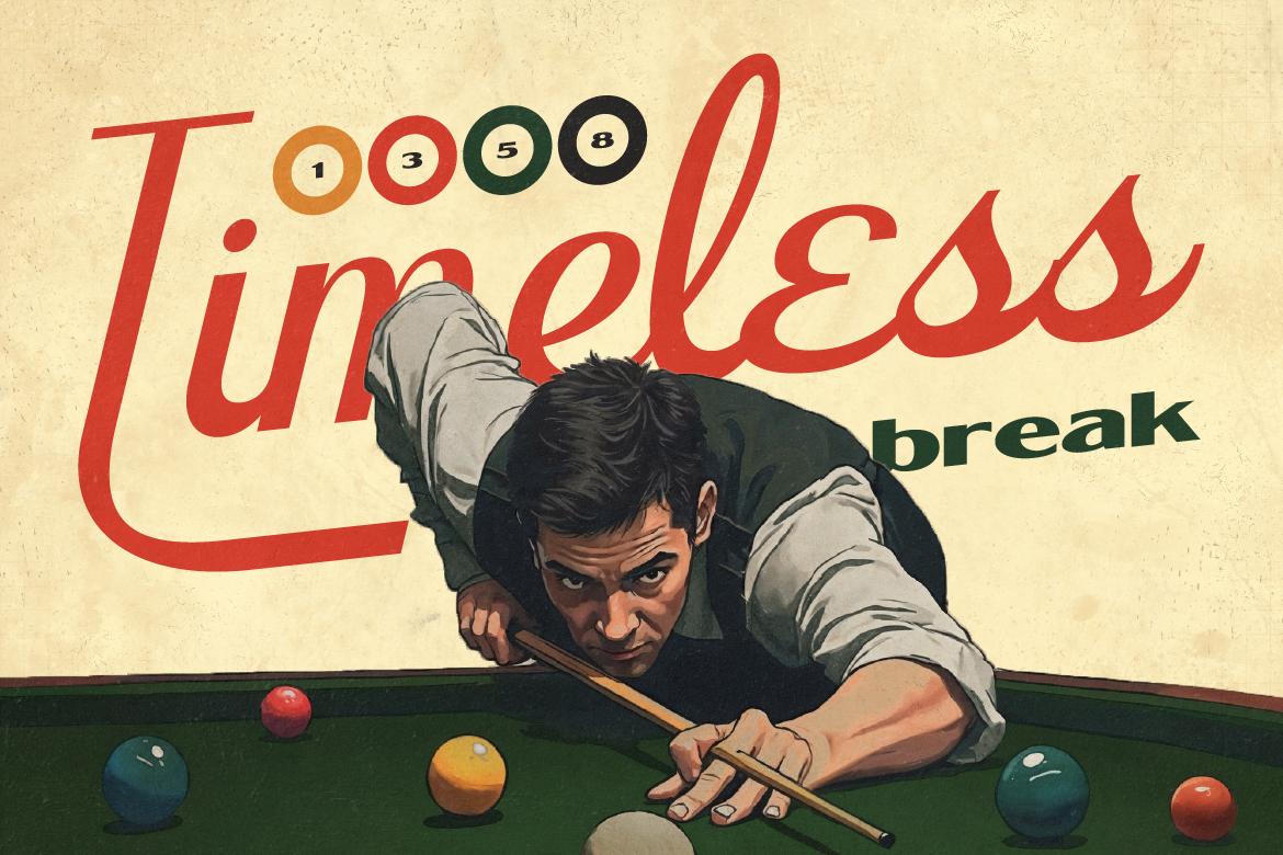
Combining two different typefaces for a brand logo is one of the most challenging tasks in graphic design. If the selected font styles clash, your overall brand identity looks messy and unstructured. However, if the chosen fonts are too similar, your design lacks interest and looks visually boring. Learning how to pair fonts for logos correctly will elevate your branding projects instantly.
Follow these three simple design rules to create balanced, professional typography combinations every single time.
The golden rule of successful typography pairing is avoiding fonts that look almost identical. Mixing two slightly different serif fonts creates visual confusion because viewers sense something is inconsistent without understanding why.
Instead, aim for deliberate visual contrast by pairing opposing font styles together. For example, combine an expressive decorative serif or script font for your main logo name with a clean, neutral Sans Serif font for your supporting tagline. This sharp contrast defines clear boundaries between your brand elements.
Your primary brand name should always be the visual hero of your logo design. When planning your font layout, ensure that your primary font carries significantly more weight, size, or personality than secondary text elements.
As a result of this clear visual hierarchy, your audience naturally reads your brand name first and supporting business details second, making your logo far more memorable.
If spending hours testing hundreds of font combinations slows down your design process, consider using pre-matched font duos. Type designers engineer font duos specifically to complement each other in weight, letter proportion, line thickness, and overall aesthetic vibe.
Using a font duo removes all the stressful guesswork from typography pairing. You receive two complementary font files designed to work seamlessly together out of the box, allowing you to complete client branding projects much faster.
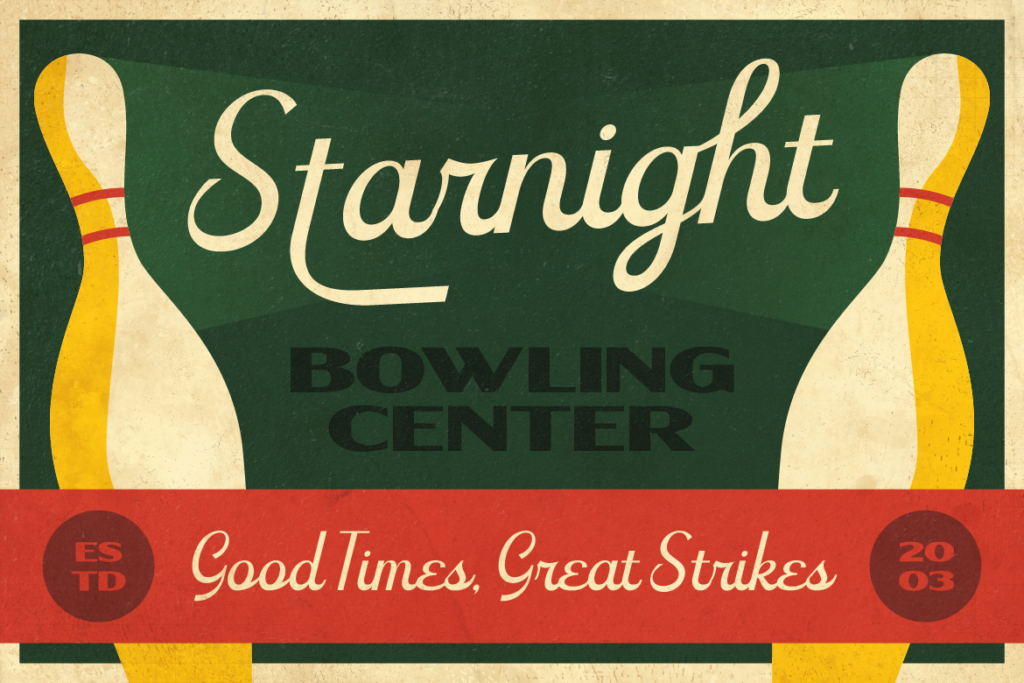
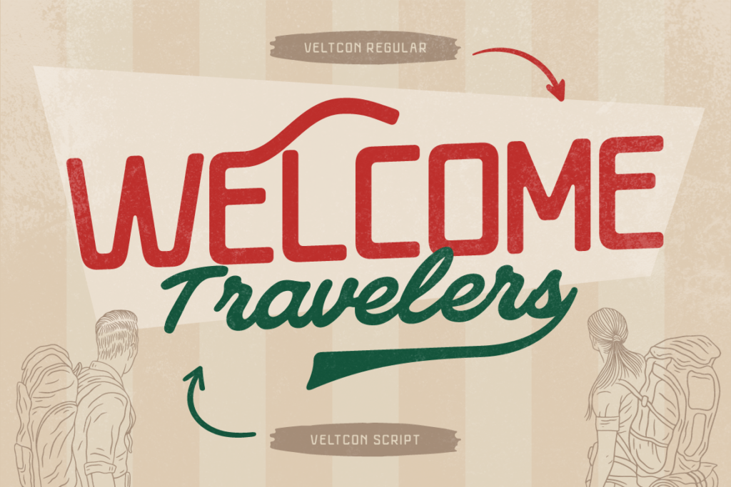
Speed up your creative workflow and deliver stunning brand identities! [Explore Tenford at Artisan Font now] and create perfectly paired logo designs effortlessly!
Best Fonts for Coffee Packaging and Roastery Branding
Stand out on store shelves! Discover the best fonts for coffee packaging that capture artisan warmth, premium quality, and customer interest.
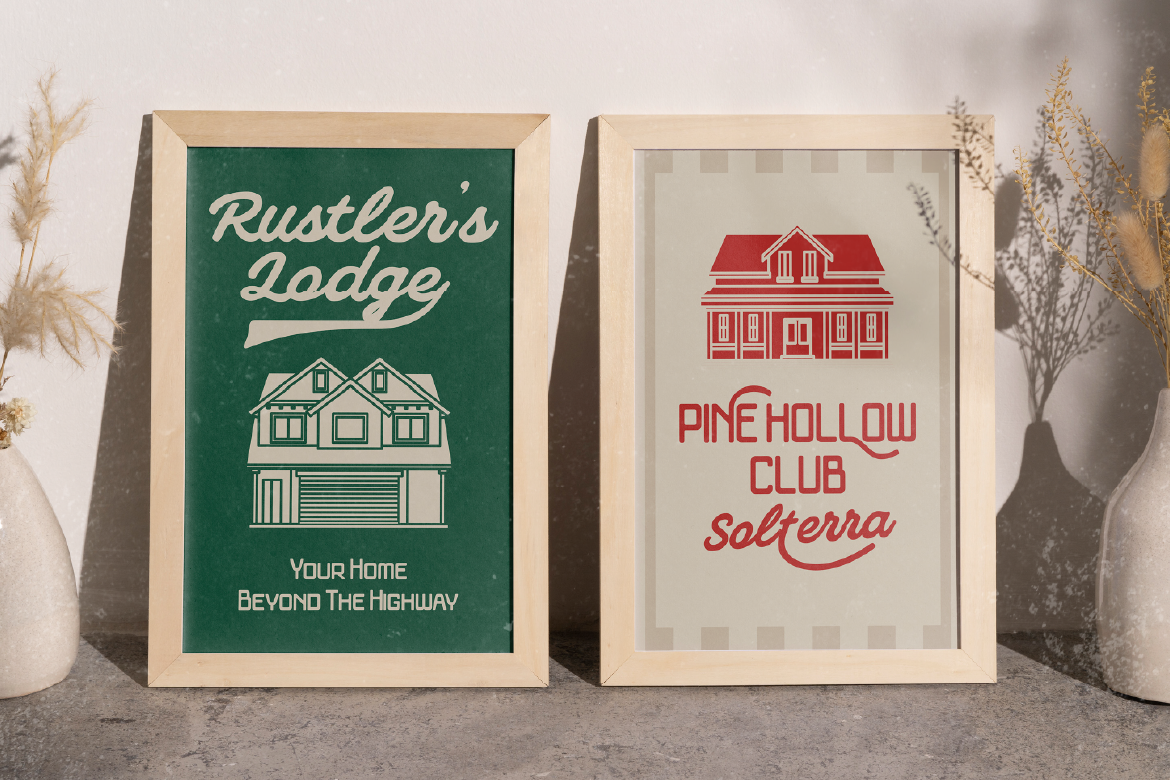
Best Font Duo for Logos: How to Create Instant Visual Hierarchy
Stop wasting hours testing typography pairs! Discover how using the best font duo for logos gives your brand identities instant visual balance.
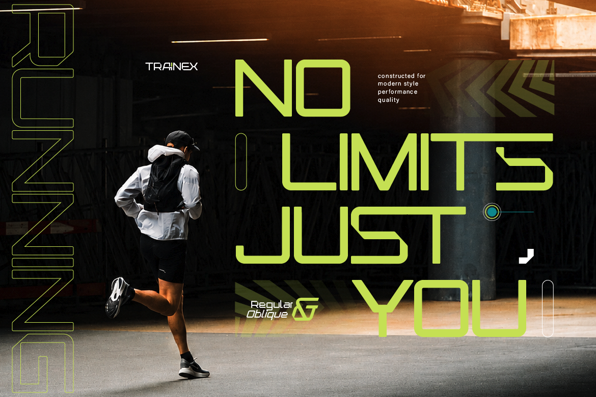
How to Fix Kerning Issues Before Printing T-Shirts
Tired of messy apparel graphics? Learn how fixing kerning issues and selecting vector-ready display fonts ensures crisp t-shirt prints every time.