Ever stared at a design and thought, “why does this look so… good?” Nine times out of ten, it’s not just the colors or layout — it’s the font pairing. Picking the right combination of typefaces can make your design feel polished and professional, while the wrong combo can make it look messy or amateur, even if everything else is perfect.
The good news? Font pairing isn’t some secret skill only designers are born with. It’s a learnable craft, and once you understand a few simple principles, you’ll start spotting good (and bad) pairings everywhere. Let’s break it down step by step.
Why Font Pairing Matters
Typography sets the tone before a single word is even read. A bold, geometric sans-serif screams “modern startup,” while an elegant serif whispers “luxury brand.” When you pair fonts well, you create visual hierarchy, guide the reader’s eye, and make your content easier to digest.
On the flip side, mismatched fonts can clash, distract, or make your design feel unbalanced — even if each font looks great on its own.
Rule #1: Contrast Is Your Best Friend
The golden rule of font pairing is contrast. You want your fonts to be different enough that they don’t compete, but similar enough that they feel like they belong together.
Some classic ways to create contrast:
- Serif + Sans-serif: A timeless combo. Use a serif for headings (elegant, traditional) and a sans-serif for body text (clean, easy to read).
- Bold + Light weights: Pair a heavy display font for headlines with a lighter weight for paragraphs.
- Wide + Narrow letterforms: Mixing a chunky display font with a slim, minimal body font creates visual interest without chaos.
Avoid pairing two fonts that look almost the same — it tends to look like a mistake rather than an intentional design choice.
Rule #2: Stick to Two (Maybe Three) Fonts Max
It’s tempting to use every cool font you find, but more isn’t better. A good rule of thumb:
- One font for headings — something with personality and presence.
- One font for body text — something clean and highly readable.
- (Optional) One accent font — for small details like buttons, labels, or quotes.
Three fonts is usually the limit. Beyond that, your design starts to feel cluttered and inconsistent.
Rule #3: Match the Mood
Every font has a personality. Before pairing, ask yourself: what feeling am I trying to create?
- Playful & fun → rounded sans-serifs, hand-lettered scripts
- Elegant & luxurious → high-contrast serifs, refined script accents
- Modern & minimal → geometric sans-serifs with lots of whitespace
- Bold & energetic → display fonts with strong weight and character
Your fonts should tell the same story. A whimsical script paired with a stiff corporate sans-serif, for example, sends mixed signals to your audience.
Rule #4: Pay Attention to X-Height and Proportions
This one’s a bit more technical, but stick with us — it makes a huge difference. X-height refers to the height of lowercase letters (like “x”) relative to the font’s overall size.
When pairing fonts, try to choose typefaces with similar x-heights. If one font has a much larger x-height than the other, they’ll look mismatched in size even when set at the same point size, throwing off your visual balance.
A quick tip: type out the same sentence in both fonts at the same size and place them side by side. If one looks noticeably bigger or smaller, you may need to adjust the sizing manually.
Rule #5: Use Pairing Tools (Especially as a Beginner)
You don’t have to guess your way through this. There are tons of resources that suggest tried-and-tested font combinations:
- Font marketplaces like ArtisanFont often include style guides or recommended pairings for each typeface — a huge time-saver.
- Pairing tools and generators let you preview combinations live before committing.
- Look at design inspiration sites (Pinterest, Behance, Dribbble) and study what fonts are being used in designs you admire.
Pro tip: when you find a font you love, check if the foundry or designer has listed “recommended pairings” — this is basically a cheat sheet made by people who know the font inside and out.
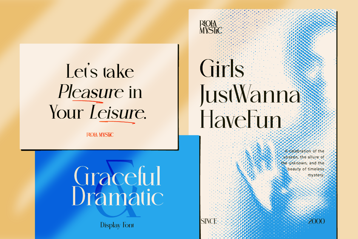
ArtisanFont Pairing Combos to Try
Want some real-world inspiration? Here are a few pairing ideas using fonts from the ArtisanFont collection — perfect if you’re already browsing for your next project:
- Foramte (headings) + Cantilos (body) — Foramte’s elegant serif details give your headlines a touch of luxury, while Cantilos’ clean, minimalist style keeps body text easy to read. Great for high-end branding, editorial layouts, or boutique websites.
- Flanky (headings) + Cantilos (body) — Flanky is a bold, chunky sans-serif with playful character (perfect for food or lifestyle branding), paired with Cantilos for clean, no-fuss body text. The contrast in weight creates strong visual hierarchy without feeling cluttered.
- Truewild (headings) + Cantilos (body) — Truewild’s western slab-serif style brings a rustic, vintage personality, balanced nicely by Cantilos’ modern simplicity. Ideal for cafes, rustic brands, or anything with a “handmade” feel.
- Lisaline (accent/logo) + Cantilos (body) + Foramte (headings) — A three-font combo for projects that need extra personality. Use Lisaline’s elegant script sparingly — for logos, quotes, or small accents — while Foramte and Cantilos handle the heavy lifting for headings and body text.
- Veltcon (display) + Cantilos (body) — Veltcon already combines a wide sans-serif with a vintage script in one font family, making it a great all-in-one display option. Pair it with Cantilos for clean supporting text, and you’ve got a combo that feels curated without overdoing it.
💡 Tip: Notice how Cantilos keeps showing up? That’s intentional — a clean, minimalist font like Cantilos is super versatile and pairs well with almost any display or headline font with more personality. If you’re just starting out, having one reliable “workhorse” body font in your toolkit makes pairing way less stressful.
Common Font Pairing Mistakes to Avoid
- ❌ Using two decorative or display fonts together — they’ll fight for attention.
- ❌ Pairing fonts with wildly different x-heights without adjusting sizes.
- ❌ Ignoring readability for the sake of “looking cool” — body text especially needs to be easy on the eyes.
- ❌ Mixing too many styles (e.g., a script, a serif, AND a bold sans-serif all in one design).
Trust Your Eyes (and Practice)
At the end of the day, font pairing is part science, part art. The “rules” above are great starting points, but the more you practice — and the more designs you study — the more your instincts will sharpen. Try different combinations, step back, and ask yourself: does this feel balanced? Does it match the mood I’m going for?
If you’re looking for high-quality fonts to start experimenting with, browse the collection at ArtisanFont — many of our typefaces come with pairing suggestions to help you build beautiful designs faster, even if you’re just getting started.