script font

How to Style Aesthetic Script Fonts for Elegant Branding

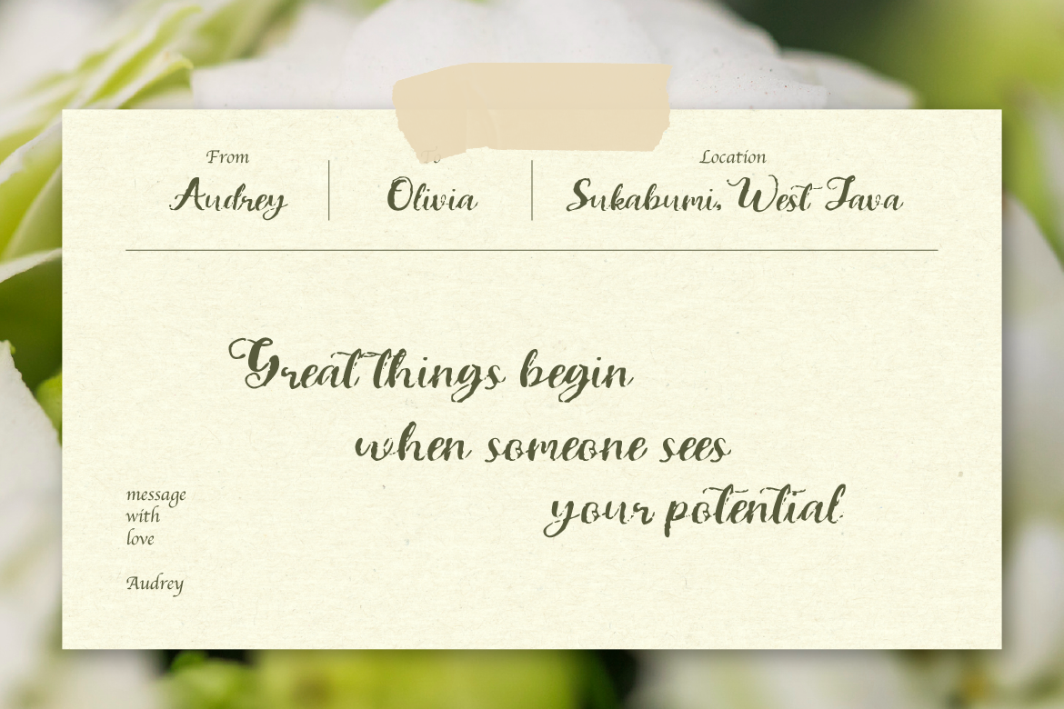
From luxury boutique logos to romantic wedding stationery, hand-drawn typography brings an irreplaceable human touch to graphic design. Incorporating aesthetic script fonts into your visual projects allows you to express elegance, warmth, and sophistication effortlessly.

However, cursive typefaces require careful handling to keep them legible. Here is how to style script typography like a professional designer.

1. Never Use Script Fonts in ALL CAPS

Cursive and handwritten letters are designed to connect smoothly from one character to the next. Typing an entire word in uppercase script breaks these natural connecting strokes, making the text completely unreadable. Always use title case or lowercase when applying aesthetic script fonts.

2. Give Cursive Lettering Plenty of Breathing Room

Because script lettering features intricate loops, swoashes, and delicate lines, crowding it with other graphic elements will make your design look messy. Surround your script text with generous white space (empty space) so its graceful curves stand out clearly.

3. Use Script Fonts for Subtle Accents and Signatures

Script fonts carry heavy emotional weight, so a little goes a long way. Instead of using cursive for long paragraphs, use it strategically for:

  • Brand taglines or short signature accents beneath a primary logo.
  • Callout words on social media banners (e.g., “Special Edition” or “With Love”).
  • Elegant monograms and custom package seals.

Ready to add a sophisticated touch to your next project? Discover our beautiful library of aesthetic script fonts today!

Related Blog