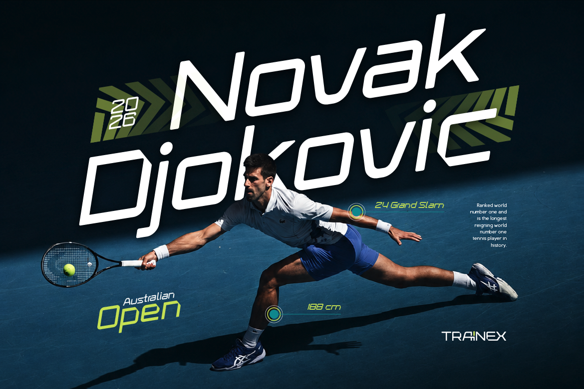
Best Sport Fonts for Apparel and Gym Merchandise
Power up your clothing line! Discover the best sport fonts for apparel that print cleanly on hoodies, varsity tees, and motorsports merchandise.

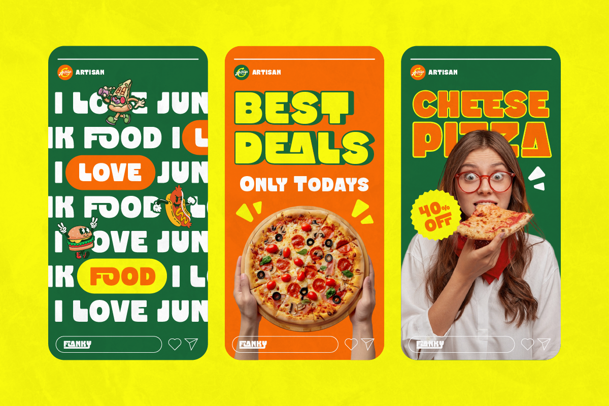
Best Sport Fonts for Apparel and Gym Merchandise
Power up your clothing line! Discover the best sport fonts for apparel that print cleanly on hoodies, varsity tees, and motorsports merchandise.

Best Retro Display Fonts for Nostalgic Food Packaging
Bring back 70s nostalgic charm! Discover the best retro display fonts to elevate your artisan food packaging, sticker merch, and product logos effortlessly.
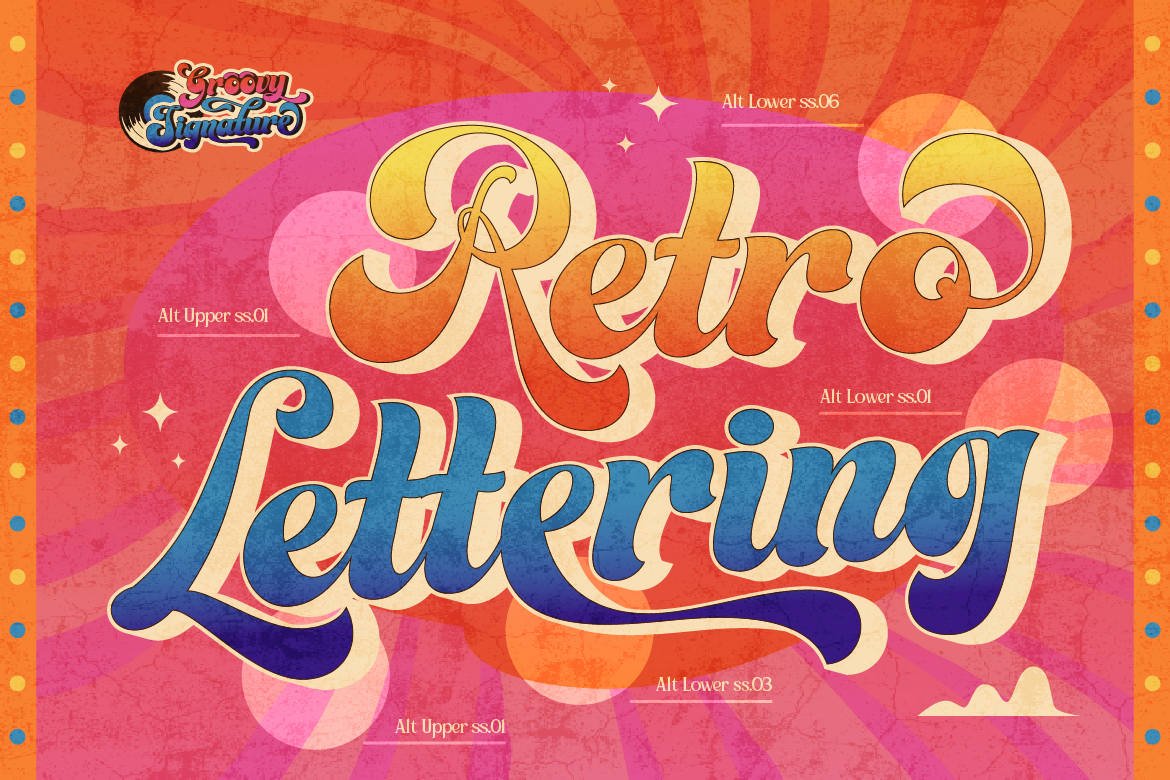
The Ultimate Guide to Vintage Sign & Retro Display Fonts for Branding
Looking to add authentic heritage and nostalgia to your brand? Discover how vintage sign painting and retro display typography elevate modern packaging and logos.