
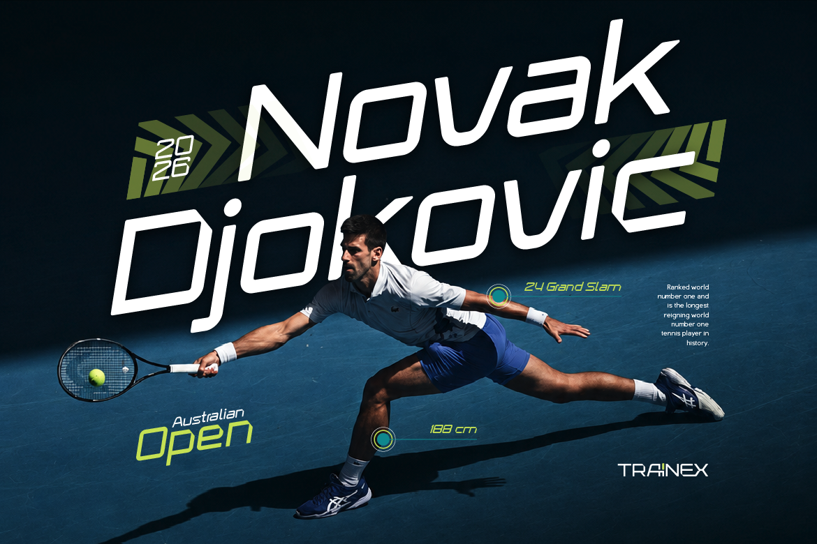
Best Sport Fonts for Apparel and Gym Merchandise
Power up your clothing line! Discover the best sport fonts for apparel that print cleanly on hoodies, varsity tees, and motorsports merchandise.
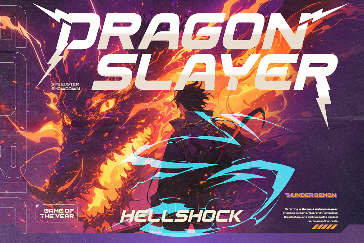
Display fonts are irresistible. You see one with a bold, dramatic personality — maybe it’s got thick slabs, wild textures, or an unusual shape — and you immediately want to use it everywhere. On your logo, your headers, your social posts, your packaging. All of it.
And then you do, and something feels… off. Instead of looking bold and confident, the design feels cluttered. Overwhelming. Hard to read. Like too many people talking at once.
Sound familiar? You’re not alone. Display fonts are powerful — but that power needs to be directed. Here’s how to use them well.
Display fonts — also called decorative fonts — are typefaces designed specifically to be used at large sizes for maximum visual impact. They’re the showoffs of the font world: dramatic, expressive, and full of personality.
Unlike body text fonts (designed to be readable at small sizes for long stretches), display fonts prioritize character over comfort. They’re built to grab attention, not to be read for paragraphs at a time.
Think of fonts like Rushmax’s bold display energy, Granix’s futuristic Y2K style, or Glorea’s inline sport aesthetic from Artisan Font’s collection. These are fonts that make a statement the moment you see them. That’s exactly what they’re supposed to do — in the right context.
This is the single most important rule when working with display fonts: pick one and commit to it. Using two or more display fonts in the same design creates visual chaos. Each one is fighting for attention, and the result is that nothing stands out.
Think of a display font like the lead singer of a band. There can only be one. Everything else in the design — the supporting typography, the colors, the layout — should be backing them up, not competing with them.
If you fall in love with two display fonts, save one for another project. Your designs will thank you.
Display fonts are built for impact at large sizes — headlines, titles, poster text, logo treatments. They start to break down at smaller sizes, losing the details and character that make them special.
More importantly, they’re exhausting to read in large amounts. A few words in a bold display font is exciting. A paragraph in that same font is a chore.
The rule of thumb: use your display font for the headline or main title, then switch to something clean and neutral for everything else. This is where a well-chosen body font makes all the difference — it lets the display font shine without burning out your reader.
Display fonts need room. When you cram a bold, dramatic typeface into a tight space surrounded by other elements, it loses its power. The visual weight of the font competes with everything around it and the result is claustrophobic.
Gheno’s layered sport slab design from Artisan Font, for example, looks incredible when it has generous white space around it. That breathing room is what lets the font’s complexity read clearly rather than turning into visual noise.
Practically speaking: increase the margins around your display text, reduce the number of competing elements nearby, and let it be the focal point it was designed to be.
Every great display font needs a neutral partner. This is the font that handles all the supporting text — descriptions, captions, body copy, secondary headlines. It should be clean, simple, and unobtrusive.
The contrast between a bold, expressive display font and a clean neutral font is one of the most effective typographic moves in design. The display font brings the drama; the neutral font brings the calm. Together they create visual hierarchy and make the design easy to navigate.
A simple sans-serif or a clean serif makes the perfect partner for most display fonts. The more dramatic the display font, the simpler the partner should be.
Not all display fonts work in all environments. Some are designed for print and look incredible on a poster but render poorly on a screen. Others are optimized for digital use. Some need to be seen at poster-scale to truly shine; others work well even at moderate sizes.
Before committing to a display font, test it in the actual environment where it will be used. If it’s for Instagram content, preview it on your phone screen. If it’s for a printed banner, mock it up at scale. The difference between how a font looks in a preview and how it looks in context can be significant.
Trivox’s modern sport font energy from Artisan Font, for instance, reads brilliantly at large scale on digital screens — bold, clear, and impactful. Knowing that before you build your design saves time and frustration.
Display fonts are incredibly expressive — which means they can easily clash with the content they’re presenting if you’re not careful. A heavy metal-style display font on a children’s birthday invitation is wrong not because it’s a bad font, but because it’s the wrong font for that context.
Always ask: does this font’s personality match what this piece of content is communicating? Broteli’s circus display energy is perfect for fun, playful, or event-driven content. Granix’s futuristic style fits tech, gaming, or cutting-edge brand content. The font should feel like a natural extension of the message — not a contradiction of it.
When the font and the content are aligned, the design feels effortless. When they clash, even beautiful fonts can make a design feel confused.
Display fonts are some of the most exciting and expressive tools in a designer’s toolkit. The key to using them well is restraint — knowing when to let them take center stage, and when to step back and let the rest of the design support them.
When you get that balance right, a great display font can transform a design from ordinary to unforgettable.
Ready to find your next statement font? Browse the display font collection at Artisan Font and find the one that’s been waiting for your next project.
Best Sport Fonts for Apparel and Gym Merchandise
Power up your clothing line! Discover the best sport fonts for apparel that print cleanly on hoodies, varsity tees, and motorsports merchandise.
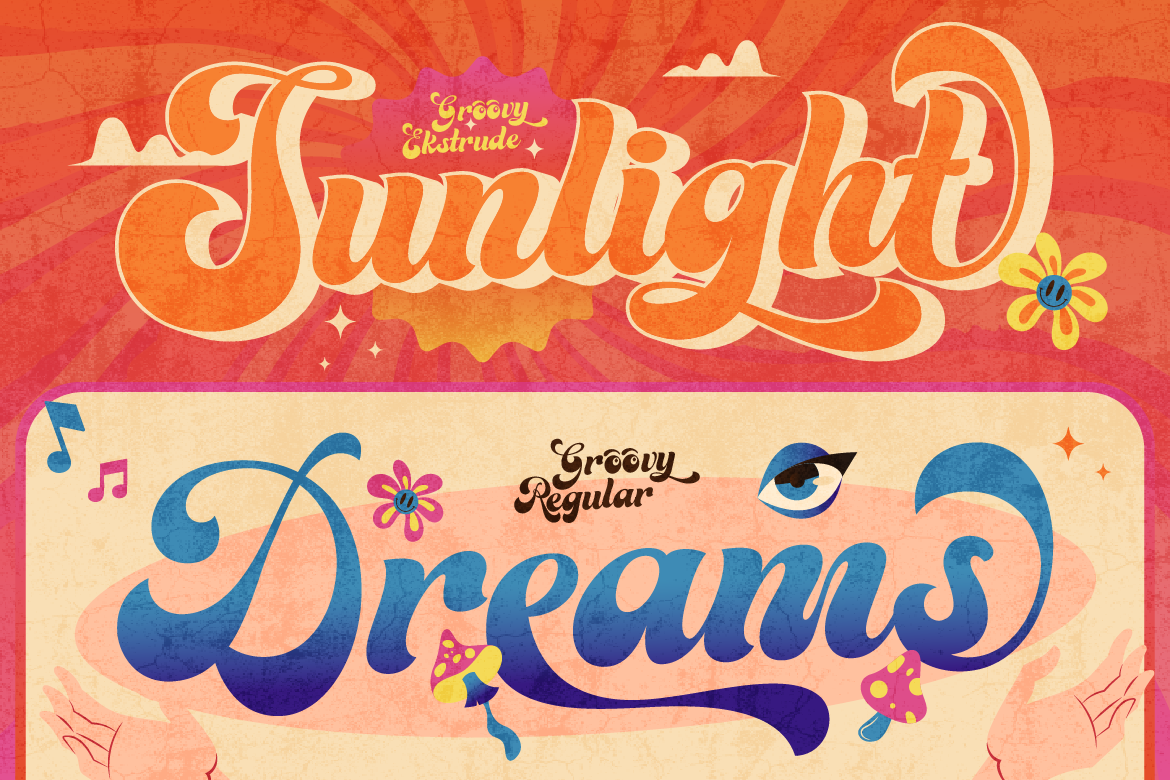
Best Retro Display Fonts for Nostalgic Food Packaging
Bring back 70s nostalgic charm! Discover the best retro display fonts to elevate your artisan food packaging, sticker merch, and product logos effortlessly.
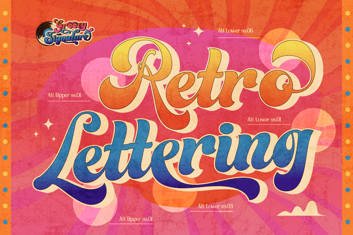
The Ultimate Guide to Vintage Sign & Retro Display Fonts for Branding
Looking to add authentic heritage and nostalgia to your brand? Discover how vintage sign painting and retro display typography elevate modern packaging and logos.