modern sport fonts

How to Fuel Your Designs with Modern Sport Fonts

Athletic brands, gym apparel, and automotive logos all share one key requirement: their visual identity must convey movement, power, and high energy. Choosing the right modern sport fonts allows you to instantly inject speed and strength into your graphic design projects.

Whether you are designing varsity jackets, fitness social media posts, or racing graphics, here are three essential tips for working with athletic typography.

1. Look for Sharp Angles and Dynamic Slants

Sport typography relies heavily on geometry to express speed. Fonts with sharp corners, blocky letterforms, or forward-slanted italics naturally create a feeling of forward motion. When selecting a typeface, choose strong geometric weights that stand firm on the page.

2. Utilize Modern Sport Fonts for Apparel and Merch

Athletic fonts are practically built for physical merchandise. Because they feature thick strokes and solid structures, they print exceptionally well on fabrics using screen printing or embroidery:

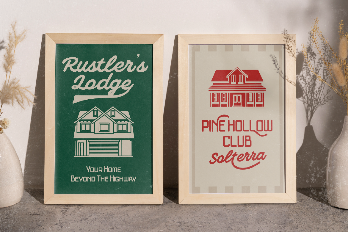
  • Varsity & Block Styles: Perfect for college-style hoodies, caps, and team jerseys.
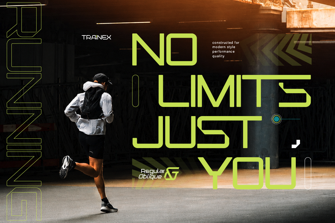
  • Futuristic & Automotive Styles: Ideal for gym wear, esports branding, and motorsport graphics.

3. Keep Letter Spacing Tight for Maximum Impact

While general body text requires wide spacing for legibility, headlines using athletic fonts often look more aggressive and cohesive when letter spacing (kerning) is kept slightly tight. Compact lettering creates a solid visual block that feels impactful and bold.

Ready to elevate your athletic branding? Browse our fresh selection of modern sport fonts crafted specifically for high-octane designs!

Related Blog