Script fonts are some of the most popular typefaces around — and for good reason. They’re elegant, expressive, and can add a personal, handcrafted feel to almost any design. But they’re also one of the most misused font styles out there.
Used well, a script font looks stunning. Used carelessly, it can make a design feel dated, cluttered, or unprofessional. The difference often comes down to a few key decisions. Here’s how to get it right.
First, Know Your Script Font Types
Not all script fonts are the same. Understanding the main categories helps you pick the right one for your project:
Formal scripts — Inspired by traditional calligraphy and copperplate penmanship. Think flowing, connected letterforms with elegant flourishes. Great for luxury brands, wedding stationery, and high-end packaging.
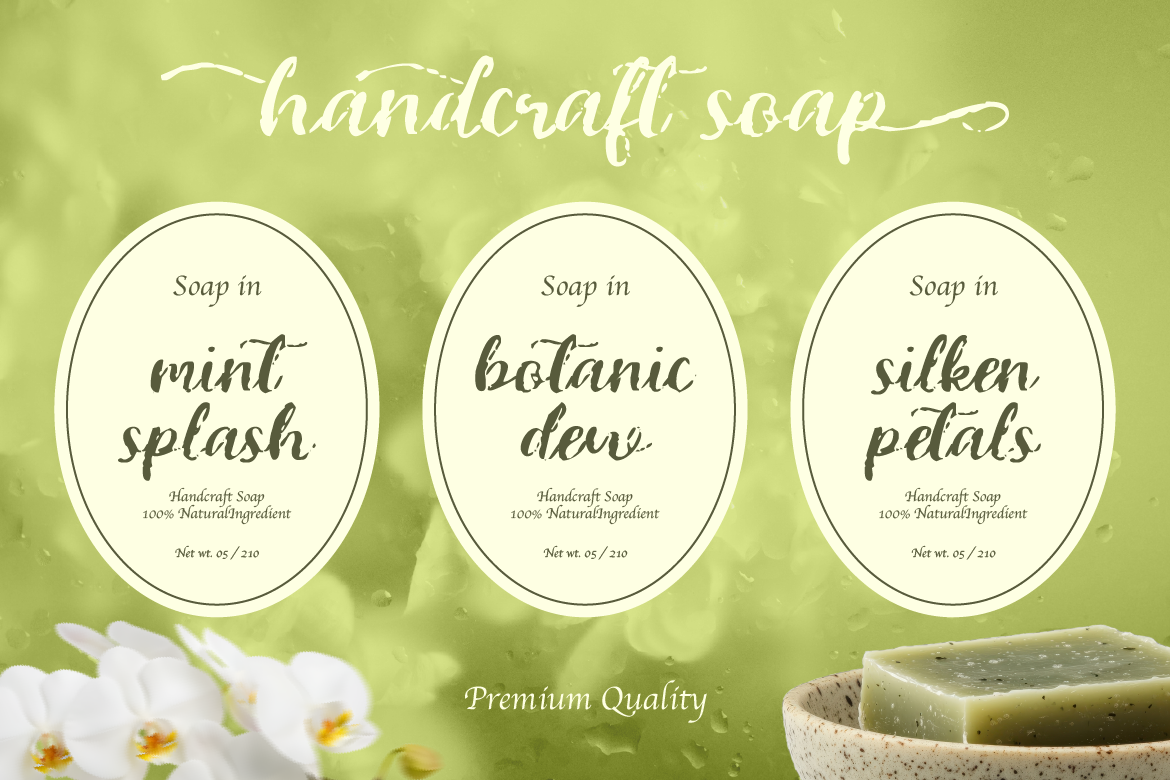
Casual scripts — Looser, more relaxed handwritten styles. Feel approachable and friendly rather than formal. Great for lifestyle brands, food packaging, and social media content.
Brush scripts — Bold, textured strokes that look like they were painted with a brush. Feel energetic and creative. Great for branding, apparel, and bold display use.
Signature scripts — Designed to mimic a personal signature. Feel intimate, personal, and authentic. Great for personal brands, boutiques, and artisan products.
Knowing which type you’re working with helps you match it to the right context — and avoid putting a casual brush script on a luxury brand’s packaging (or vice versa).
Rule #1: Never Use Script for Body Text
This is the golden rule. Script fonts are designed for short bursts of text — a name, a tagline, a headline, a single word. The moment you start using one for full sentences or paragraphs, readability drops fast.
If your audience has to squint, slow down, or re-read to understand what a font says, it’s failing its job. Save script fonts for the spotlight — one key phrase or element per design — and use a clean, readable font for everything else.
Rule #2: Size Matters More Than You Think
Script fonts need to be large enough to read clearly. A lot of their beauty comes from the details — the loops, the connections between letters, the subtle stroke variations — and those details disappear at small sizes.
Before finalizing your design, test your script font at the actual size it will appear. What looks elegant at 200pt in your design software might become a muddy mess at 24pt on a printed product label.
Rule #3: Don’t Stack Script Fonts
Pairing two script fonts in the same design almost never works. They’ll compete with each other, create visual noise, and make the whole thing feel overdone.
Instead, pair your script font with something that creates clear contrast — a clean sans-serif, a simple serif, or a bold display font. The contrast is what makes both fonts look better. Script fonts shine brightest when they’re the only expressive element in the design.
Rule #4: Watch Your Letter Spacing
Script fonts are designed to flow naturally — so be careful about adjusting letter spacing (tracking). Adding too much space between letters breaks the visual connection between characters, which can make a script font look disjointed and awkward.
If you need to adjust spacing, do it subtly and check the result at multiple sizes. Some script fonts are more flexible than others, but the general rule is: less is more.
Rule #5: Use Alternates and Swashes Intentionally
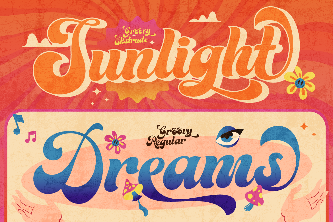
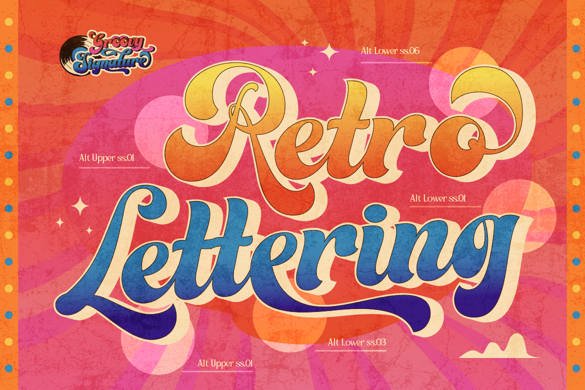
Many high-quality script fonts come with stylistic alternates — different versions of certain letters that can add extra flair or change the visual rhythm of a word. Swashes (extended, decorative strokes on certain letters) are a great example.
These extras can elevate your design — but only when used sparingly. Swashing every letter, or using alternates randomly without a clear visual logic, quickly tips from elegant to chaotic.
A good approach: use a swash or alternate on the first or last letter of a word, or on a key letter that anchors the visual composition. That’s it.
Rule #6: Contrast Is Everything
The biggest reason script fonts look “cheap” in many designs? They’re surrounded by other design elements at the same visual weight. Script fonts need contrast to breathe — contrast in size, contrast in weight, contrast in style.
Try pairing a delicate script headline with a bold, all-caps sans-serif subheading. Or place a large script word against a minimal, open layout with lots of white space. The script becomes the focal point, and the whole design feels elevated.
Final Thoughts
Script fonts aren’t hard to use — they just require a bit more intentionality than other font styles. Keep them large, keep them short, give them contrast, and let them breathe. When you do, they can add a level of warmth and personality to your designs that no other font style can replicate.
Looking for a script font that’s built for elegance and versatility? Browse the ArtisanFont collection and find the one that fits your project’s vibe.