Here’s something most people don’t realize: you form an opinion about a brand before you read a single word of their copy. The font alone — its shape, weight, and style — triggers an emotional response almost instantly.
That’s not magic. That’s typography psychology. And once you understand it, you’ll never look at fonts the same way again.
Why Fonts Make Us Feel Things
Our brains are pattern-recognition machines. Over a lifetime of reading, we build deep associations between certain visual shapes and specific emotions, contexts, and values. A font with sharp, angular letterforms triggers different associations than one with soft, rounded curves — even when the words are identical.
Designers who understand this use typography deliberately, choosing fonts that reinforce the message they want to communicate rather than accidentally contradict it.
The Emotional Personalities of Font Styles
Different font categories consistently evoke different emotional responses. Here’s a breakdown:
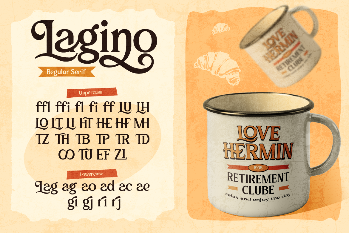
Serif fonts feel trustworthy, established, and authoritative. The small “feet” at the ends of letterforms give a sense of stability and tradition. That’s why law firms, financial institutions, and legacy publications tend to use serifs — they signal reliability and history.
Sans-serif fonts feel clean, modern, and approachable. Without the decorative feet, they look forward-thinking and minimal. Tech companies, startups, and lifestyle brands gravitate toward sans-serifs because they feel open and accessible.
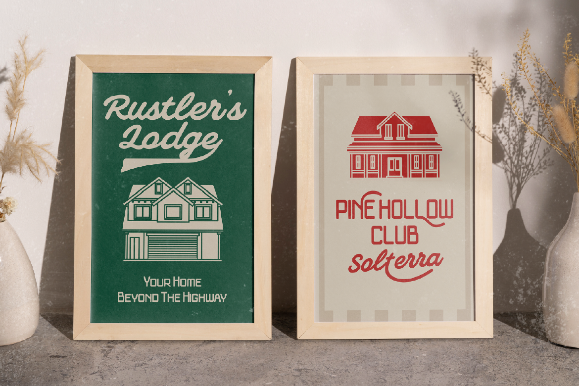
Script and handwritten fonts feel personal, warm, and human. They suggest something handcrafted, intimate, or artisanal. Used well, they build an emotional connection — making a brand feel less corporate and more like a person you’d want to know.
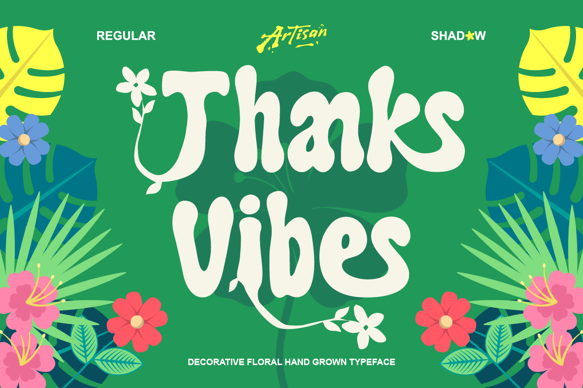
Display and decorative fonts feel bold, expressive, and distinctive. They carry the strongest personality of any font category, which is exactly why they work so well for branding. The right display font can make a single word feel adventurous, dramatic, playful, or powerful.
Monospaced / typewriter fonts feel technical, retro, and authentic. They evoke the precision of code or the nostalgia of old documents — great for brands that want to feel transparent, honest, or maker-focused.
Weight and Thickness: The Unspoken Signal
Beyond font style, font weight sends its own psychological signals:
- Heavy, bold fonts feel strong, confident, and loud — they demand attention and project authority
- Light, thin fonts feel delicate, sophisticated, and refined — they whisper rather than shout
- Medium weights feel balanced and approachable — the “friendly professional” of typography
This is why a luxury brand might use a light-weight serif for its logo while a sports brand uses a heavy bold sans-serif. Same category of font, completely different feeling.
Shape Psychology: Round vs. Sharp
Even within the same font style, the shape of individual letterforms carries meaning:
Round, curved letterforms feel friendly, soft, and approachable. They’re used frequently in brands targeting children, wellness, food, and lifestyle. Rounded shapes subconsciously signal safety and warmth.
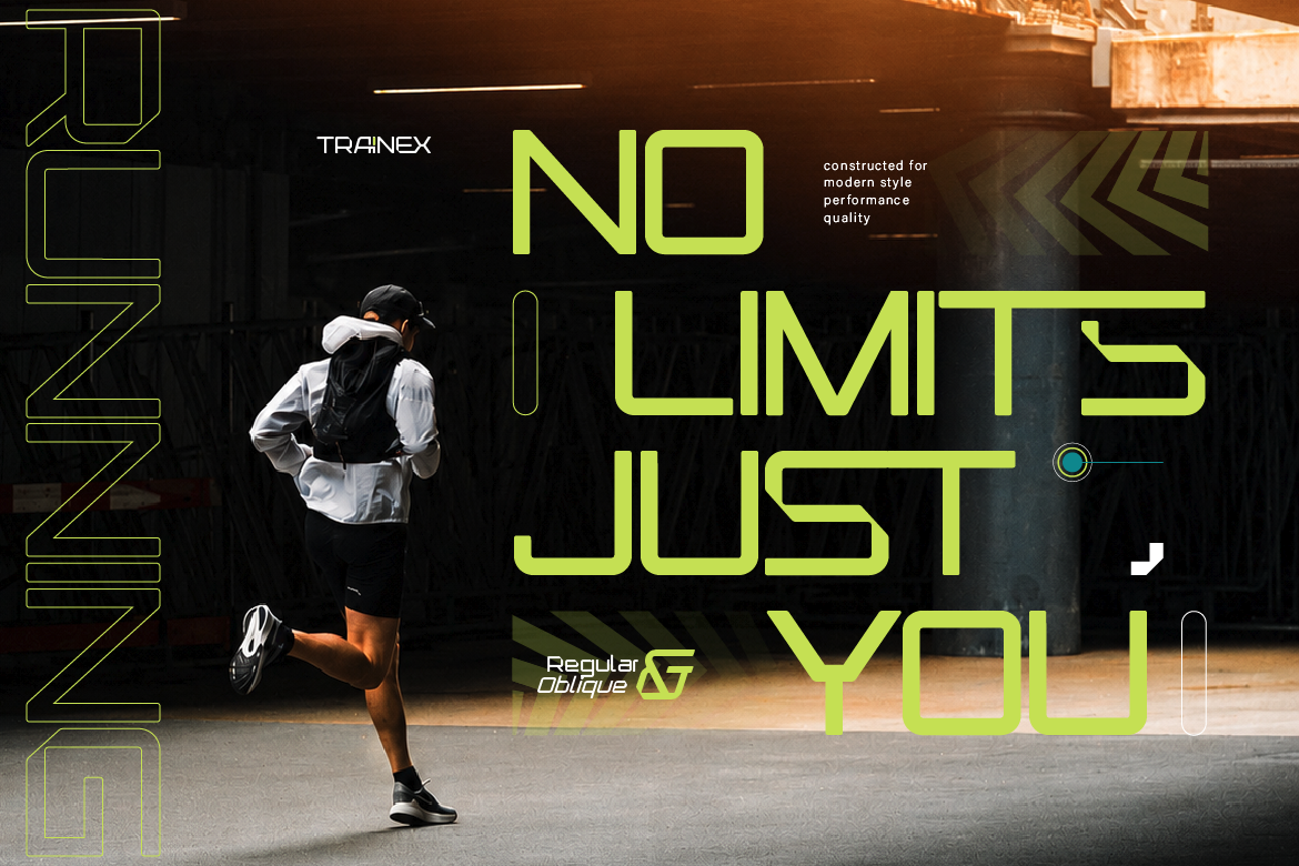
Angular, sharp letterforms feel precise, strong, and serious. They project confidence and edge — common in tech, finance, automotive, and fashion brands that want to feel sharp and authoritative.
Typography and Color: A Combined Signal
Typography doesn’t work in isolation — it interacts with the colors around it. The same font can feel completely different depending on its color context.
A playful script font in pastel pink feels soft and feminine. The same font in deep black with bold contrast feels dramatic and editorial. Understanding how typography and color work together lets you fine-tune the emotional signal your design sends.
Practical Tips: Using Typography Psychology in Your Work
Match your font’s personality to your brand’s personality. If your brand is warm and approachable, use rounded, friendly fonts. If it’s bold and edgy, use heavy display or angular type.
Don’t contradict your message. A delicate script font on a “hardcore fitness brand” sends a confusing signal. Alignment between font personality and brand personality builds trust.
Test with real people. Show your font choices to someone outside the project and ask them how it makes them feel — before you mention what it’s for. Their instinctive response will tell you a lot.
Use contrast intentionally. Pairing a bold display font with a minimal sans-serif doesn’t just look good — it creates a visual hierarchy that guides the reader’s emotions through the design.
Final Thoughts
Typography is never just about aesthetics. Every font choice sends a signal — about who you are, what you value, and who you’re talking to. The most effective designers treat typography as a communication tool, not just a decoration layer.
Next time you’re choosing a font, ask yourself: how do I want this to make people feel? The answer will point you straight to the right typeface. And if you’re looking for fonts with strong, intentional personalities across every style, the ArtisanFont collection is a great place to explore.