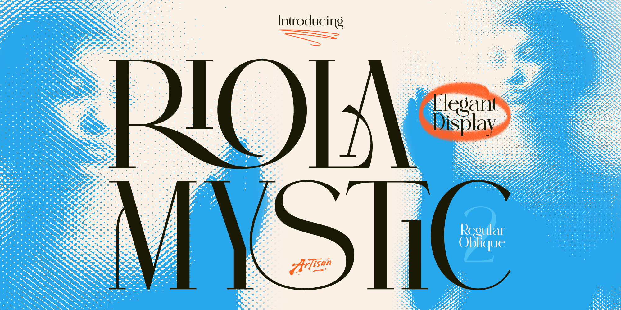
Why You Need a Mystic Elegant Display Font for Your Brand
Elevate your brand identity with a mystic elegant display font. Discover how Riola brings celestial luxury to skincare, tarot, and boutique logos.
Nostalgia sells. Coffee brands leaning into 70s diner energy, skincare labels borrowing old apothecary elegance, streetwear drops channeling a decade that predates the designer’s own birth — retro and vintage typography keeps showing up because it works. A font that looks like it’s been on a shelf for fifty years signals something a clean modern sans-serif can’t: history, warmth, a story behind the product.
The catch is that a lot of “vintage” fonts commit to one narrow decade or style and stop there, leaving a brand with a striking logo and nothing to build a full identity around. The three fonts below each carry enough built-in range — multiple styles, a matched duo, or real alternates — to support more than a single nostalgic headline.
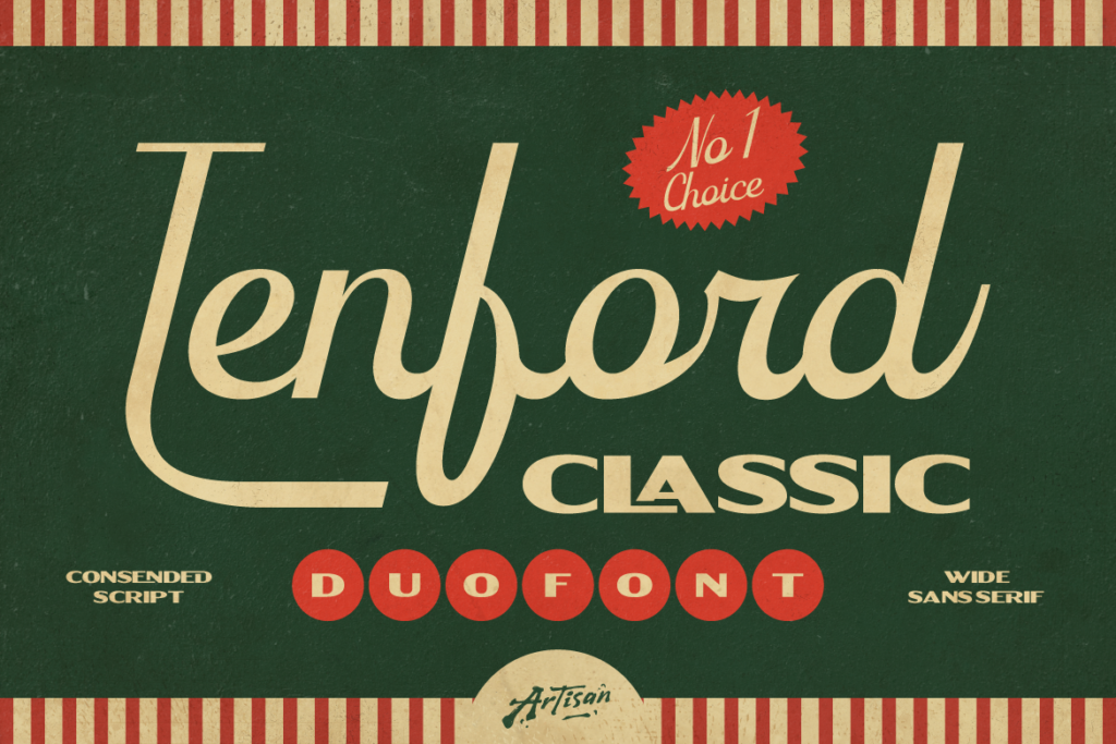
Tenford’s biggest advantage isn’t just that it looks vintage — it’s that the script and sans styles were built together, sized and weighted to sit correctly against each other without a designer having to eyeball the pairing themselves. That saves real production time on a logo lockup or packaging layout, and it avoids the mismatched-baseline, mismatched-weight problems that come from grabbing a script font from one foundry and a sans from another and hoping they work together.
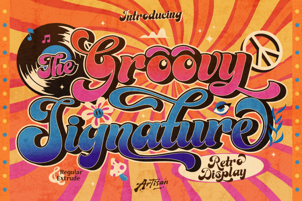
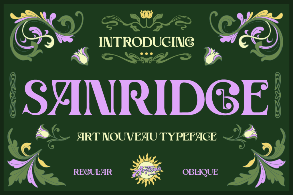
Groovy Signature and Sanridge solve a different problem: range within a single typeface. Groovy Signature’s extrude effect means a single word can carry real dimensional weight without extra design work, while Sanridge’s Oblique style gives a second, more dynamic register to pair against the Regular style — useful for a secondary tagline or an accent detail that needs to feel connected to the main logotype without literally repeating it.
The brands that pull off nostalgic design convincingly are the ones whose typography actually earns the reference — not just a vintage-looking word, but a font built with the range to carry packaging, signage, and social content without falling apart.
Explore Groovy Signature, Tenford, Sanridge, and the rest of Artisan Font‘s retro and vintage collection. Browse the catalog now and find the font that gives your next nostalgic brand some real history behind it.
Why You Need a Mystic Elegant Display Font for Your Brand
Elevate your brand identity with a mystic elegant display font. Discover how Riola brings celestial luxury to skincare, tarot, and boutique logos.
3 Spooky Halloween & Dark Fantasy Fonts
October is close enough that anyone doing seasonal design work should already be building their font shortlist — party flyers, product drops, packaging, social campaigns.
3 Retro & Vintage Fonts for Nostalgic Branding
70s psychedelic swagger, old-world Art Nouveau elegance, and a smooth vintage script-sans duo — three fonts built for brands with a nostalgic streak.