It’s one of the most fundamental decisions in typography, serif or sans serif? The two categories couldn’t feel more different, and choosing the right one can shape how your entire brand comes across. Let’s break down what makes each one unique, and how to figure out which one is right for you.
What Is a Serif Font?
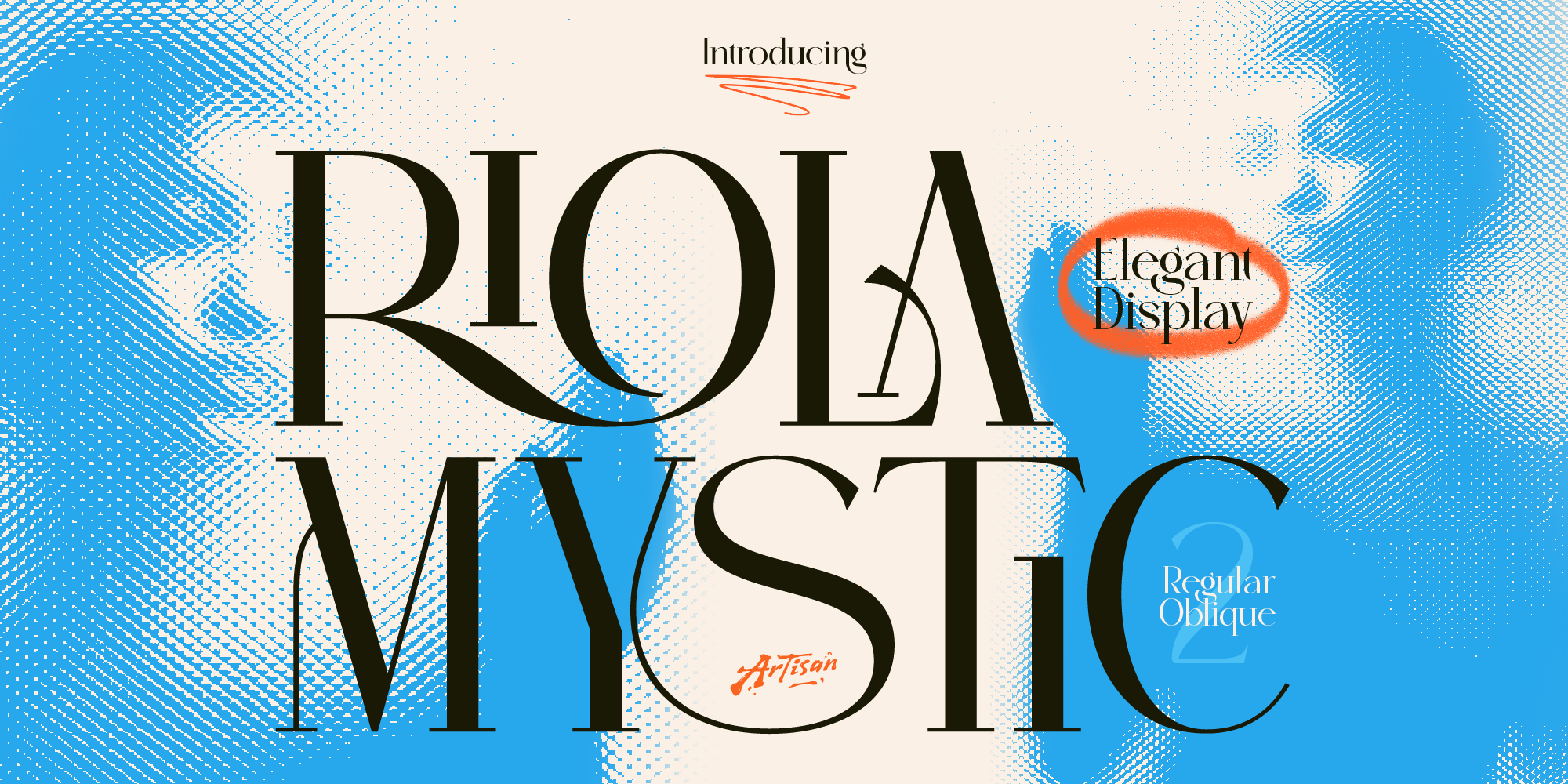
Serif fonts have small decorative strokes, called serifs, at the ends of their letters. Think of the little “feet” you see on letters in classic book typography. Serif fonts tend to feel traditional, elegant, and trustworthy, which is why you’ll see them so often in editorial design, luxury branding, and anything that wants to feel established or refined.
Serif fonts can range from classic and formal to more decorative and expressive, depending on the letterforms and detailing. They’re a great choice when you want your brand to feel timeless, sophisticated, or a little more personal.
What Is a Sans Serif Font?
Sans serif fonts, on the other hand, skip the decorative strokes entirely, “sans” literally means “without” in French. The result is a cleaner, more minimal letterform that tends to feel modern, direct, and highly readable, especially at smaller sizes or on screens.
Sans serif fonts are everywhere in tech, startups, and modern branding because they feel fresh, approachable, and easy to read across devices. If your brand leans modern, minimal, or tech-forward, sans serif is usually the safer bet.
So Which One Should You Choose?
It really comes down to the feeling you want your brand to communicate.
Choose serif if your brand wants to feel elegant, established, trustworthy, or a little more traditional. Serif fonts work beautifully for editorial content, luxury products, and anything with a storytelling or heritage angle.
Choose sans serif if your brand wants to feel modern, clean, and highly functional. Sans serif is a strong pick for digital products, tech branding, and anything that needs to prioritize readability across different screen sizes.
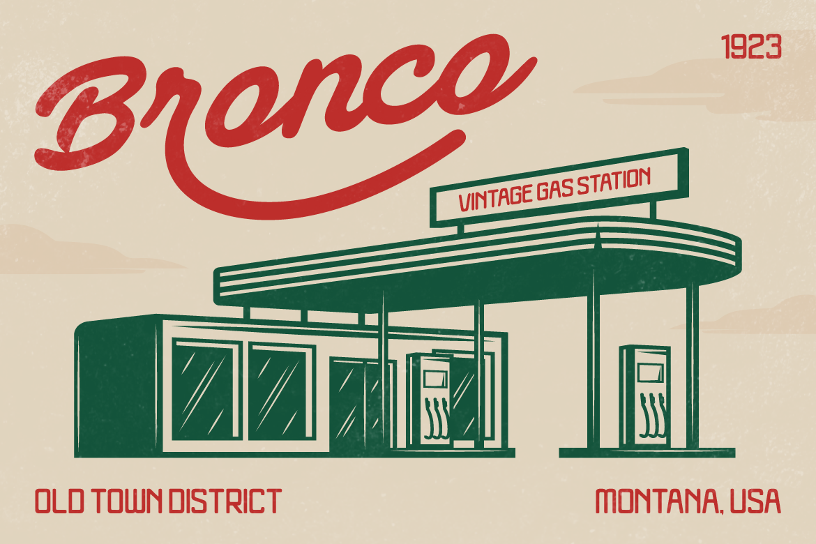
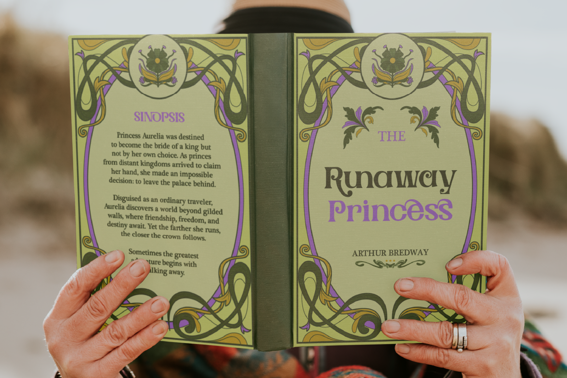
And here’s a secret: you don’t always have to pick just one. Many brands pair a serif and sans serif together, using one for headlines and the other for body text, to get the best of both worlds.
Explore Both Styles
Whether you’re leaning serif or sans serif, Artisan Font has a wide range of both styles to help bring your brand’s personality to life. Browse the full collection and find the perfect fit for your next project!