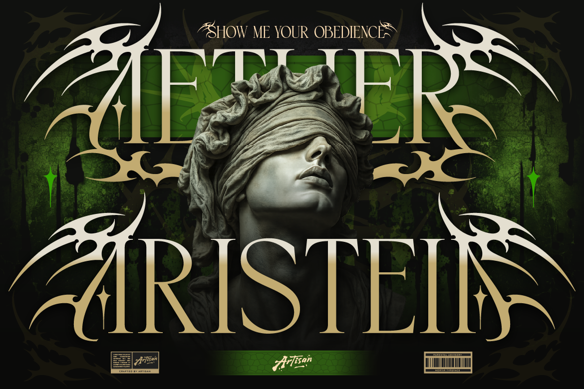
Why You Need an Ethnic Serif Font for Logos
Bring cultural texture to your packaging! Learn how using an ethnic serif font for logos like Arimels adds boho charm and authenticity to your brand.

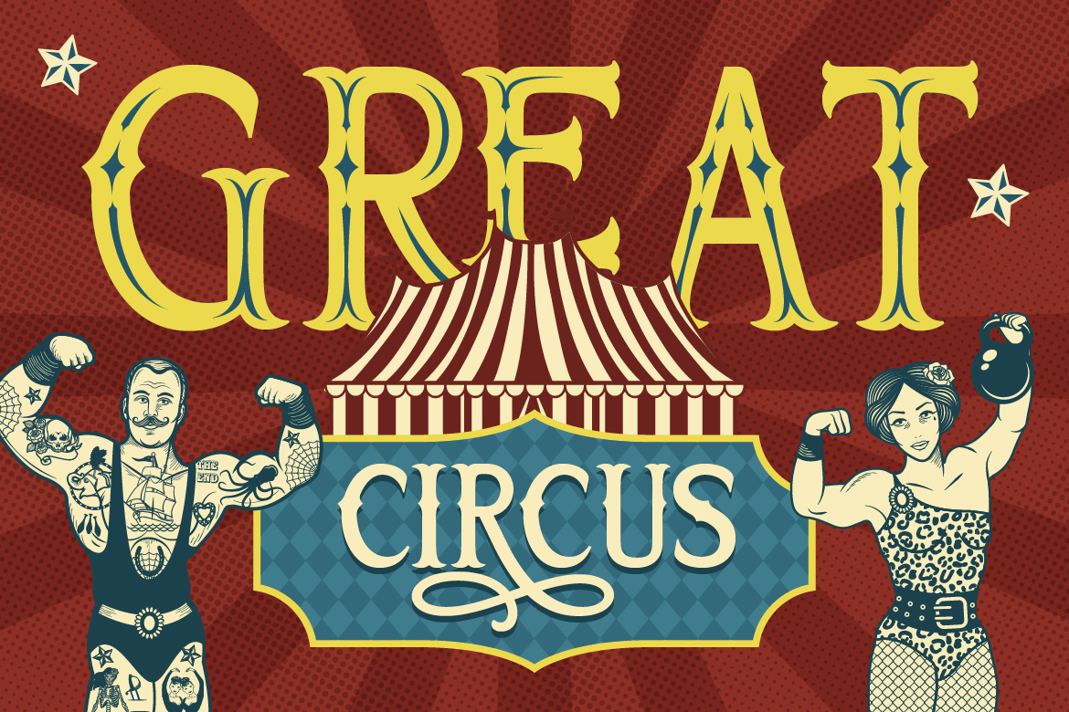
If you want your graphics to command immediate attention, subtle typography will not cut it. Theatrical display fonts from the late 19th century were designed specifically to be noticed from miles away. Incorporating vintage circus display fonts gives your creative layouts a grand, theatrical presence.
Here is how to use vintage display fonts to build bold, dramatic brand graphics.
Circus and carnival fonts feature unique decorative spurs, blocky serifs, and exaggerated letter proportions. For example, using a theatrical display font on an event poster title creates instant drama. Consequently, viewers immediately pause to read your event details.
Theatrical display fonts fit rustic, artisanal brand niches exceptionally well:
Because theatrical display typography carries intense visual personality, avoid using it for long body paragraphs. Instead, use your vintage font for main headlines, while using a clean Sans Serif for event dates, addresses, or prices. Therefore, your layout remains structured and functional.
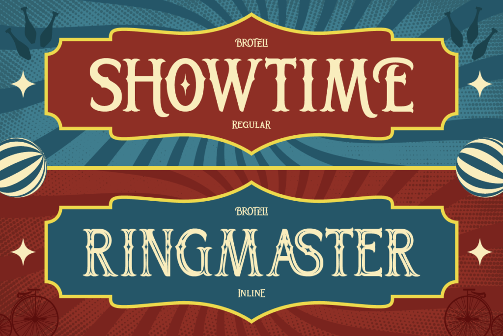
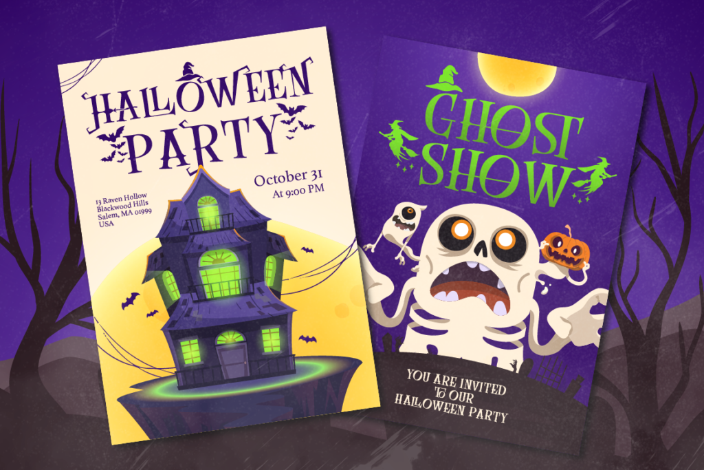
Ready to put on a show and capture attention? [Explore Broteli on Artisan Font today] and bring theatrical vintage charm to your portfolio!
Why You Need an Ethnic Serif Font for Logos
Bring cultural texture to your packaging! Learn how using an ethnic serif font for logos like Arimels adds boho charm and authenticity to your brand.
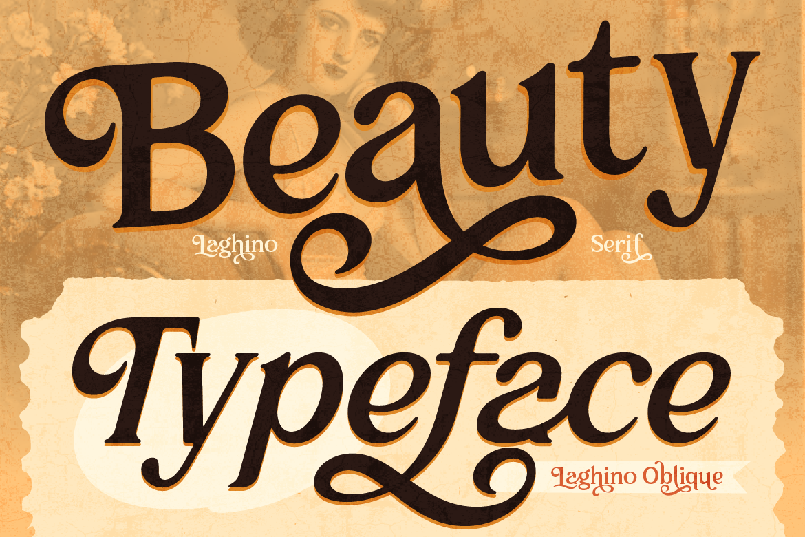
Why You Need a Luxury Serif Font for Branding
Make your brand look high-end! Learn how using a luxury serif font for branding like Laghino adds sophistication and charm to your packaging.
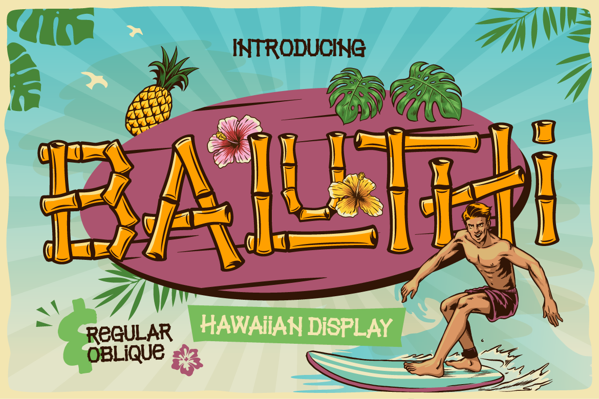
Why You Need a Bamboo Hawaiian Font for Summer Branding
Bring summer vibes to your packaging! Learn how using a bamboo hawaiian font like Baluthi adds tropical charm and fun energy to your branding.