Theatrical display typography from the late 19th century brings an irreplaceable charm to modern graphic design. When you want your graphics to command immediate attention on store shelves or social feeds, subtle lettering is not enough. Incorporating vintage circus display fonts gives your visual identity a grand, unforgettable presence.
Here is how to use vintage display fonts effectively to build bold, dramatic brand graphics.
1. Unique Decorative Details for Eye-Catching Headlines
Circus and carnival fonts feature distinctive spurs, blocky slab serifs, and exaggerated letter proportions. For example, using a decorative display font on an event banner creates instant nostalgia. Consequently, viewers immediately pause to read your title text.
2. Perfect Applications for Craft Packaging and Events
Theatrical typography fits naturally into creative, artisanal product niches:
- Artisan Food & Bakery Packaging: Adds a lively, nostalgic touch to cookie boxes and bakery bags.
- Craft Brewery Labels: Gives beer cans and cider bottles a classic vintage tavern feel.
- Festival & Party Posters: Creates striking title banners for live stage performances.
3. Pair Decorative Fonts with Simple Neutral Text
Because theatrical display typography carries intense visual personality, avoid using it for long body paragraphs. Instead, use your vintage font for main titles, while using a clean Sans Serif font for descriptions or menu prices. As a result, your overall layout remains structured and functional.
Recommended Fonts from Artisan Font
- Broteli: A vintage circus display font designed with playful curves and grand showman spurs.
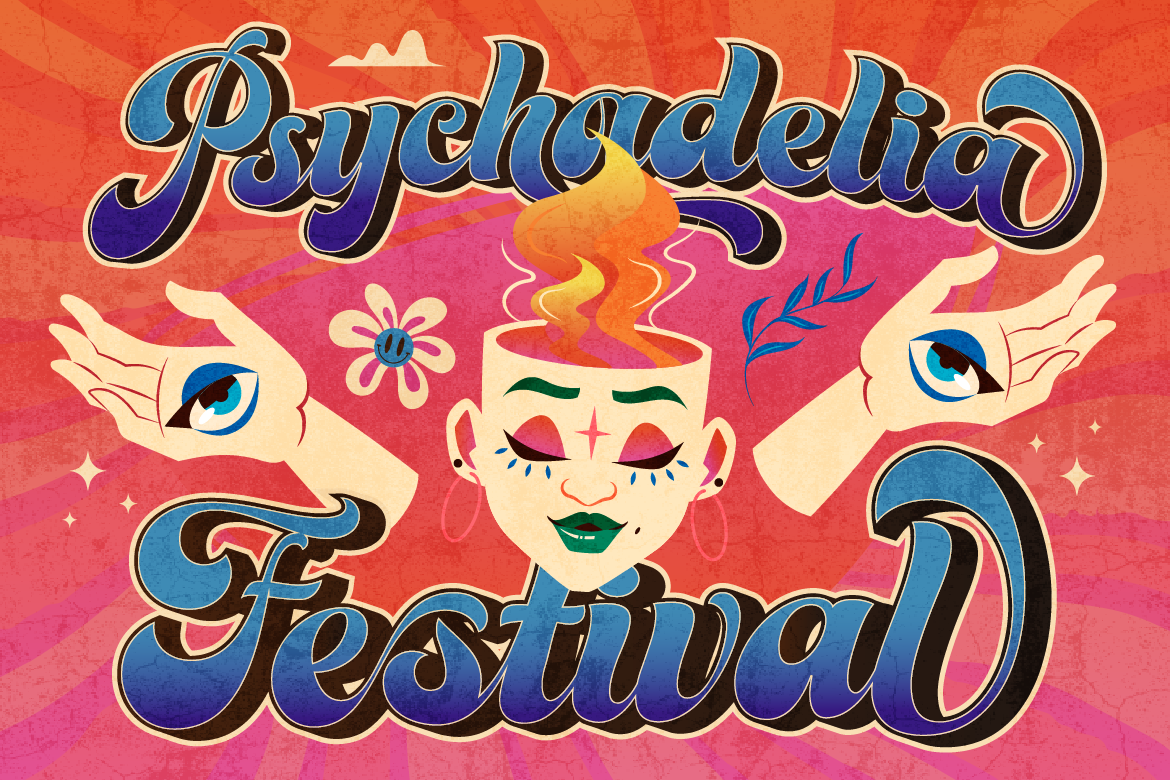
- Groovy Signature: A bold, wavy retro display font perfect for nostalgic food packaging.
Ready to put on a show and capture immediate attention? [Explore Broteli on Artisan Font today] and bring theatrical vintage charm to your next creative release!