
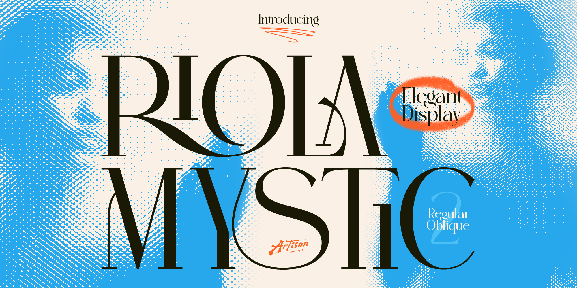
Why You Need a Mystic Elegant Display Font for Your Brand
Elevate your brand identity with a mystic elegant display font. Discover how Riola brings celestial luxury to skincare, tarot, and boutique logos.
You’ve probably heard the advice before: “make sure your brand uses professional fonts.” But what does that actually mean? Because here’s the thing — “professional” isn’t a font category you can filter by. It’s not a style, a weight, or a price point. It’s a quality that comes from several different factors working together.
And the tricky part is that an unprofessional font can quietly undermine everything else you’ve built. A well-designed website, a great product, beautiful photography — all of it can feel slightly off if the typography isn’t doing its job properly.
So let’s break down exactly what makes a font feel professional — and what to look for when you’re choosing one for your brand.
The first thing that separates a professional font from a generic one is craft. A well-made font has consistent letterforms — the curves, angles, and proportions feel deliberate, not accidental. Every character looks like it belongs to the same family.
When you zoom in on a professionally designed font, the details hold up. The spacing between letters feels balanced. The weight distribution is even. Nothing looks rushed or improvised.
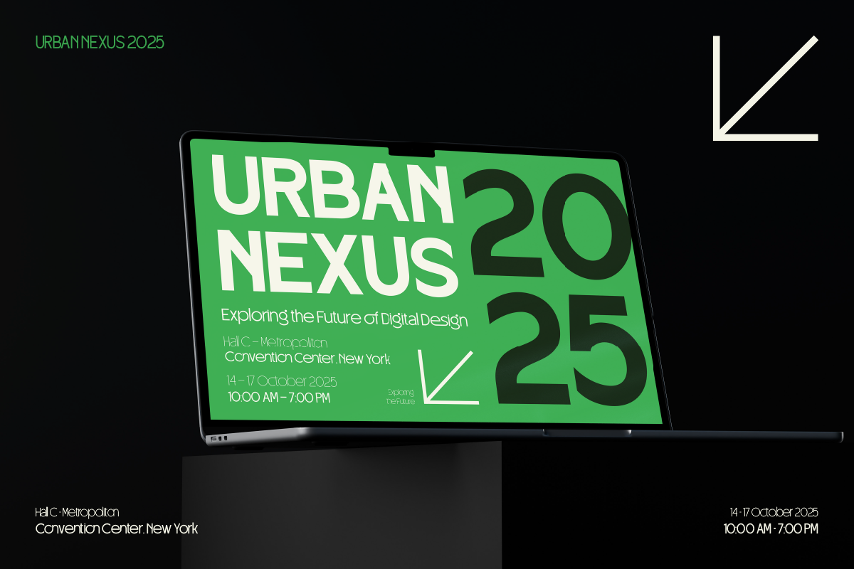
Velmora from Artisan Font is a good example of this — it’s a clean sans-serif corporate logo typeface where every letterform is considered and precise. That level of craft is exactly what makes a font feel trustworthy and polished in a brand context.
A professional font works across different sizes without falling apart. It should be just as readable in a small footer as it is in a large headline. This is especially important for brands with multiple touchpoints — website, social media, packaging, business cards.
Fonts that only look good at one specific size — usually very large — tend to feel amateur when applied to real-world brand materials. Professional fonts are built to be versatile.
Things to test:
This one is huge and often overlooked. Kerning refers to the spacing between individual letter pairs. A professionally designed font has kerning that’s been carefully adjusted so no two letters look awkwardly close or weirdly far apart.
Bad kerning is one of the fastest ways a font can look cheap or amateurish — even if the letterforms themselves are beautiful. You’ve probably seen it: a word where certain letter pairs seem to smash together while others float apart. That’s poor kerning, and it’s a red flag.
When evaluating a font, type out a full word or sentence and look at how the letters sit together. Professional fonts feel balanced and even throughout — no awkward gaps or collisions.
Here’s something a lot of people get wrong: a font that’s professional in one context can look completely wrong in another. A bold circus display font isn’t unprofessional — it’s just unprofessional for a law firm. In the right context, it’s exactly right.
Broteli, for example, is a circus display font from Artisan Font’s collection. Put it on a carnival poster, a fun brand, or a creative event — it looks fantastic and completely intentional. Put it on a financial services website and it would feel wildly out of place.
The question isn’t just “is this a good font?” but “is this the right font for this brand, this industry, this audience?” Professional typography is always contextually appropriate.
A professionally made font includes a full set of characters — not just basic A to Z, but numbers, punctuation, special characters, and ideally multiple language support. Nothing breaks the illusion of professionalism faster than a font that’s missing a character your brand needs.
Imagine designing your logo in a font, then discovering it doesn’t have an ampersand (&) or an exclamation point. Or that the numbers look completely different from the letters. These are signs of a poorly made font that wasn’t built for real-world use.
Before committing to a font, always check that it covers everything you need — especially if your brand name or tagline includes numbers, punctuation, or accented characters.
This one has nothing to do with how the font looks — but it’s a critical part of what makes a font professionally usable. A font that you can legally use for your brand, your website, your marketing, and your products is fundamentally different from one you grabbed off a free site with unclear licensing.
Professional font studios like Artisan Font provide clear commercial licenses with every purchase. You know exactly what you’re getting and what you’re allowed to do with it. That clarity is itself a sign of professionalism — both from the font creator and from you as a brand owner who takes these things seriously.
Using properly licensed fonts protects your business and signals to clients and customers that you operate with integrity.
Finally, a professional font isn’t just professional in isolation — it’s professional in the context of your entire brand system. That means it works with your colors, your imagery, your tone of voice, and your other design elements.
Strafon, for instance, has a clean and modern sans-serif quality that pairs naturally with contemporary brand aesthetics — minimal color palettes, clean layouts, modern photography. Demuffins, on the other hand, brings a playful modern sans energy that fits better with brands that have a fun, approachable personality.
The most professional-looking brands aren’t the ones using the most serious fonts — they’re the ones where everything feels cohesive and intentional. Your font should feel like it belongs in your brand world, not like it was picked randomly.
Professionalism in typography isn’t about picking the most serious or corporate-looking font. It’s about choosing a font that’s well-crafted, contextually appropriate, technically complete, and visually consistent with everything else your brand is doing.
When you get that right, your brand just looks more credible — even if your customers can’t quite explain why. And that quiet confidence is exactly what good typography is supposed to do.
Ready to find fonts that actually check all these boxes? Browse the full collection at Artisan Font — every font is professionally crafted and comes with commercial licensing included.
Why You Need a Mystic Elegant Display Font for Your Brand
Elevate your brand identity with a mystic elegant display font. Discover how Riola brings celestial luxury to skincare, tarot, and boutique logos.
3 Spooky Halloween & Dark Fantasy Fonts
October is close enough that anyone doing seasonal design work should already be building their font shortlist — party flyers, product drops, packaging, social campaigns.
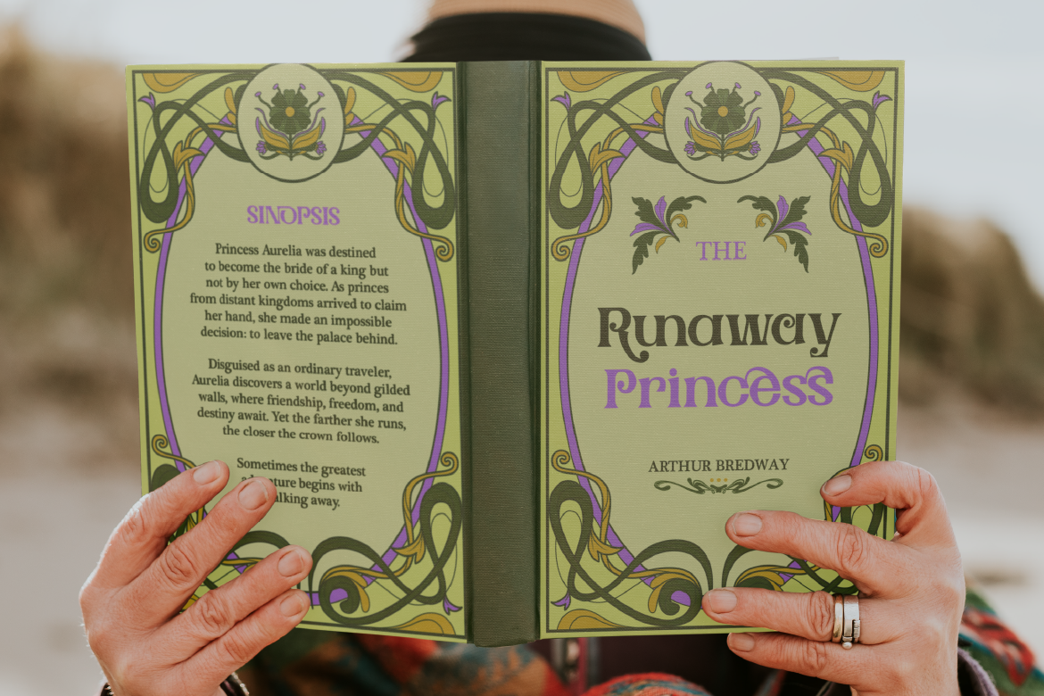
3 Retro & Vintage Fonts for Nostalgic Branding
70s psychedelic swagger, old-world Art Nouveau elegance, and a smooth vintage script-sans duo — three fonts built for brands with a nostalgic streak.