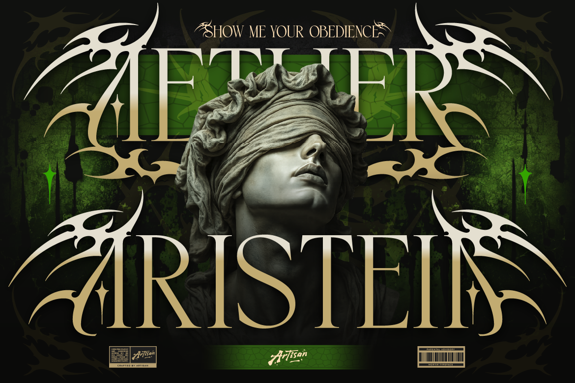
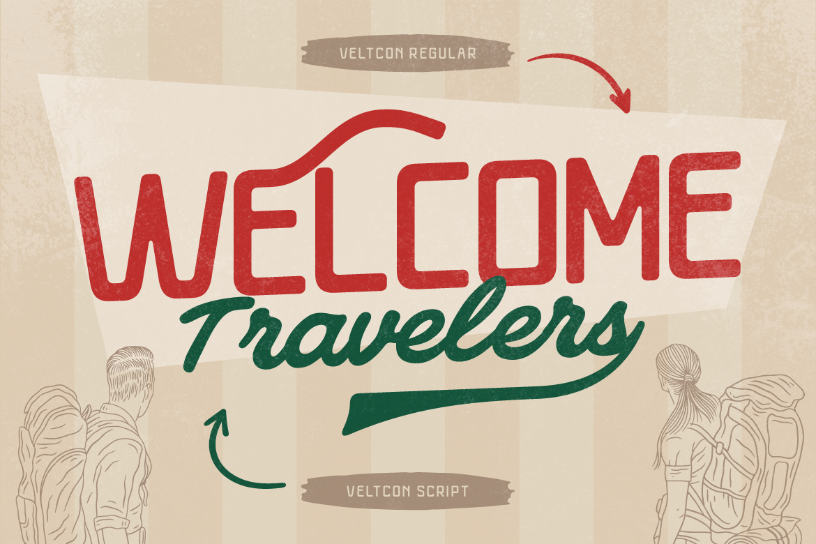
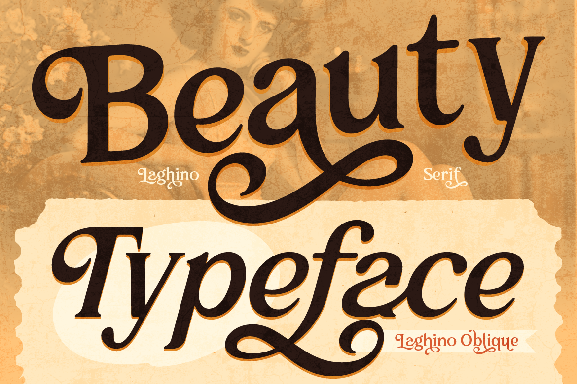
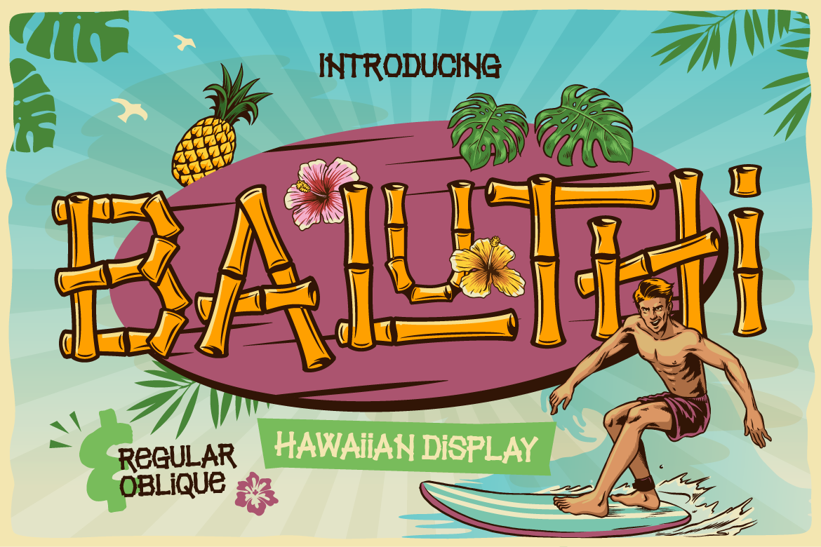
Choosing a single font for your brand is hard enough. Choosing two or three fonts that actually look good together? That is where many designers and brand owners get stuck.
Font pairing is both an art and a science. When done right, the right font combination elevates your visual identity, improves readability, and makes your brand look instantly polished and professional. When done wrong, it creates visual chaos that distracts your audience.
If you are struggling to find the perfect typography balance, follow these 4 simple rules to pair fonts effortlessly.
1. Create Clear Contrast, Not Conflict
The biggest mistake in font pairing is picking two typefaces that are too similar. If you mix two thin, classic serifs that look almost identical, it creates visual confusion. Your audience will sense something is off, even if they cannot pinpoint why.
Instead, aim for clear contrast. Pair a bold, expressive header font with a clean, understated body font.
Pro Tip: Combine opposing styles:
- A high-energy Display Font (for headlines) + A neutral Sans Serif (for body text).
- A classic Serif Font (for headings) + A clean Sans Serif (for paragraphs).
2. Establish a Strict Hierarchy
Visual hierarchy guides the reader’s eyes through your design naturally. Before choosing your fonts, decide which text elements need the most attention.
- Primary Font (Headlines): Bold, full of personality, and attention-grabbing.
- Secondary Font (Subheadings & Body): Highly readable, clean, and balanced.
- Tertiary Font (Accents & Captions): Optional, but great for callouts or quotes (such as a handwritten script).
By keeping your headline font distinct from your body copy, you make your content scannable and easy to digest.
3. Limit Your Design to 2-3 Fonts
When you have access to hundreds of beautiful typefaces, it is tempting to use all of them. However, using too many fonts makes your graphics look cluttered and unstructured.
As a rule of thumb:
- Two fonts are usually ideal for most branding projects, websites, and marketing materials.
- Three fonts should be your absolute maximum, where the third font serves only as a decorative accent (like a signature script for short quotes).
4. Match the Overall Brand Vibe
Every font carries an emotional tone. A bold varsity font feels energetic and sporty, while a thin, curved script feels romantic and elegant.
Before committing to a font pair, ask yourself: Does this combination match the personality of the brand?
If you are designing for an adventurous outdoor brand, pair a rugged Western Slab Serif with a clean, industrial Sans Serif. If you are building a modern lifestyle boutique, pair a sophisticated Round Serif with a minimalist Script Font.
Ready to Upgrade Your Typography?
Font pairing gets much easier when you work with well-crafted, versatile typefaces. Experimenting with different weight contrasts, style combinations, and letter spacing will help you discover the perfect match for your next creative project.
Explore our latest collection of handcrafted Serif, Sans Serif, and Display fonts to find the ideal typography combination for your brand today!