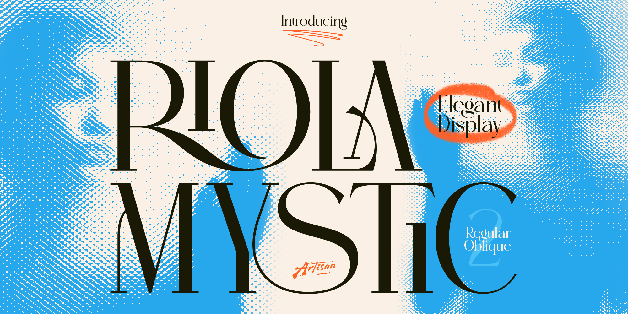
Why You Need a Mystic Elegant Display Font for Your Brand
Elevate your brand identity with a mystic elegant display font. Discover how Riola brings celestial luxury to skincare, tarot, and boutique logos.

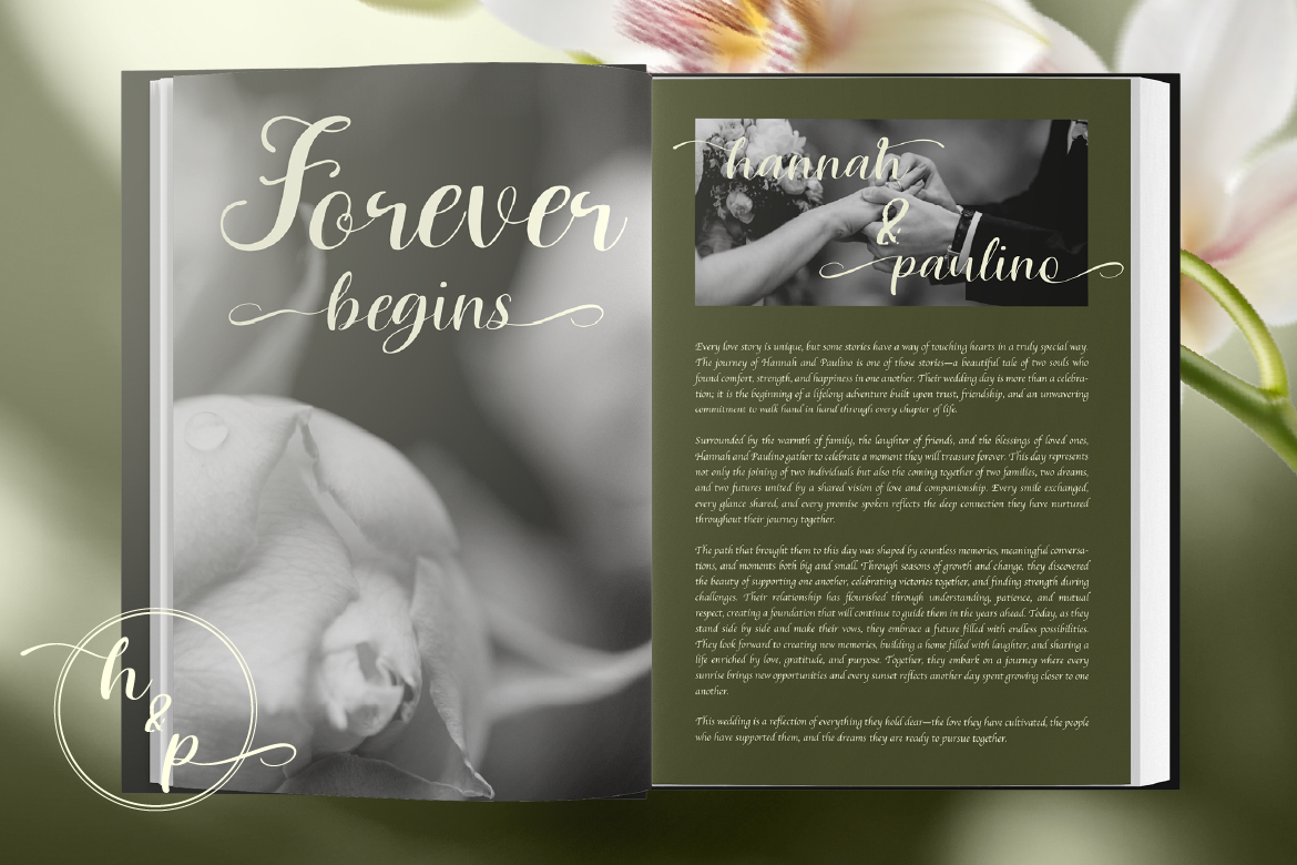
Handwritten lettering adds a personal human touch that structured geometric fonts cannot replicate. However, traditional heavy calligraphy can sometimes feel overly formal or outdated. Using aesthetic monoline script fonts offers a modern alternative that feels delicate, airy, and contemporary.
Here is how to style monoline cursive typography for modern events, lifestyle products, and minimalist brands.
Monoline scripts maintain a single stroke weight throughout every letter loop. For example, a font like Racole flows smoothly across the page without drastic thick-to-thin transitions. As a result, your typography looks clean, elegant, and modern.
Delicate script typography is extremely versatile across aesthetic niches:
To keep cursive typography readable across physical prints, follow two simple rules:
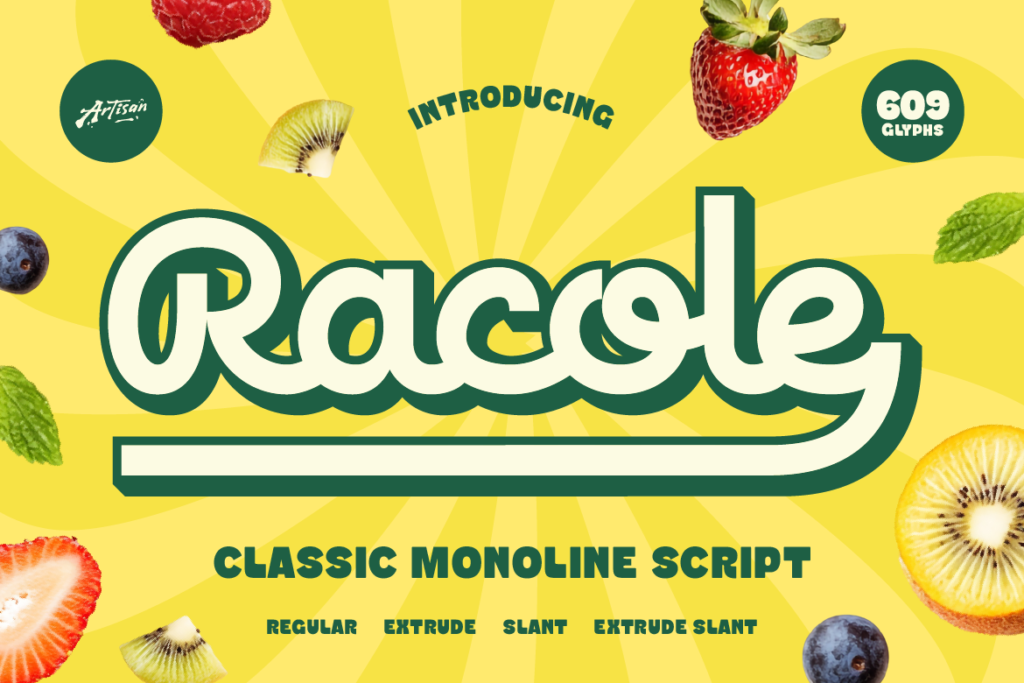
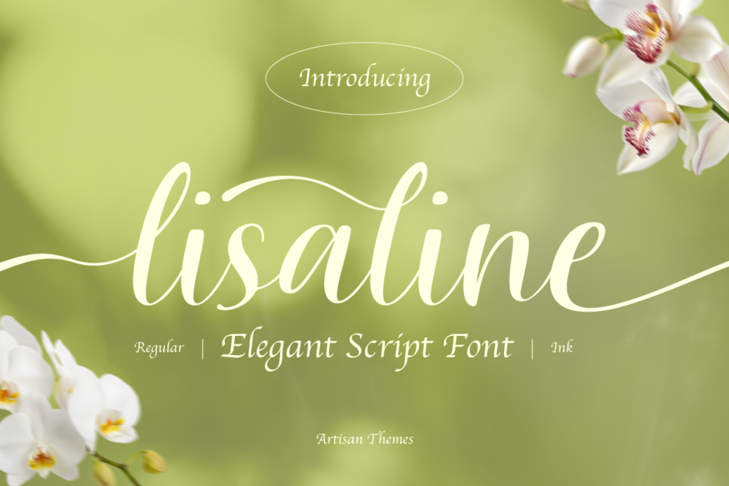
Elevate your stationery portfolio today! [Discover Racole on Artisan Font now] and create graceful cursive designs effortlessly!
Why You Need a Mystic Elegant Display Font for Your Brand
Elevate your brand identity with a mystic elegant display font. Discover how Riola brings celestial luxury to skincare, tarot, and boutique logos.
3 Spooky Halloween & Dark Fantasy Fonts
October is close enough that anyone doing seasonal design work should already be building their font shortlist — party flyers, product drops, packaging, social campaigns.
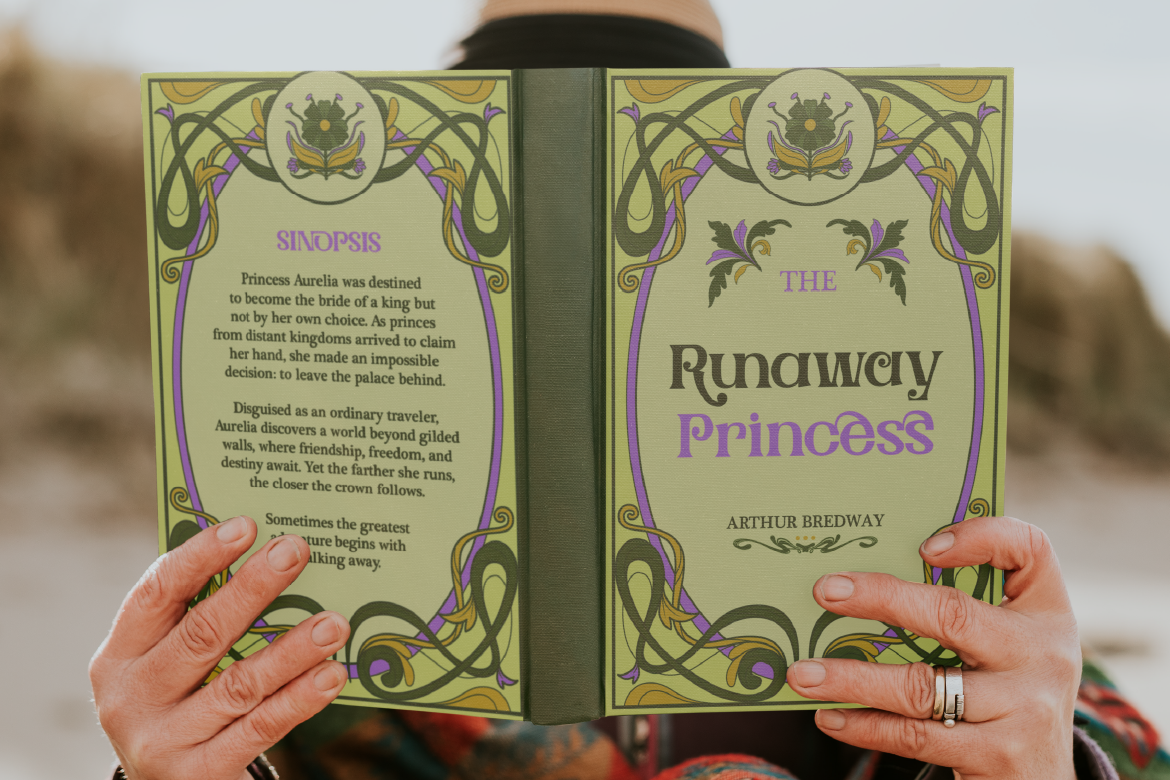
3 Retro & Vintage Fonts for Nostalgic Branding
70s psychedelic swagger, old-world Art Nouveau elegance, and a smooth vintage script-sans duo — three fonts built for brands with a nostalgic streak.