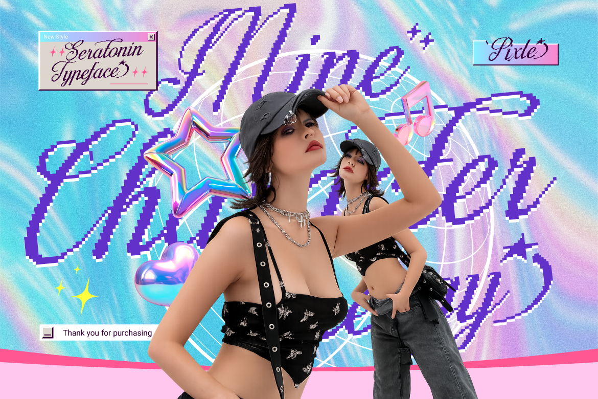
Y2K Fonts Are Back: 2026’s Biggest Type Trend
Bubble letters and chrome effects are everywhere again — here’s why Y2K typography is dominating 2026 branding, and how to use it well.

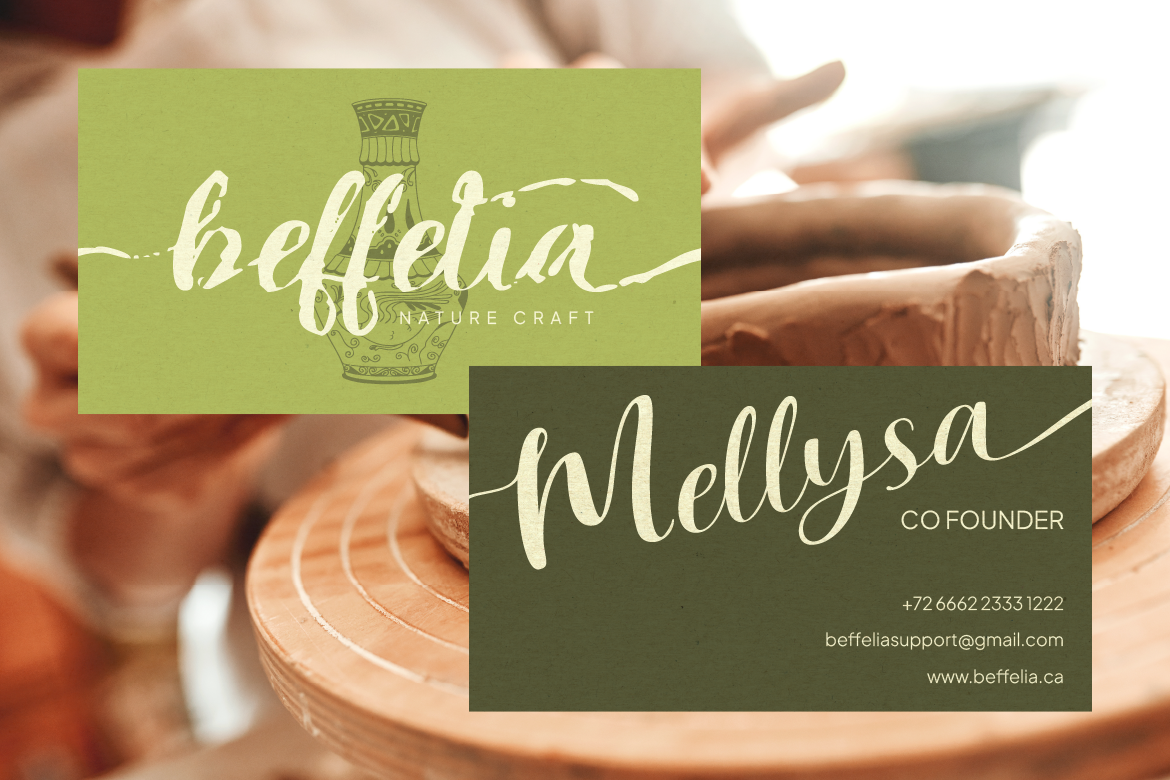
From luxury boutique logos to romantic wedding stationery, hand-drawn typography brings an irreplaceable human touch to visual design. Incorporating aesthetic script fonts into your visual projects allows you to express grace, warmth, and sophistication effortlessly.
However, cursive typefaces require careful handling to keep them legible. Here is how to style script typography like a professional designer.
Cursive and handwritten letters are designed to connect smoothly from one character to the next. Typing an entire word in uppercase script breaks these natural connecting strokes. Consequently, the text becomes completely unreadable. Always use title case or lowercase when applying cursive lettering.
Because script lettering features intricate loops, swashes, and delicate lines, crowding it with other graphic elements will make your design look cluttered. Surround your script text with generous white space so its graceful curves stand out clearly.
Script fonts carry heavy emotional weight, so a little goes a long way. Instead of using cursive for long paragraphs, use it strategically for:
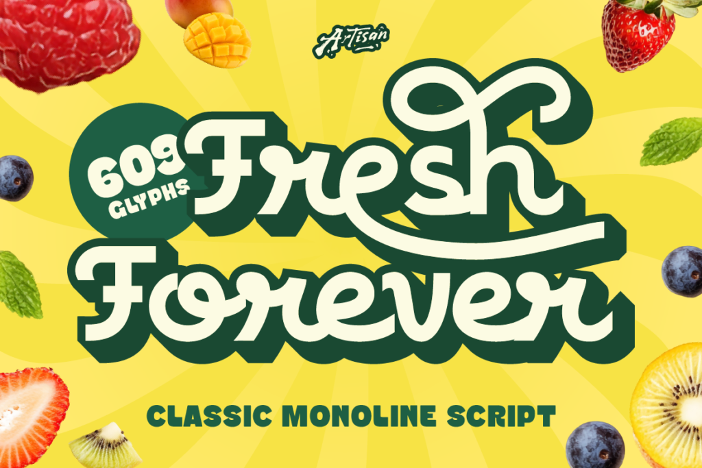
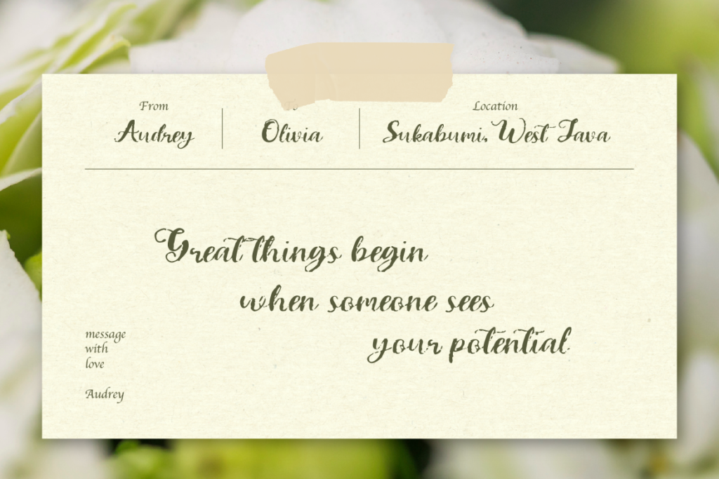
Ready to add a sophisticated touch to your next design project? [Discover Racole on Artisan Font today] and craft graceful cursive layouts effortlessly!
Y2K Fonts Are Back: 2026’s Biggest Type Trend
Bubble letters and chrome effects are everywhere again — here’s why Y2K typography is dominating 2026 branding, and how to use it well.
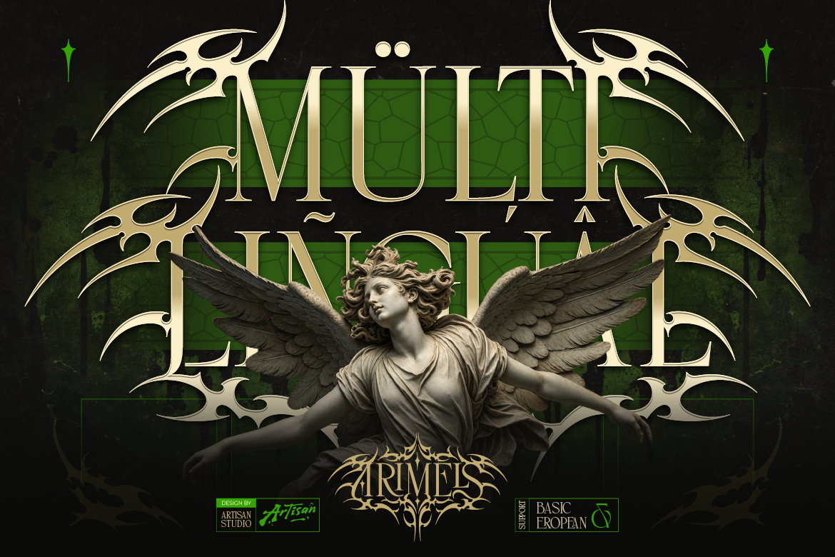
5 Blackletter Fonts for Bold Gothic Luxury Branding
Blackletter isn’t just for metal bands anymore — see how 5 bold gothic typefaces are redefining luxury branding for modern designers.
How to Use a Tribal Serif Font for Authentic Cultural and Boho Branding
Stand out from generic designs! Learn how incorporating a tribal serif font brings authentic cultural texture, luxury, and boho charm to your logos.