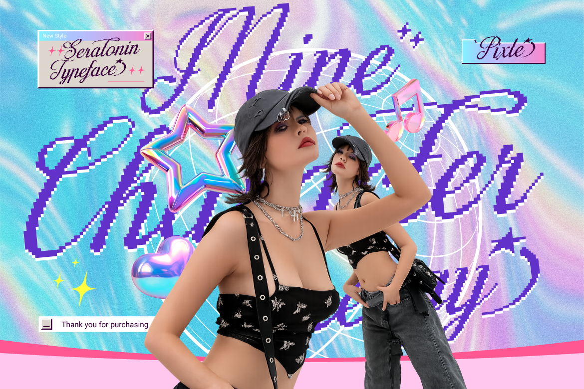
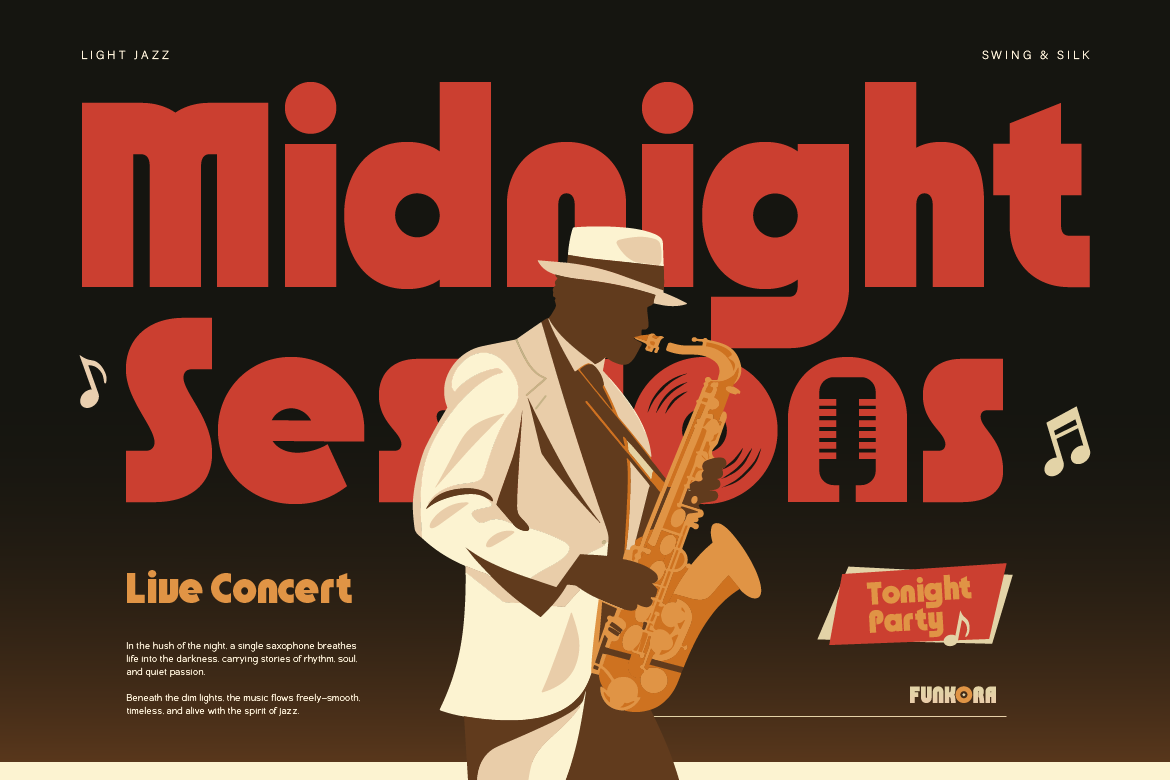
Nostalgia is taking over the design world, and vintage typography is leading the charge. Everywhere you look, brands are ditching super-minimalist styles in favor of vibrant curves and playful lettering. Learning how to incorporate groovy retro fonts into your creative projects is one of the easiest ways to stand out in a crowded market.
If you want to bring a fun, nostalgic vibe to your graphics without making your brand look outdated, here is how to use retro typography effectively.
1. Reserve Groovy Retro Fonts for Big Headlines
Because decorative 70s-style fonts carry so much personality, they work best when used as focal points. Use your retro font for website banner titles, poster headers, or primary product labels. Letting the font be the star of the layout ensures your message gets noticed instantly.
2. Pair Expressive Display Fonts with Clean Sans Serifs
To maintain a professional look, balance is crucial. If your headline uses a bold, wavy typeface, pair it with a simple, neutral Sans Serif font for the supporting body text or subheadings. This contrast keeps your design clean, modern, and easy to read.
3. Match the Font to the Right Product Niche
Retro typography naturally evokes feelings of warmth, fun, and authenticity. It works exceptionally well for:
- Coffee shops and artisan bakery packaging.
- Lifestyle, fashion, and streetwear brands.
- Music festival posters and social media event banners.
4. Experiment with Vibrant Color Palettes
Groovy typography shines brightest when paired with warm, vintage-inspired color palettes. Try combining earthy tones like mustard yellow, burnt orange, warm beige, and sage green to complete the authentic retro aesthetic.
Ready to give your brand an energetic makeover? Explore our handcrafted collection of groovy retro fonts and start creating scroll-stopping designs today!