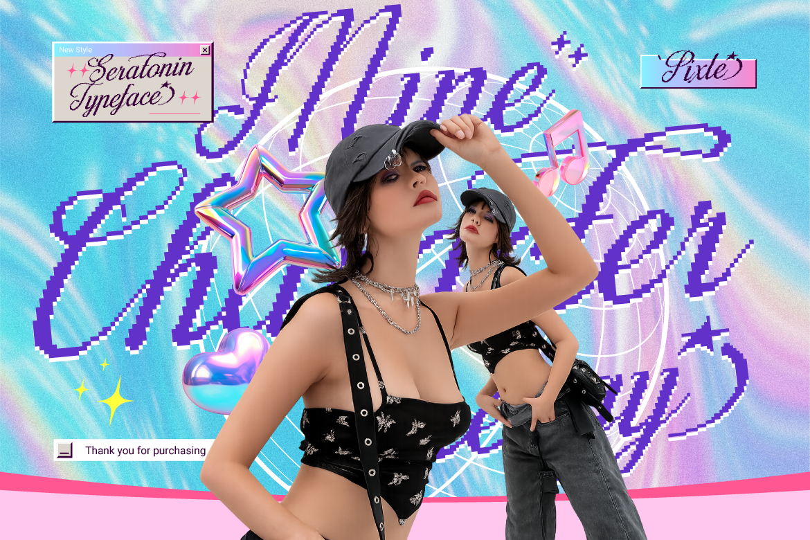
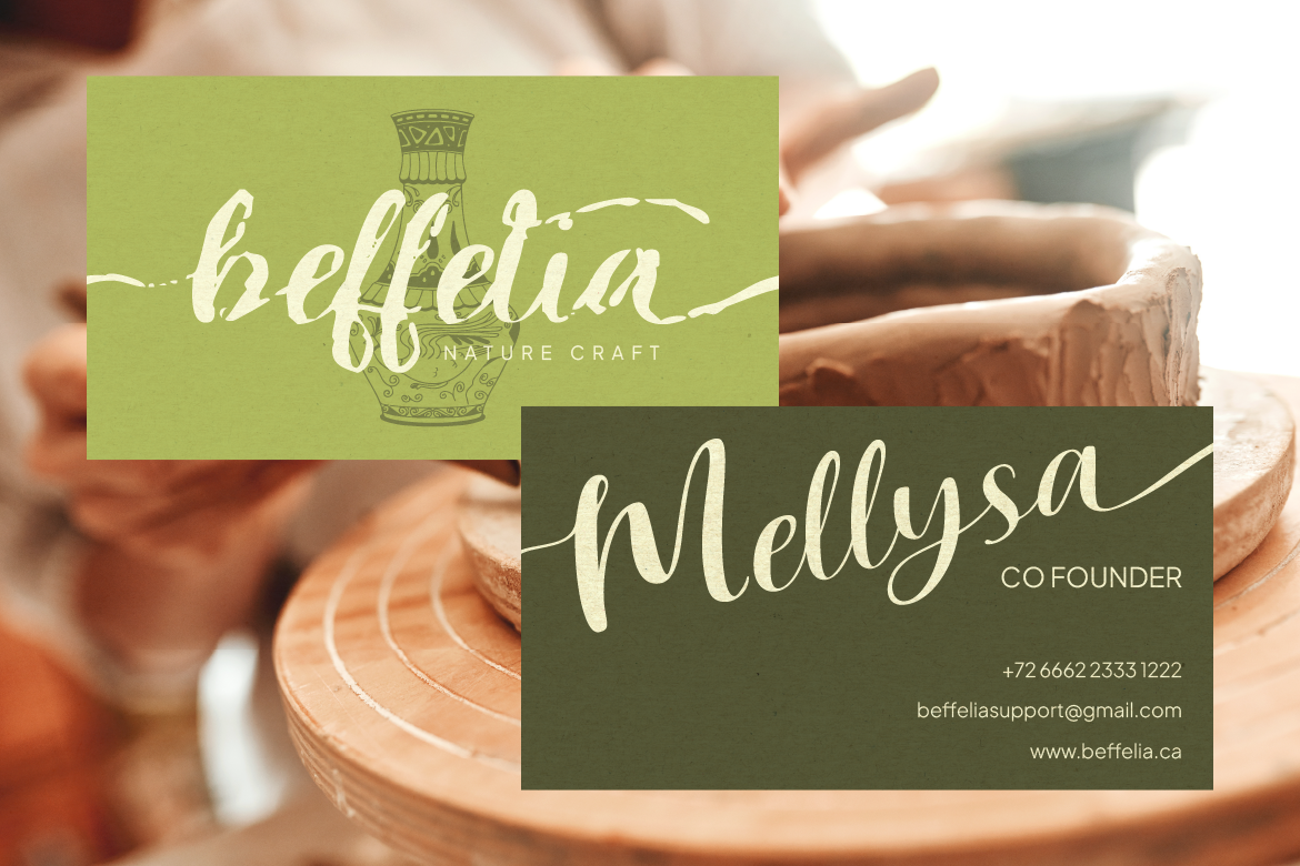
It’s easy to overlook, but the case you choose for your text, uppercase, lowercase, or a mix of both, actually changes how your message feels before anyone even processes the words. Let’s talk about how letter case affects tone, and how to use it intentionally in your designs.
Uppercase: Bold, Direct, and Attention-Grabbing
All-caps text feels loud. It commands attention, projects confidence, and reads as bold or urgent. That’s why you’ll see uppercase used so often in headlines, logos, and calls to action, it’s direct and impossible to skim past.
That said, uppercase text can feel a little aggressive or shouty if overused, especially in body copy. It’s best reserved for short bursts of text like titles, buttons, or labels rather than long paragraphs, where it can actually slow down readability.
Lowercase: Approachable, Modern, and Relaxed
Lowercase text feels more casual and approachable. It’s easier to read in long form, and it tends to give off a softer, more modern tone. A lot of contemporary and minimalist brands lean into all-lowercase branding specifically because it feels friendly and understated.
The tradeoff is that lowercase alone can sometimes feel like it’s missing a bit of authority or formality, depending on the context. It works beautifully for casual, friendly brands but might not always suit something that wants to feel more traditional or established.
Mixing Case for Balance
Most designs actually use a mix, capitalizing the first letter of sentences and proper nouns while keeping the rest lowercase. This “sentence case” or “title case” approach feels natural and balanced, formal enough to read as intentional, but not as loud as full uppercase.
Some brands also get creative by mixing cases within a single logo or headline for stylistic effect, though this works best in small doses where it won’t hurt readability.
Choosing the Right Case for Your Brand
Think about the tone you want to set. Bold and direct? Uppercase might be your friend. Friendly and approachable? Lowercase could be the better fit. And if you’re not sure, standard sentence case is almost always a safe, versatile choice.
Whatever direction you choose, Artisan Font has a wide range of styles to help bring that tone to life. Explore the collection and see how different fonts handle case in their own unique way!
→ Artisan’s Font Collection