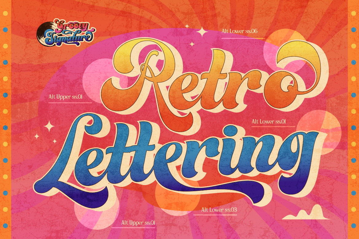
Open any moodboard for a beauty brand, a boba shop, or a Gen Z-facing app right now, and you’ll see it: bubbly, chrome-effect, slightly-too-big lettering that looks like it was pulled straight off a 2003 flip phone. Y2K typography is back, and it’s not a fringe aesthetic anymore — it’s showing up in mainstream packaging, app UI, and product launches from brands that have nothing to do with nostalgia marketing on paper.
For designers, this is a useful signal. Trend cycles are predictable in hindsight but easy to miss in real time, and Y2K’s return to relevance means the right typeface choice right now can make a brand feel current instead of dated. Here’s what’s actually driving the trend, which font styles are carrying it, and how to use them without looking like a costume.
Why Y2K Typography Is Back
Three things are converging. First, the twenty-year nostalgia cycle is right on schedule — the same way 90s grunge came back in the 2010s, early-2000s aesthetics are now hitting peak relevance for a generation that didn’t live through it the first time. Second, social platforms reward type that’s legible and expressive at thumbnail size, and bubble and chrome fonts do exactly that in a feed full of flat sans-serifs. Third, after years of minimalist “startup sans” branding, audiences have visibly grown tired of sameness, and Y2K offers an easy way to stand out without a full rebrand.
The brands capitalizing on this fastest are in beauty, beverage, and youth fashion — but the aesthetic is spreading into fintech apps, music releases, and even B2B SaaS trying to shed a corporate look.
Three Font Styles Carrying the Trend
- Bubble & Inflated Display — Rounded, high-volume letterforms with heavy weight and soft corners that often carry a glossy or chrome finish. This is the workhorse of the trend: think product names on packaging, app splash screens, or a hero headline that needs to feel playful and confident at the same time.
- Chrome & Metallic-Effect Type — Typefaces that mimic liquid metal or holographic surfaces, either through the letterforms themselves or layered color effects. Use it sparingly — a logotype or a single hero word — since overusing it makes the effect compete hard with everything else on the page.
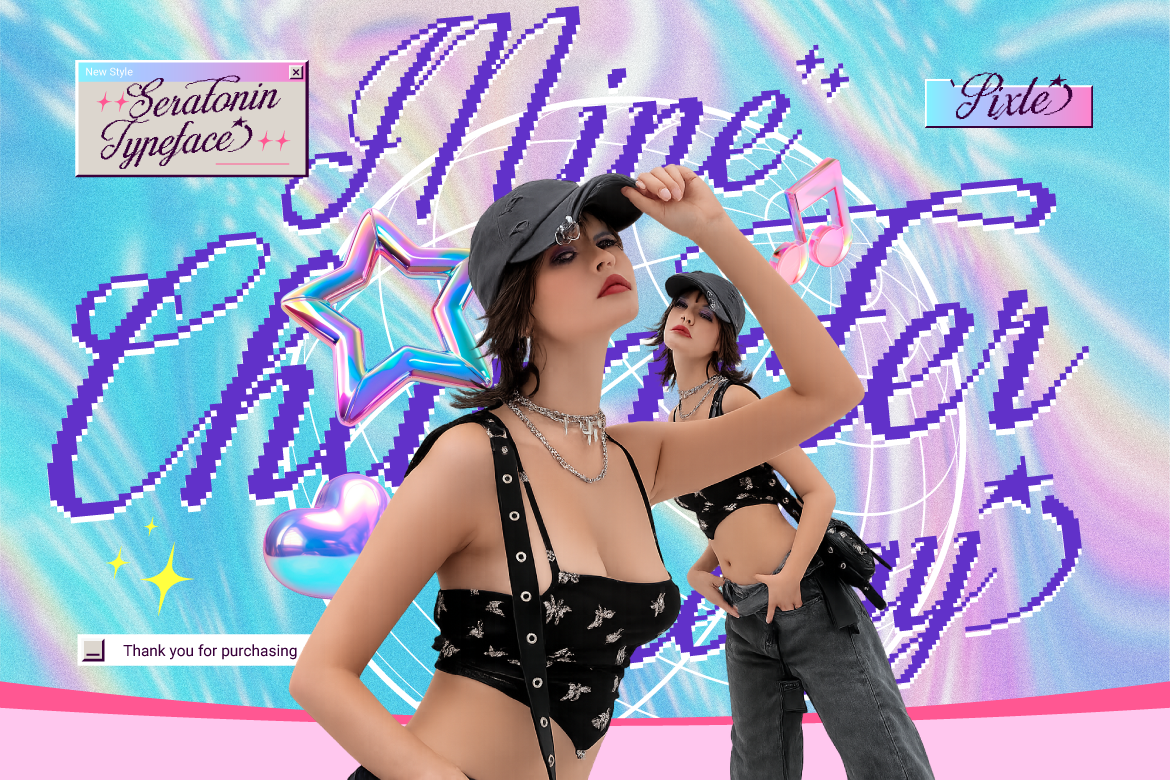
- Pixel & Low-Fi Digital — Blocky, slightly imperfect letterforms referencing early web and game interfaces. This style works well for anything leaning into internet-native or gaming-adjacent branding, and it pairs surprisingly well with modern minimalist layouts as a contrast element.
Picking between these comes down to how loud you want the nostalgia signal to be — bubble fonts read as playful and mainstream, chrome reads as aspirational and futuristic, pixel reads as niche and internet-fluent.
Actionable Design Advice: Using Y2K Type Without Dating Your Brand
The risk with any trend-driven font choice is looking dated the moment the trend cools. A few habits keep Y2K type working as a brand asset rather than a costume.
Use it as an accent, not a system. Reserve bubble or chrome fonts for hero moments — a product name, a campaign headline, a splash screen — and keep supporting copy in a clean, trend-neutral typeface. This way, when the aesthetic shifts again, you’re only refreshing one element instead of your entire type system.
Balance nostalgia with restraint. The most effective modern Y2K branding borrows the shapes and effects without going full early-2000s clutter. Pair a bubble headline with generous whitespace and a modern color palette instead of stacking gradients, glitter, and drop shadows the way the original era did.
Test legibility at small sizes early. Bubble and chrome effects can look great at hero size and fall apart in a favicon or app icon. Check your typeface choice at the smallest size you’ll actually use it before locking it into a brand system.
Confirm your license covers the application. Designers often push trend-driven fonts across a huge range of touchpoints fast — packaging, social templates, app UI, merch. Before rolling a typeface out brand-wide, check that your license tier actually covers the volume and use cases you’re planning, not just the initial mockup.
Building a Trend-Proof Type Library
The safest way to ride a trend like this is to pick a well-drawn display font with a full character set and proper OpenType support, rather than a free download that looks fine in a single headline and breaks the moment you need it across a full brand system. A trend typeface with clean production quality has a much longer shelf life than one that only holds up in a mockup.
Ready to Give Your Brand a Y2K Moment?
If your next campaign, product launch, or rebrand could use some early-2000s energy, browse the display and script collection at Artisan Font. Every typeface comes with clear, scalable licensing so you can take a trend from mockup to full brand rollout with confidence — explore the full catalog and find your next hero font today..